

Art direction and catalogue design for the Student Medal Project, published by the British Art Medal Society at the British Museum
Art Direction
Catalogue Design
Background
The Student Medal Project encourages and promotes the art of making medals throughout art colleges in the United Kingdom and from international partners. Each year over one hundred student medals, from as many as fifteen art colleges, are submitted for judging for prizes and selection for exhibition.
The Project is run by The British Art Medal Society at the British Museum and is supported by The Worshipful Company of Founders, The Worshipful Company of Cutlers, The Worshipful Company of Tin Plate Workers, The Goldsmiths’ Centre and Thomas Fattorini.
The Project acts as a forum for students and academic institutions to contribute to the ongoing discourse on the creative medium. Medals are often cast in bronze and submitted from sculpture students and those studying metalwork and jewellery but, the Project is open to other disciplines and creative interpretations of the form as well.
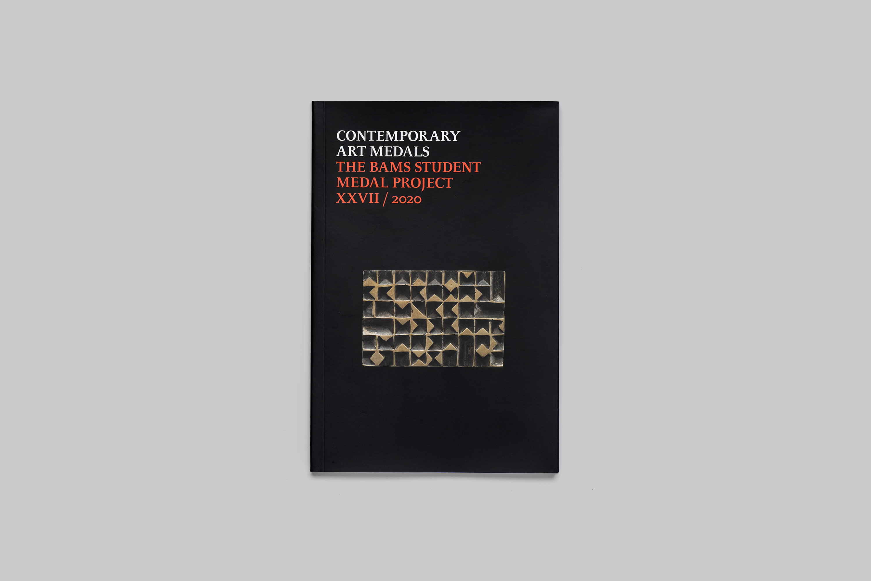
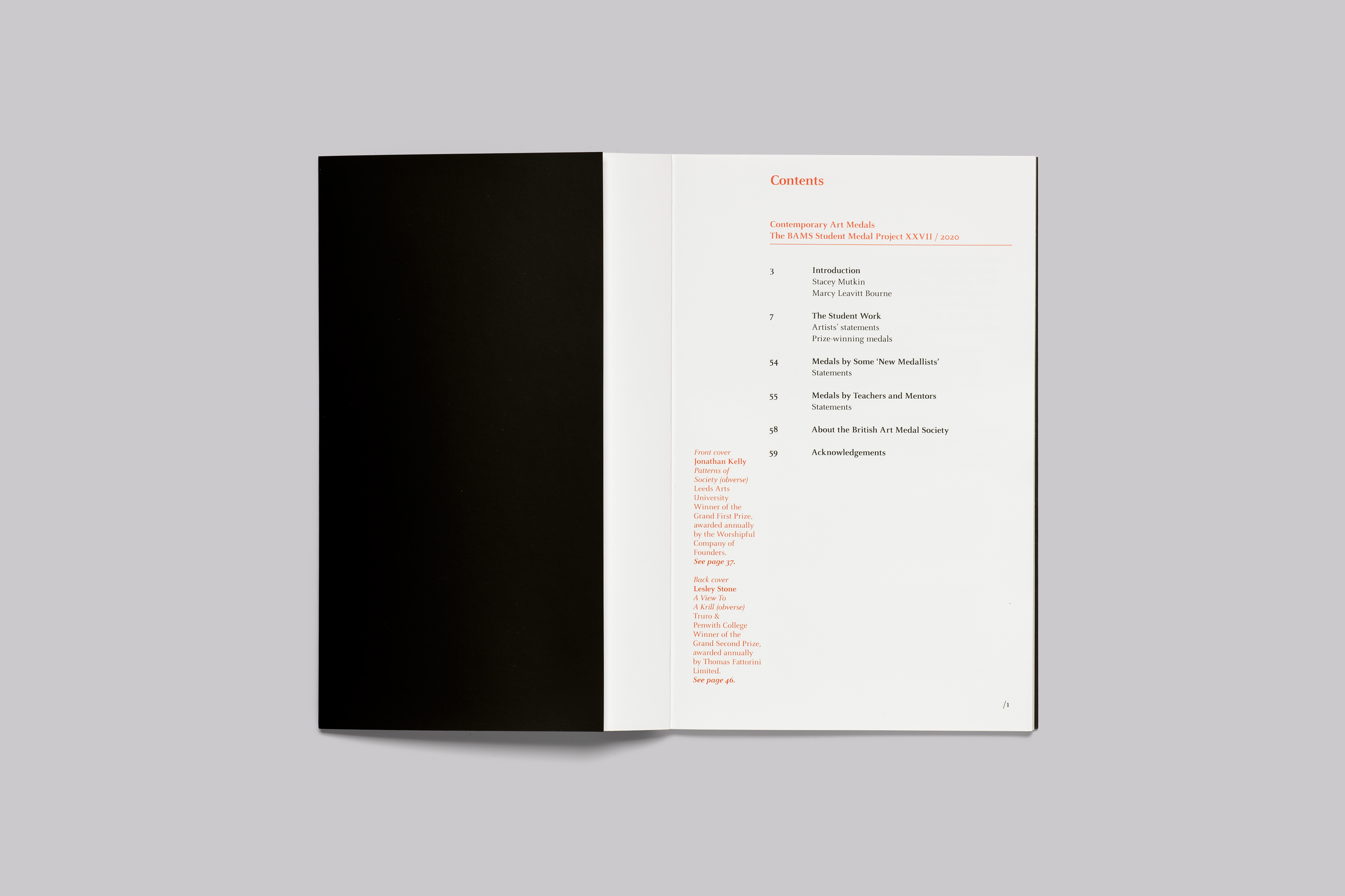
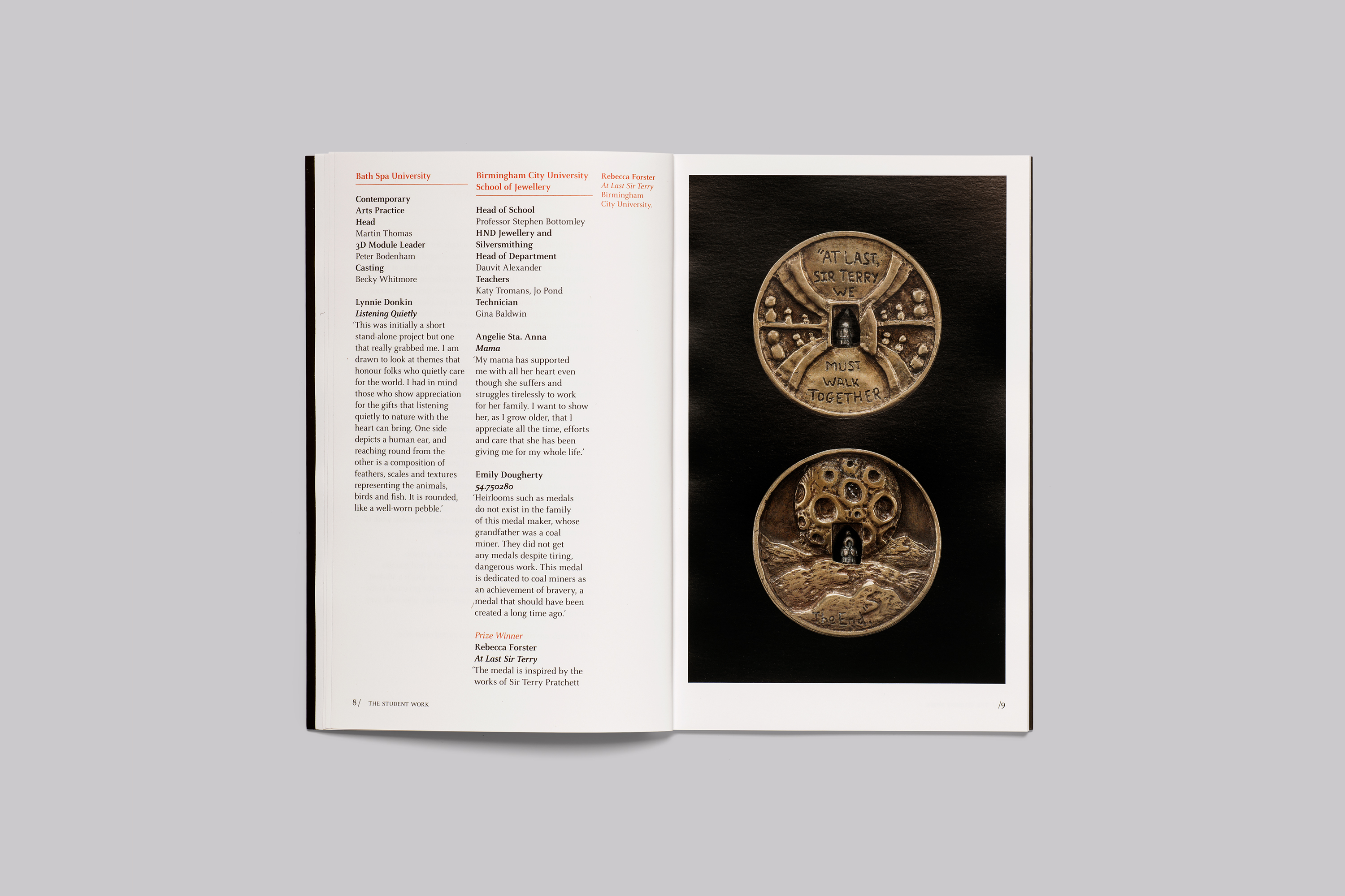
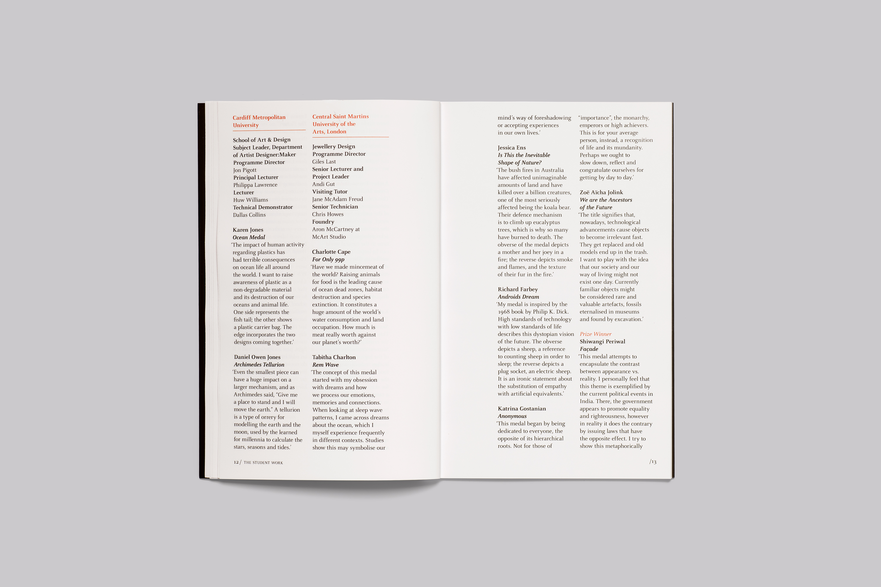
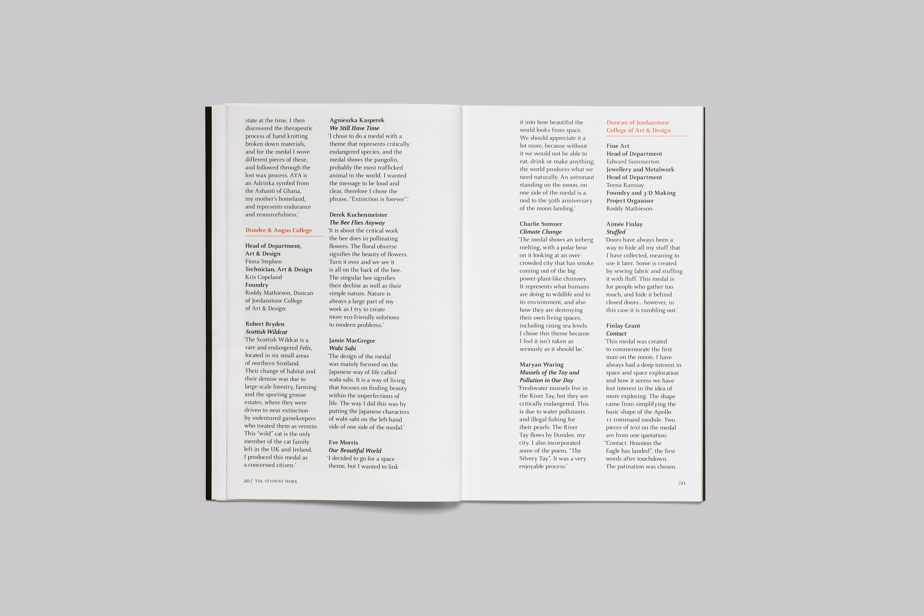
The catalogue is published each year and includes entries for everyone who participates with illustrations of the winners; and stands as a record for those at the start of their artistic careers.
Art Direction
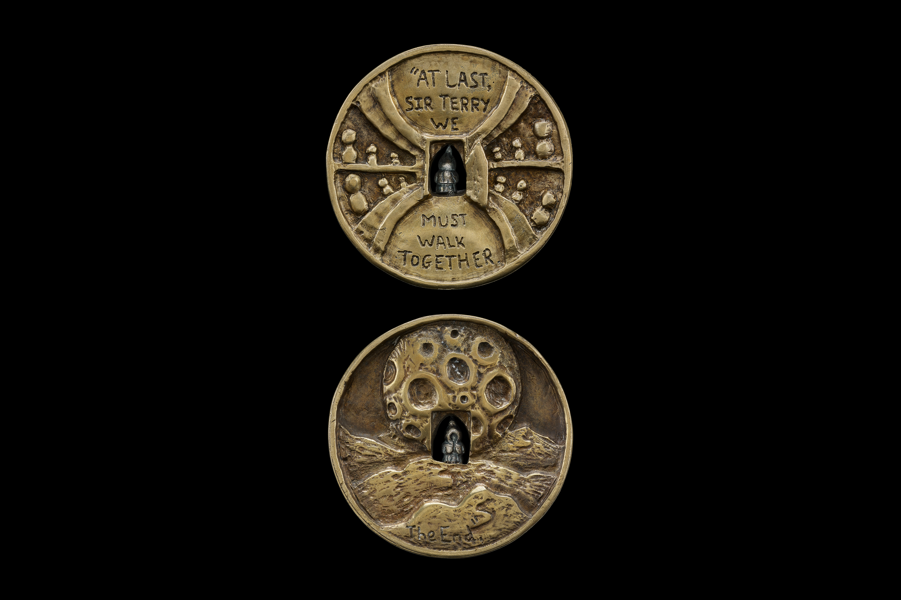
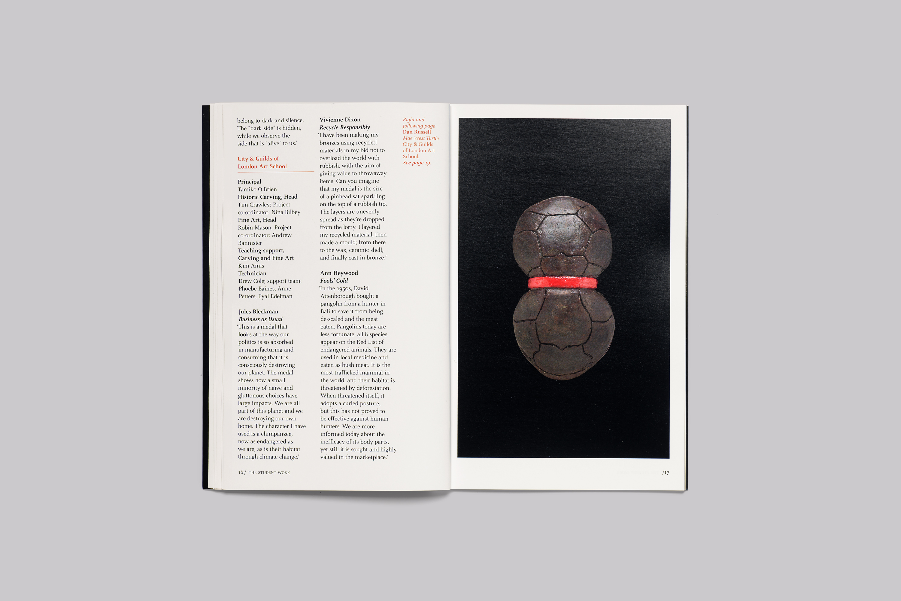
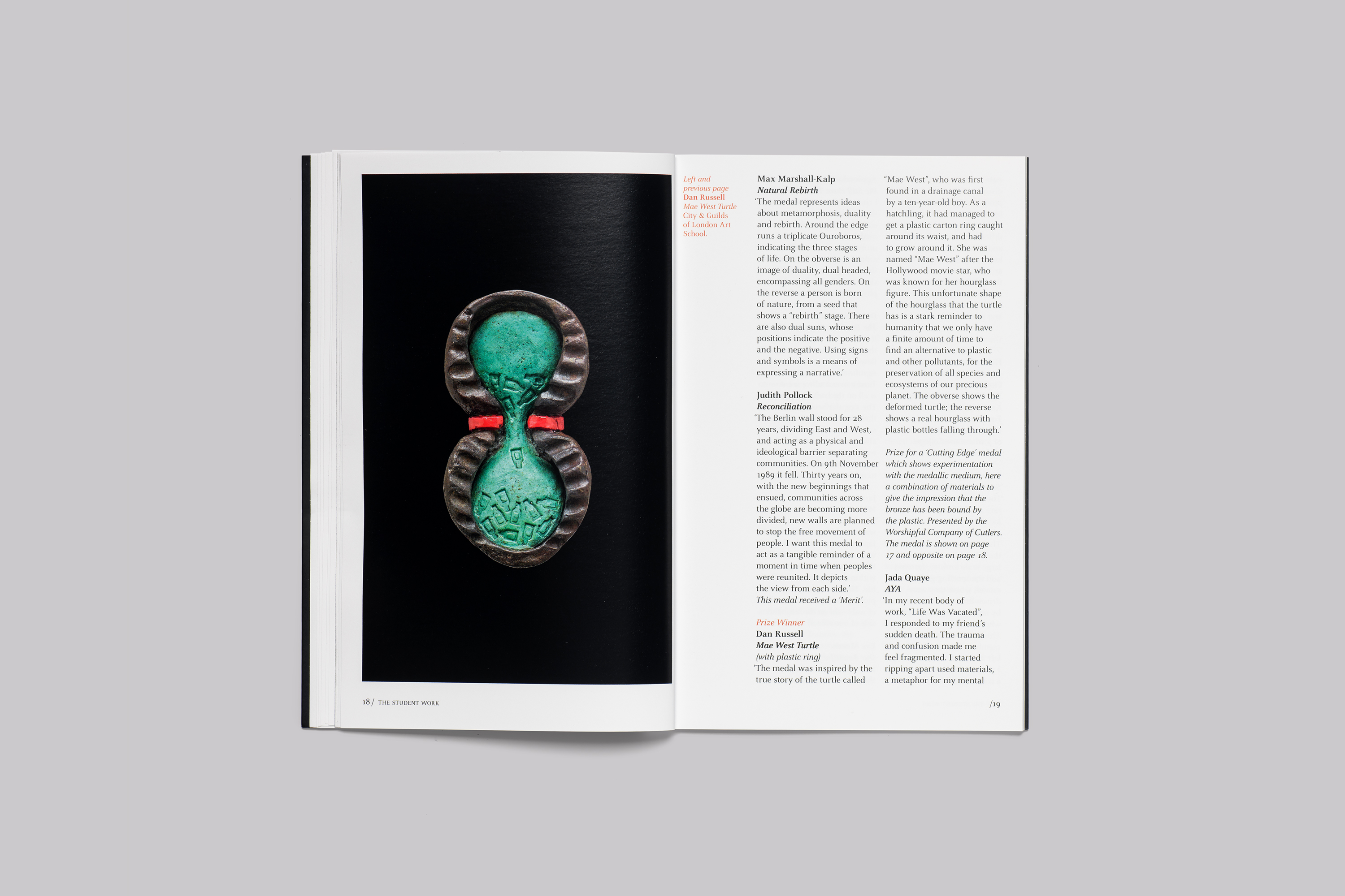
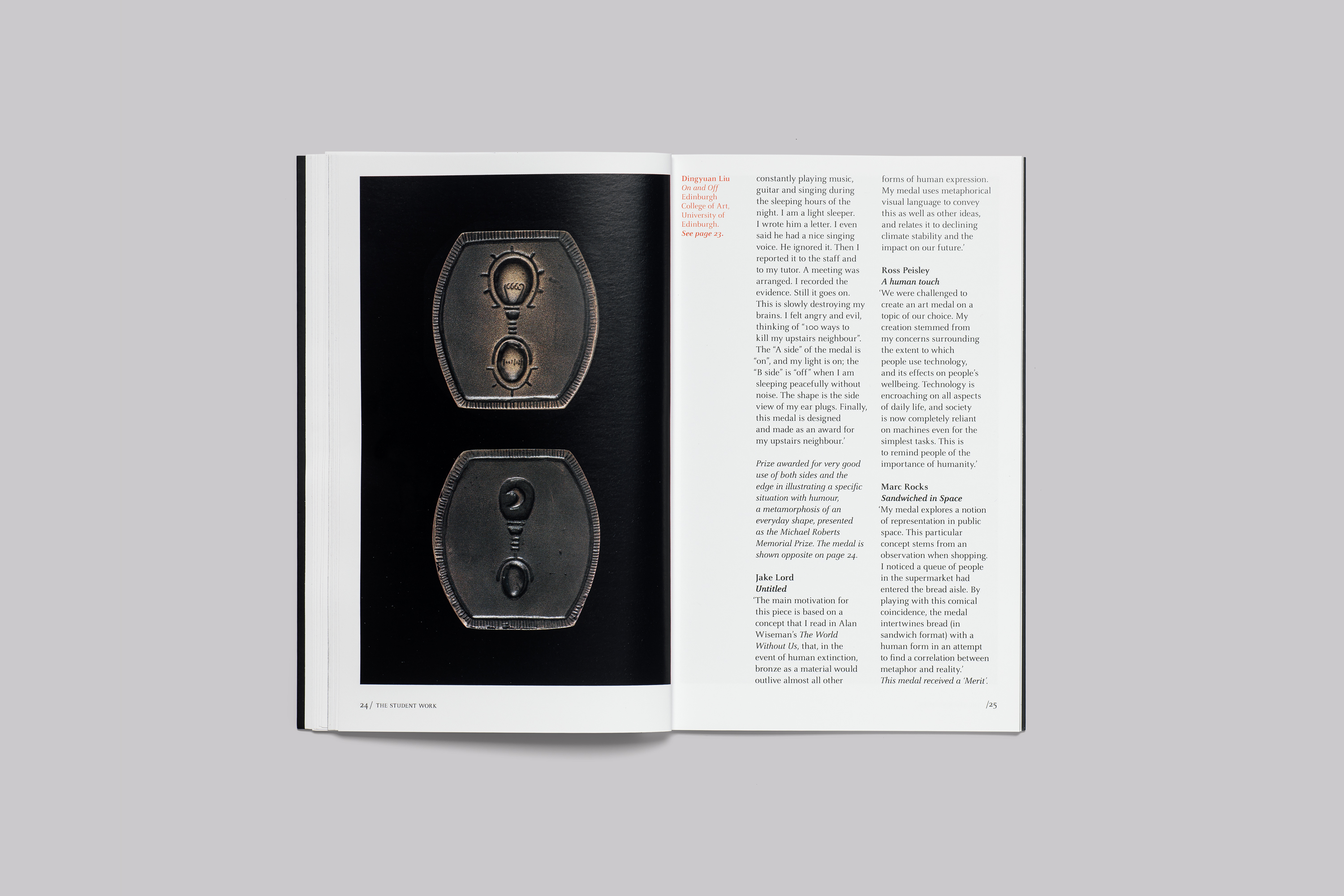
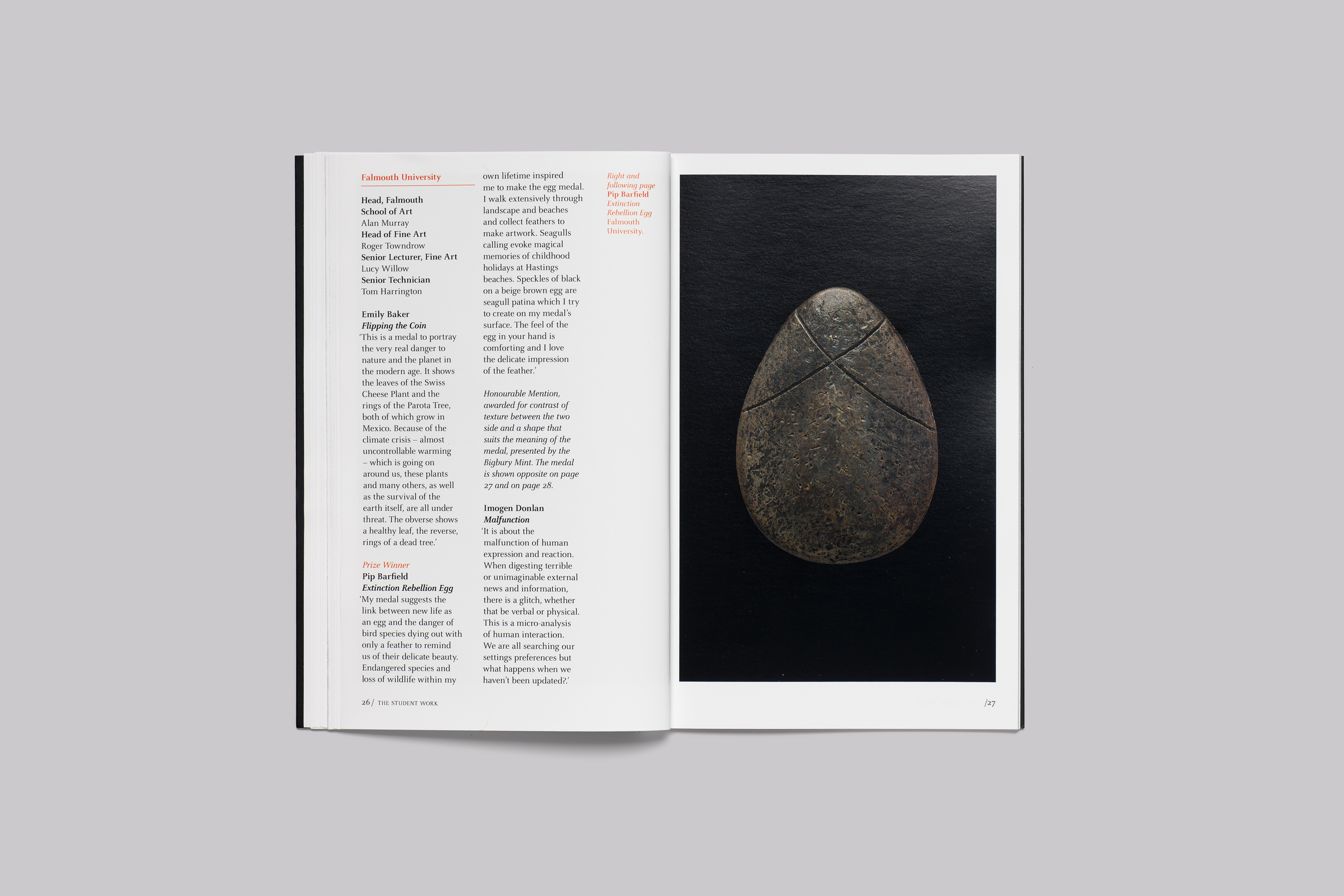
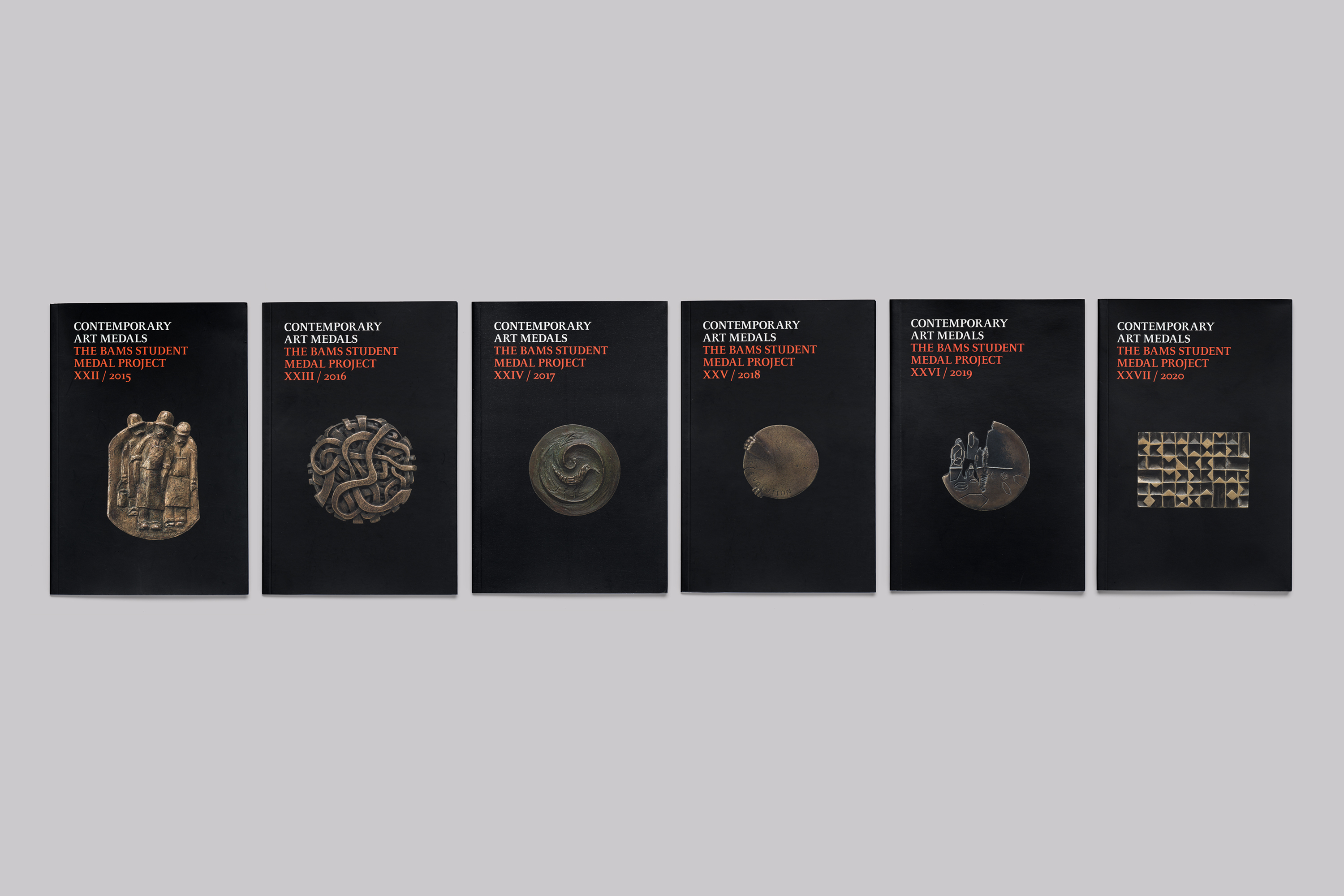
Previously medals had been photographed on a white background and there was a convention to remove the unwanted shadow which was deemed distracting from the quality of the subject of the photograph.
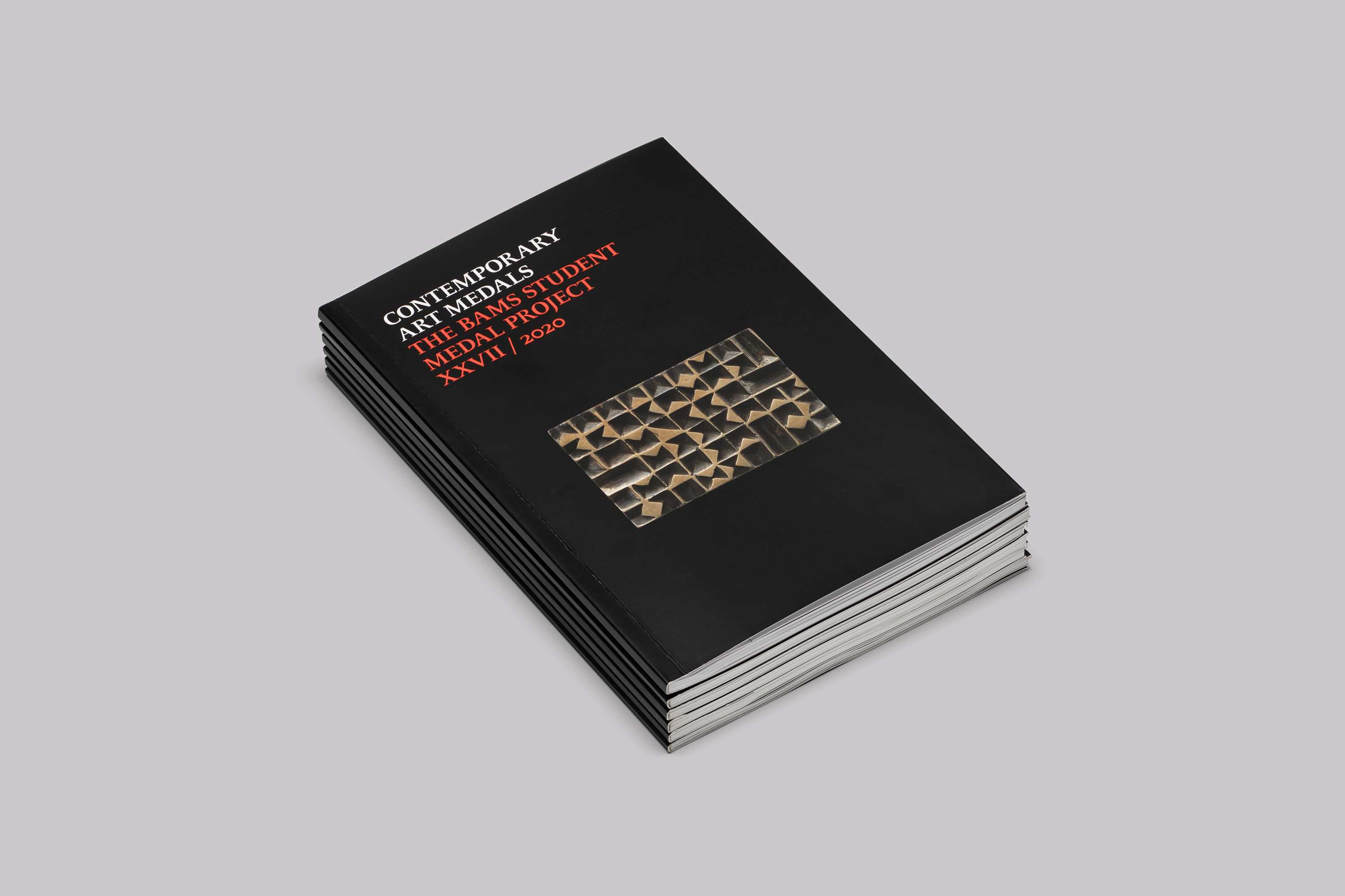
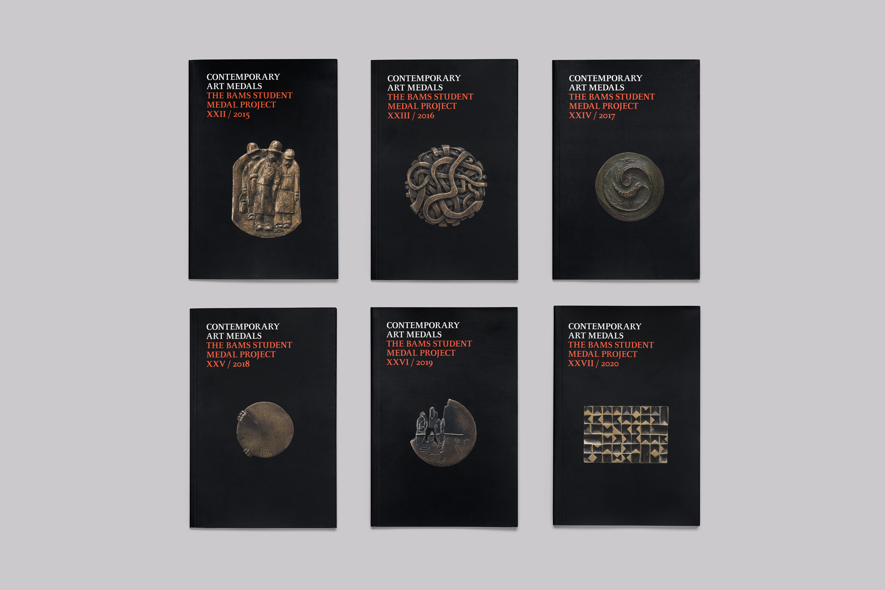
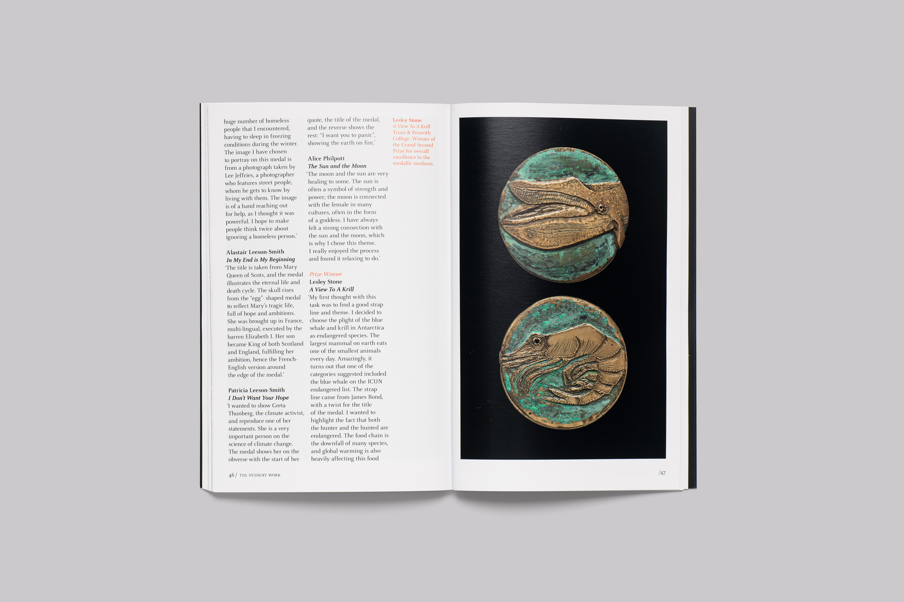
We proposed the medals be shot on a black background to create a deep richness in the image and a photographic image that celebrated the key qualities of the medals—without distraction. Reproduced at 100% scale the images create a deep tactile impression of the actual physical medal.
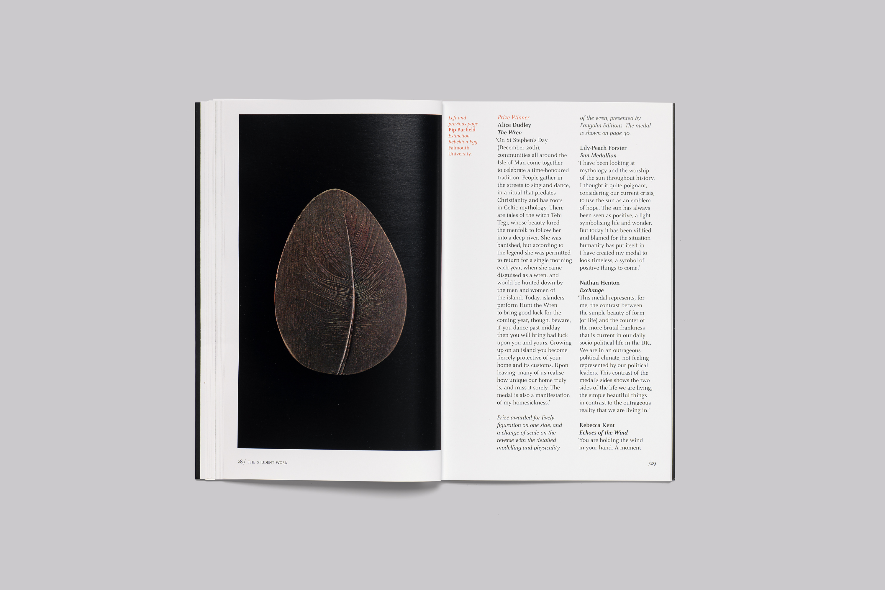
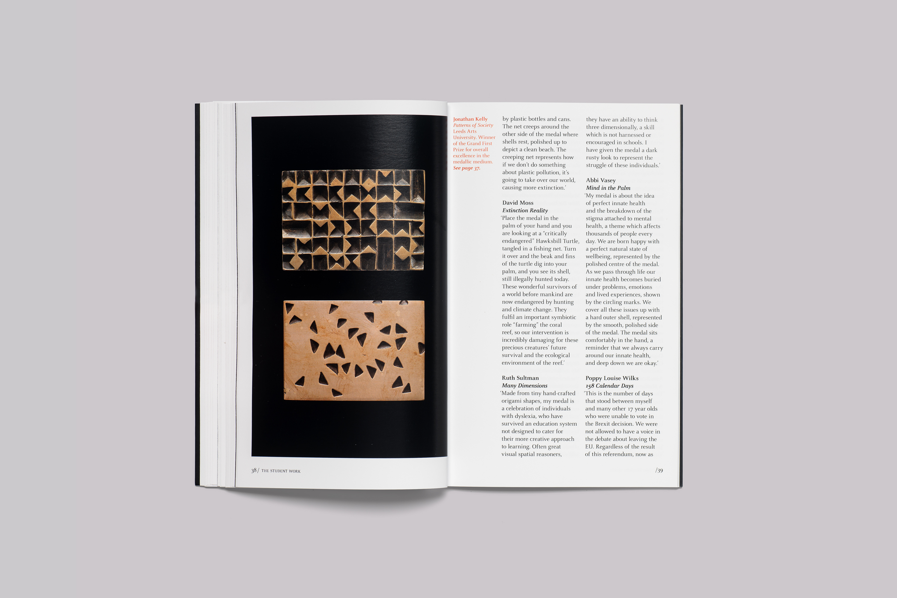
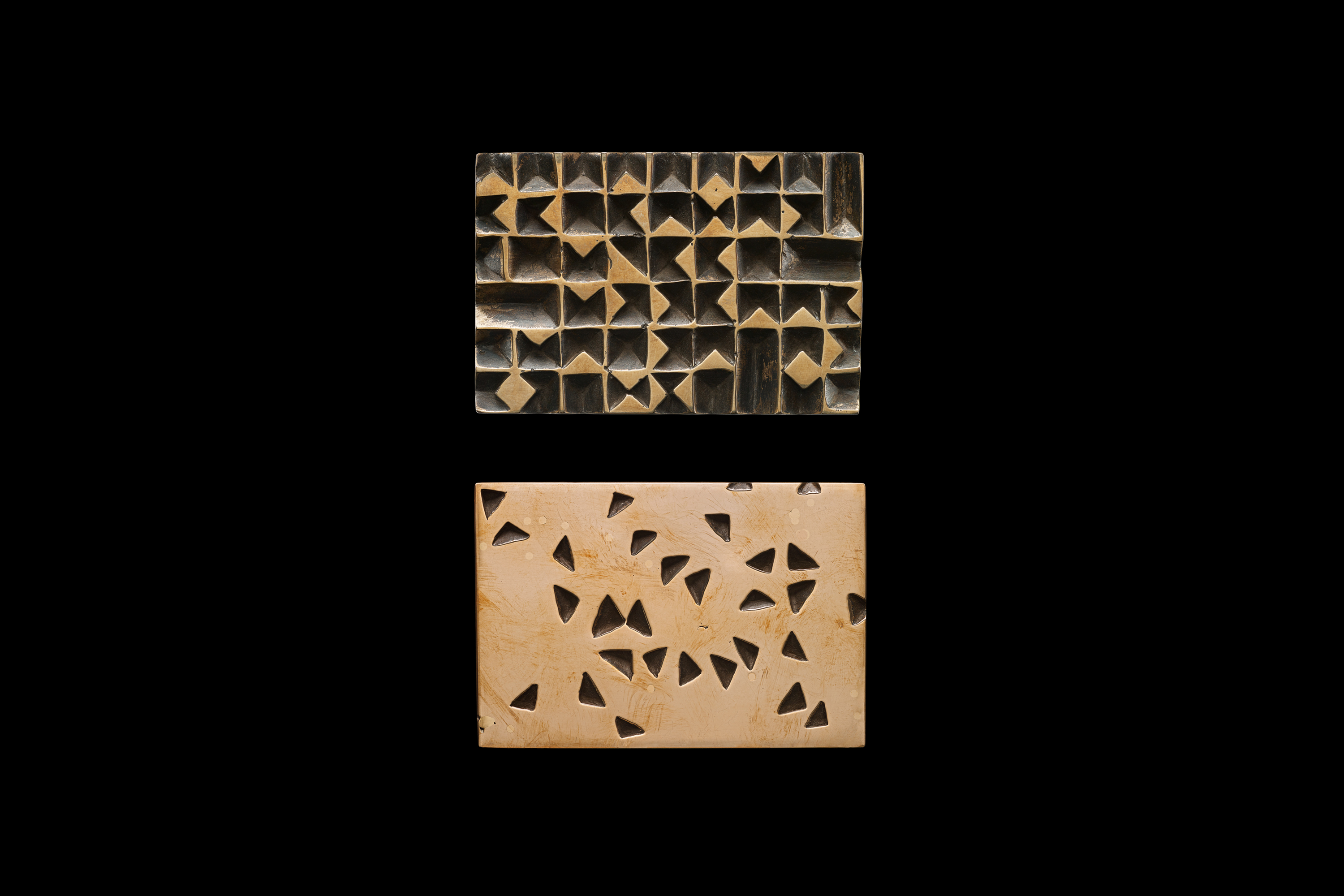
This ambition led us to numerous challenges not least the printing of a photographic black. Rich black is made up of all four colours—black underpinned by 20% cyan, magenta and yellow, giving an ink density of 160%. But, we were wanting to lay down a black created in the camera that had an ink density of 330%. This was way too much for traditional litho printing to handle; that much ink created a saturation point with problems of ink offsetting and paper stretch, due it being too wet.
Working closely with our print partners the solution came in the form of the HP Indigo, a digital printing press, and using treated papers that could hold this amount of ink.
Working closely with collaborating photographers, we have been able to ensure the aesthetic ambitions have been maintained. And we have preserved this consistency through the art direction for the images across all years of the publication, from 2009—2020.
Services
Printed Communications
Catalogue Design
Art Direction
Print Management
Project Management
Related Projects