

Brand identity and visual communication design for Gwelen, a public artwork created by Emma Smith in Mount’s Bay, Cornwall, UK, for Cornwall Council as part of the Experience project.
Brand Identity
Strategic Positioning
Integrated Campaign
Printed & Digital Communications
Background
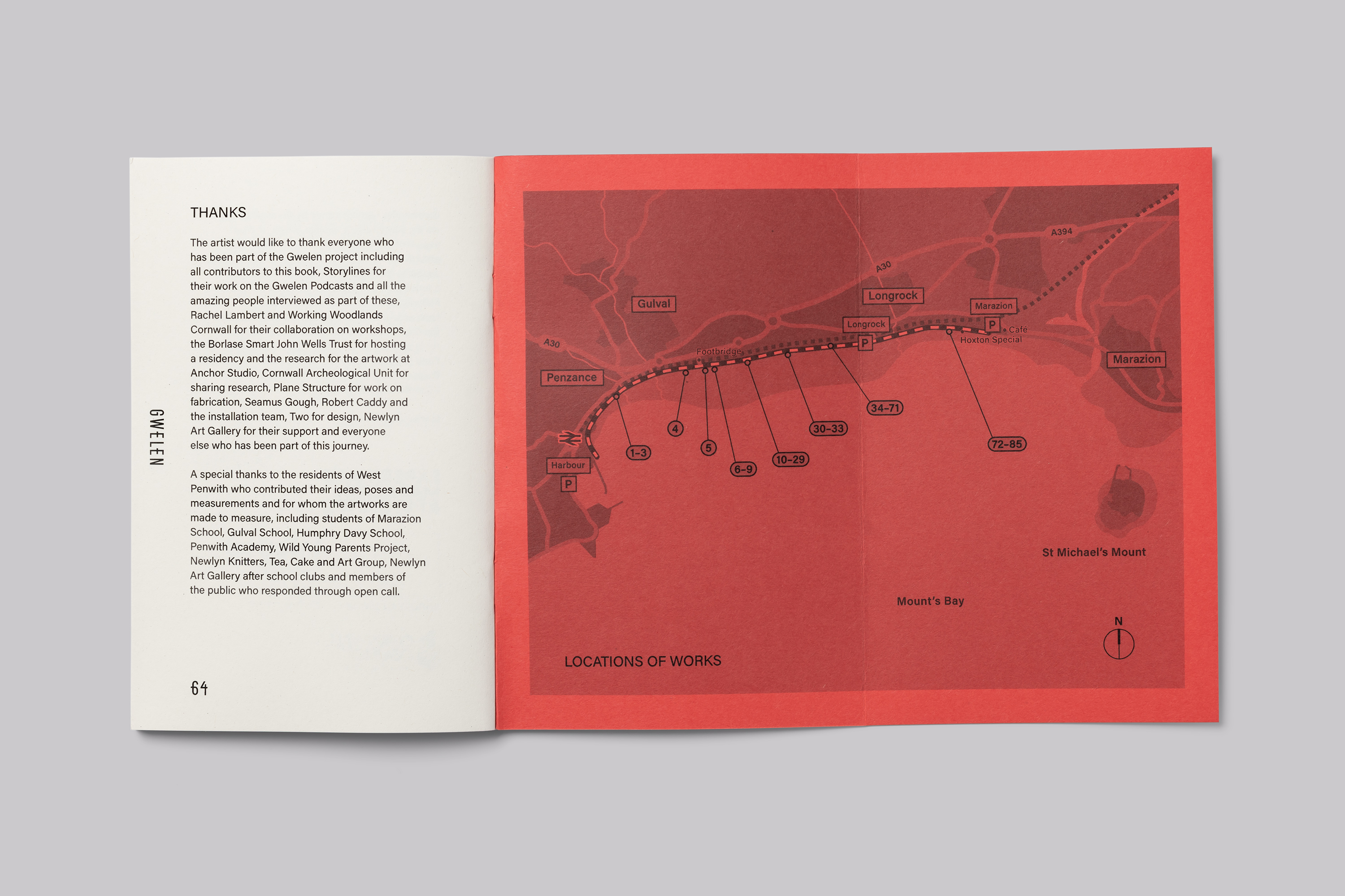
Gwelen is an artwork for the Penzance to Marazion coastal path, in Cornwall UK, by Emma Smith with residents of West Penwith.
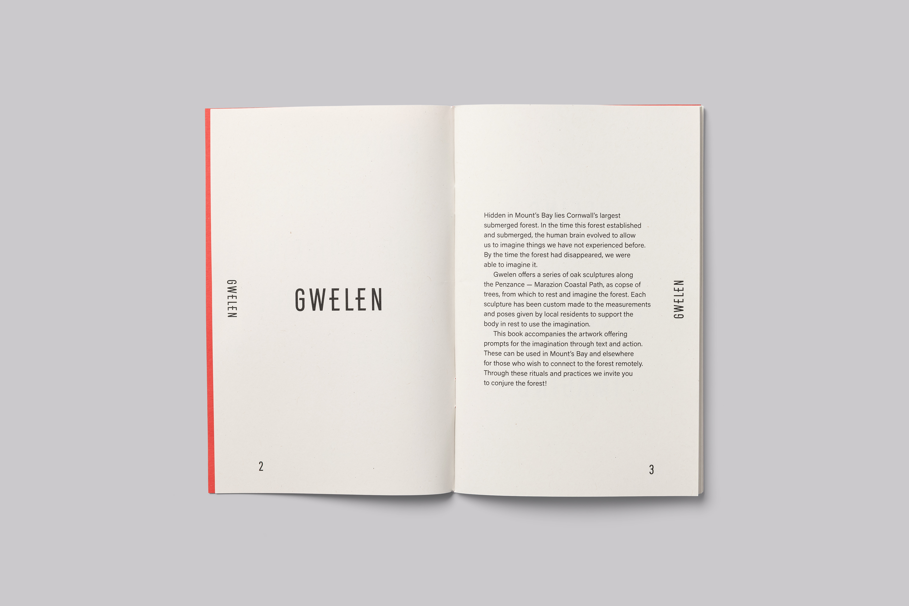
Hidden in Mount’s Bay lies Cornwall’s largest submerged forest. In the time frame this forest established and submerged, the human brain evolved to allow us to imagine things we had not experienced before. By the time the forest had disappeared, we were able to imagine it.
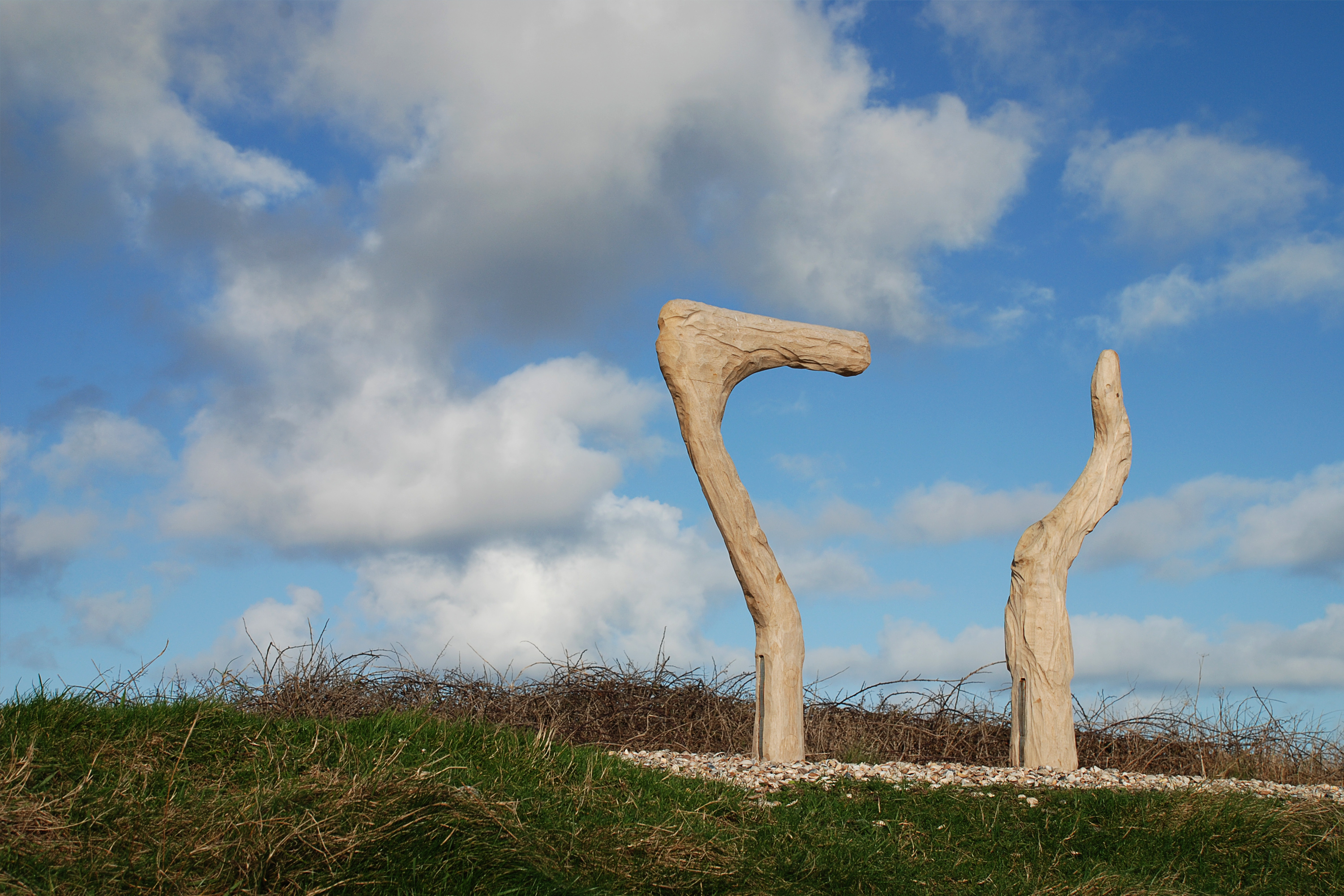
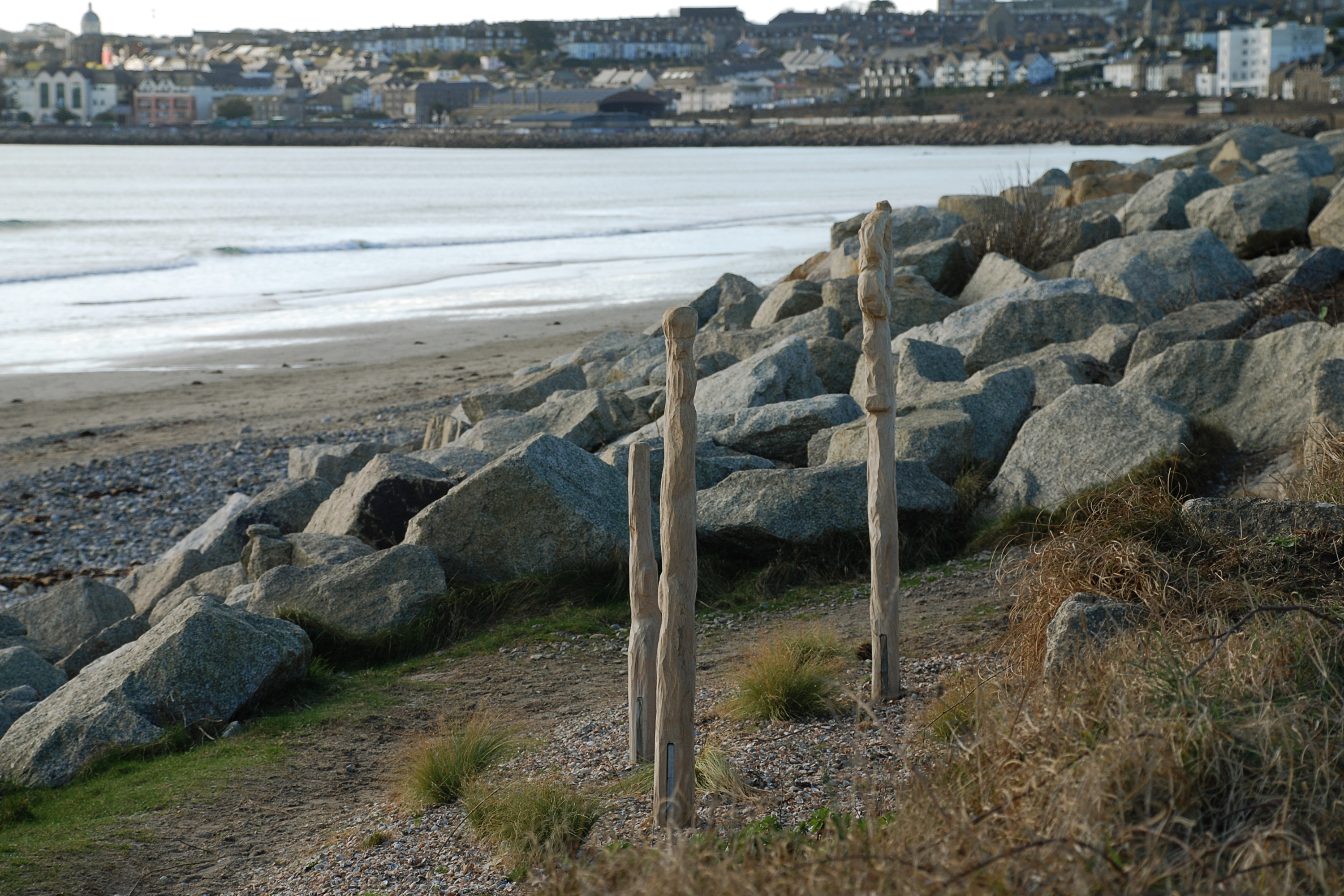
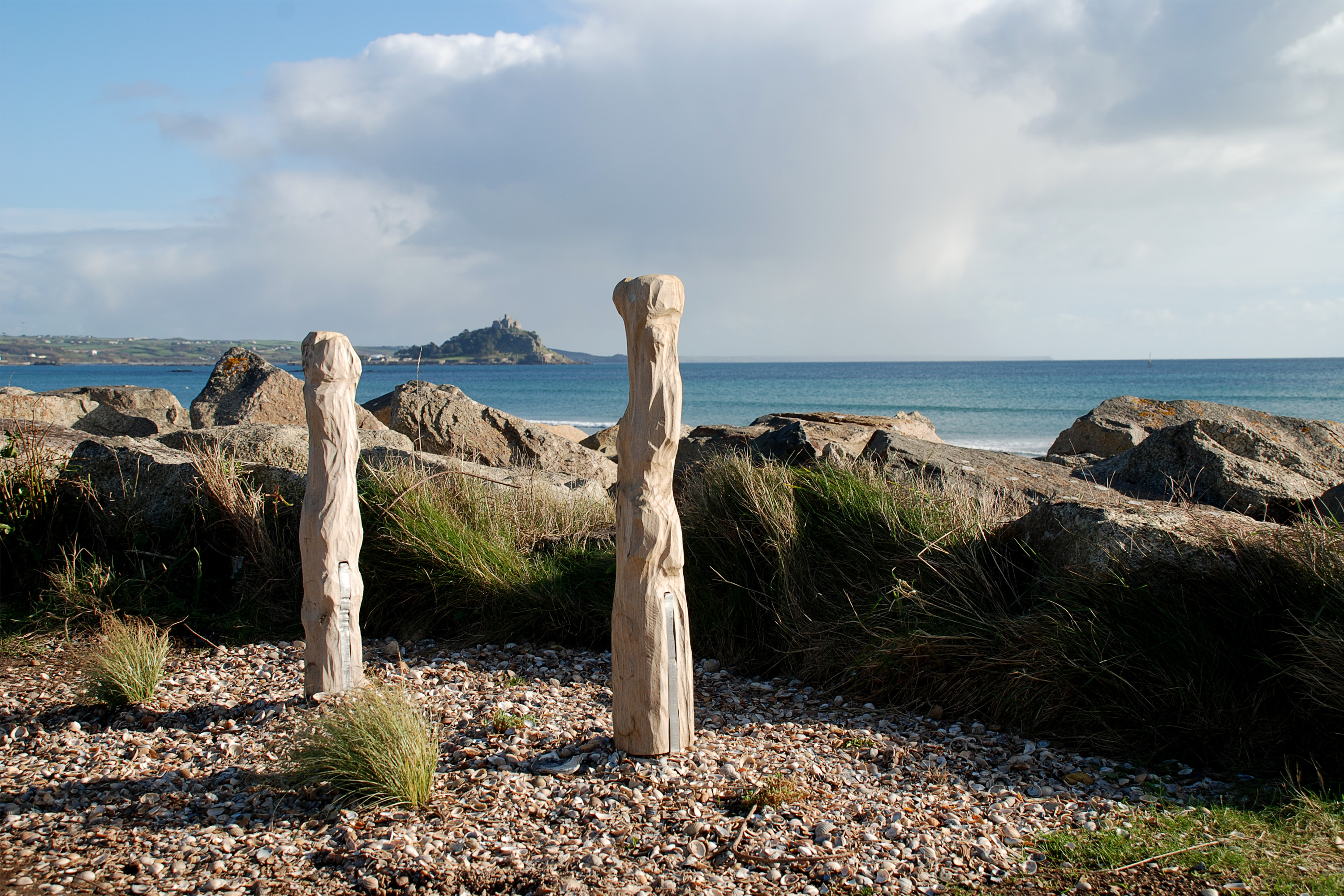
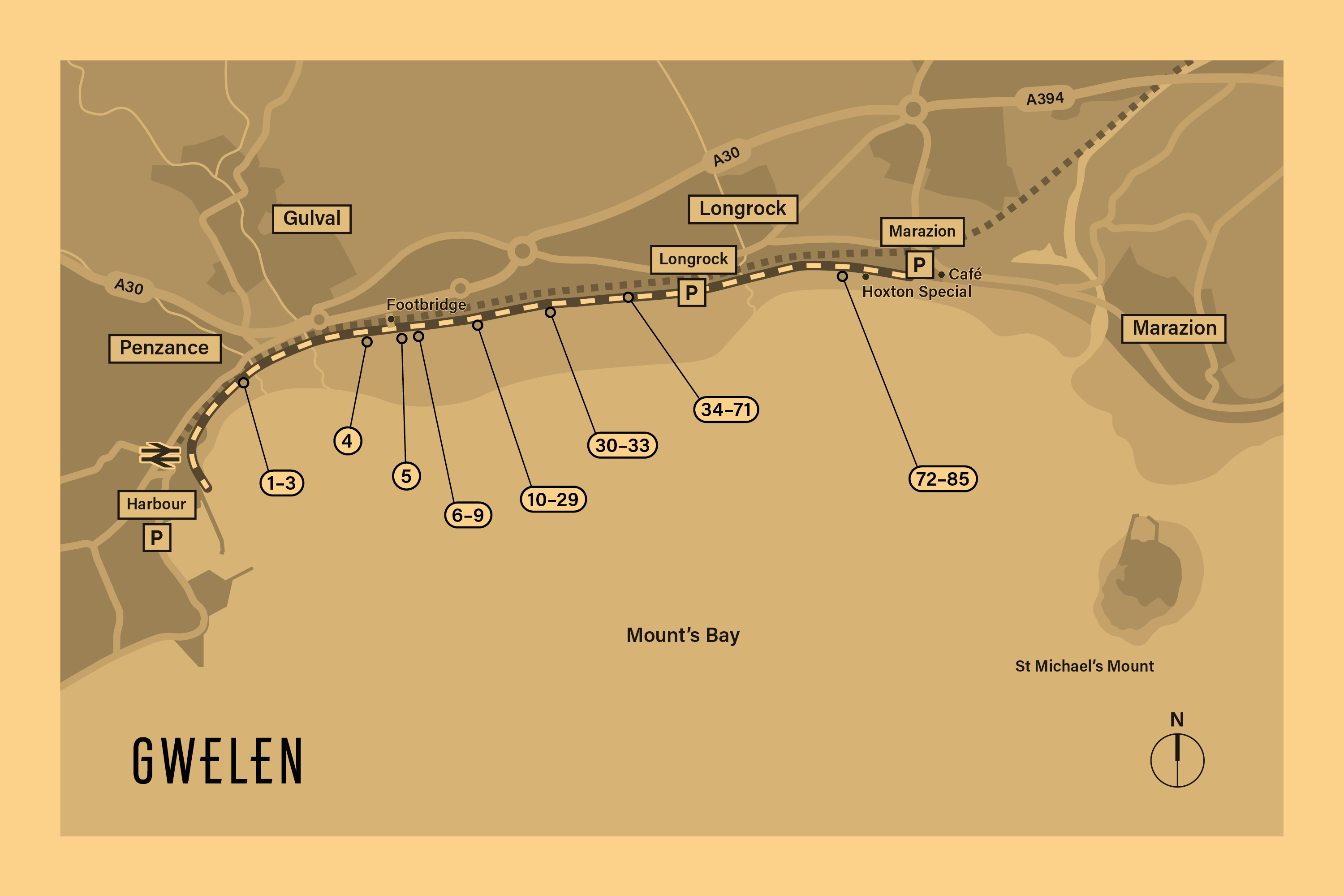
Gwelen offers a series of oak sculptures along the Penzance—Marazion Coastal Path, as copse of trees, from which to rest and imagine the forest. Each sculpture has been custom made to the measurements and poses given by local residents to support the body in rest to use the imagination. The artwork invites active participation from passers-by to engage in the work and to use the sculptures to reflect upon the bay and conjure the forest through imagination.
Icon Set Design
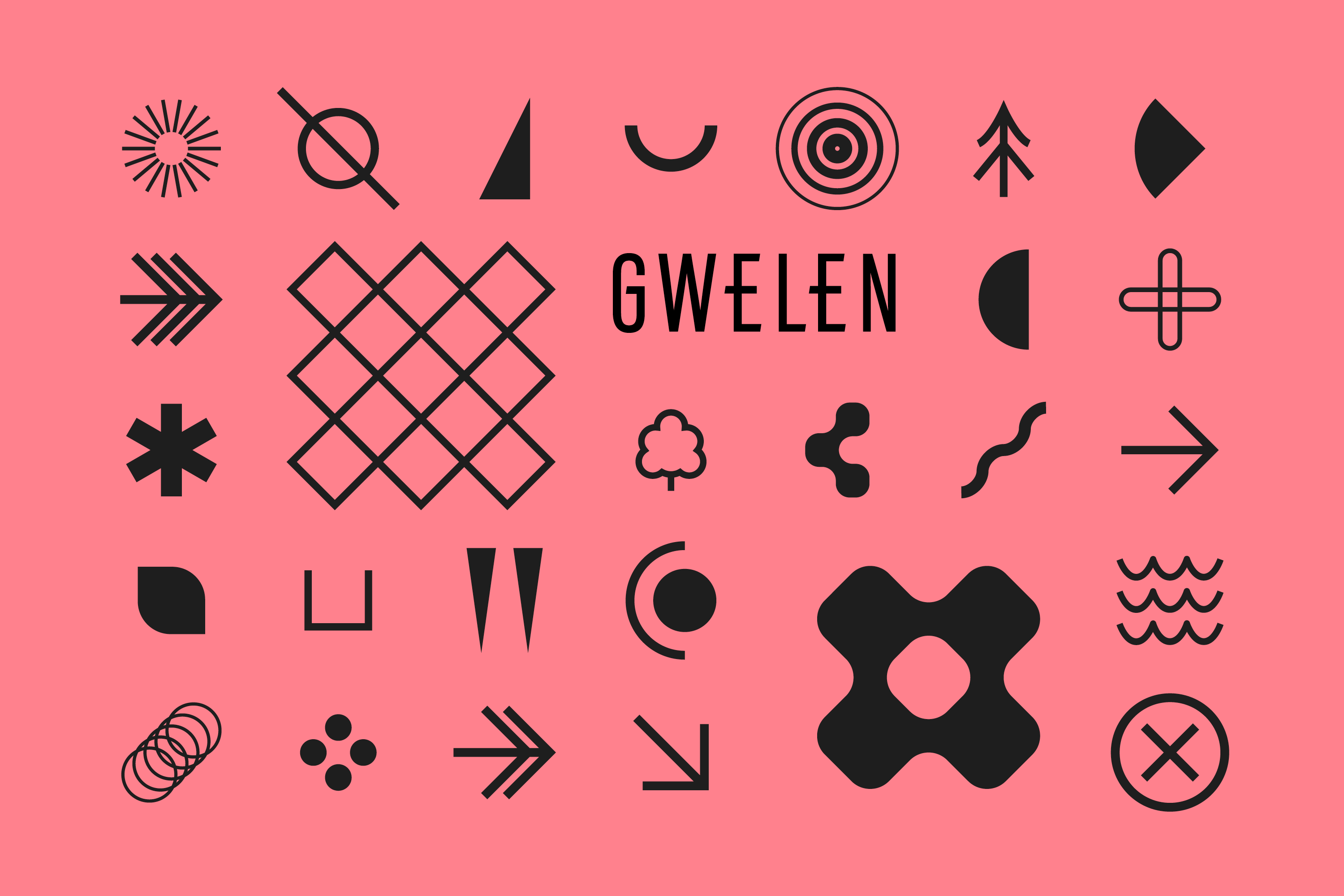
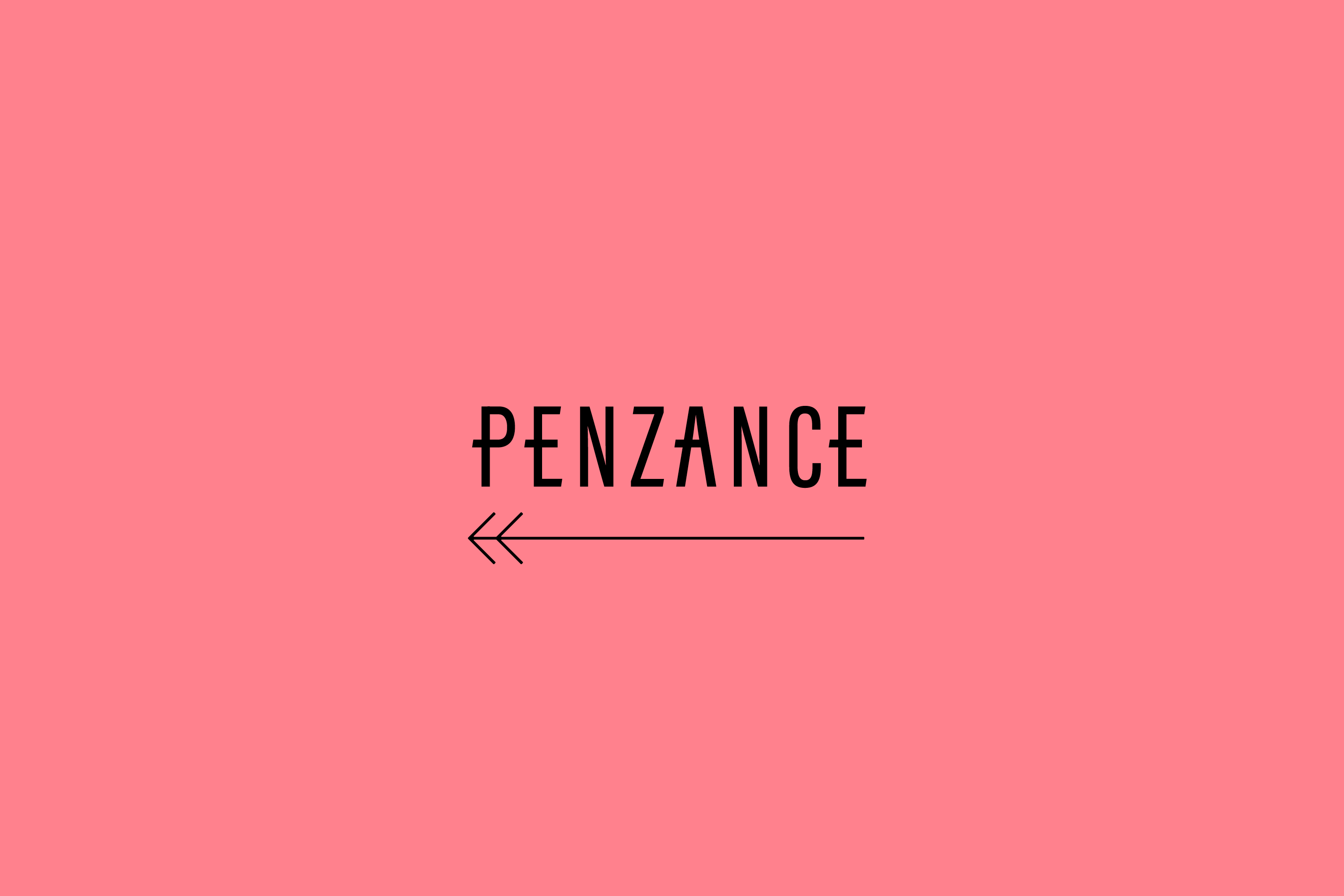
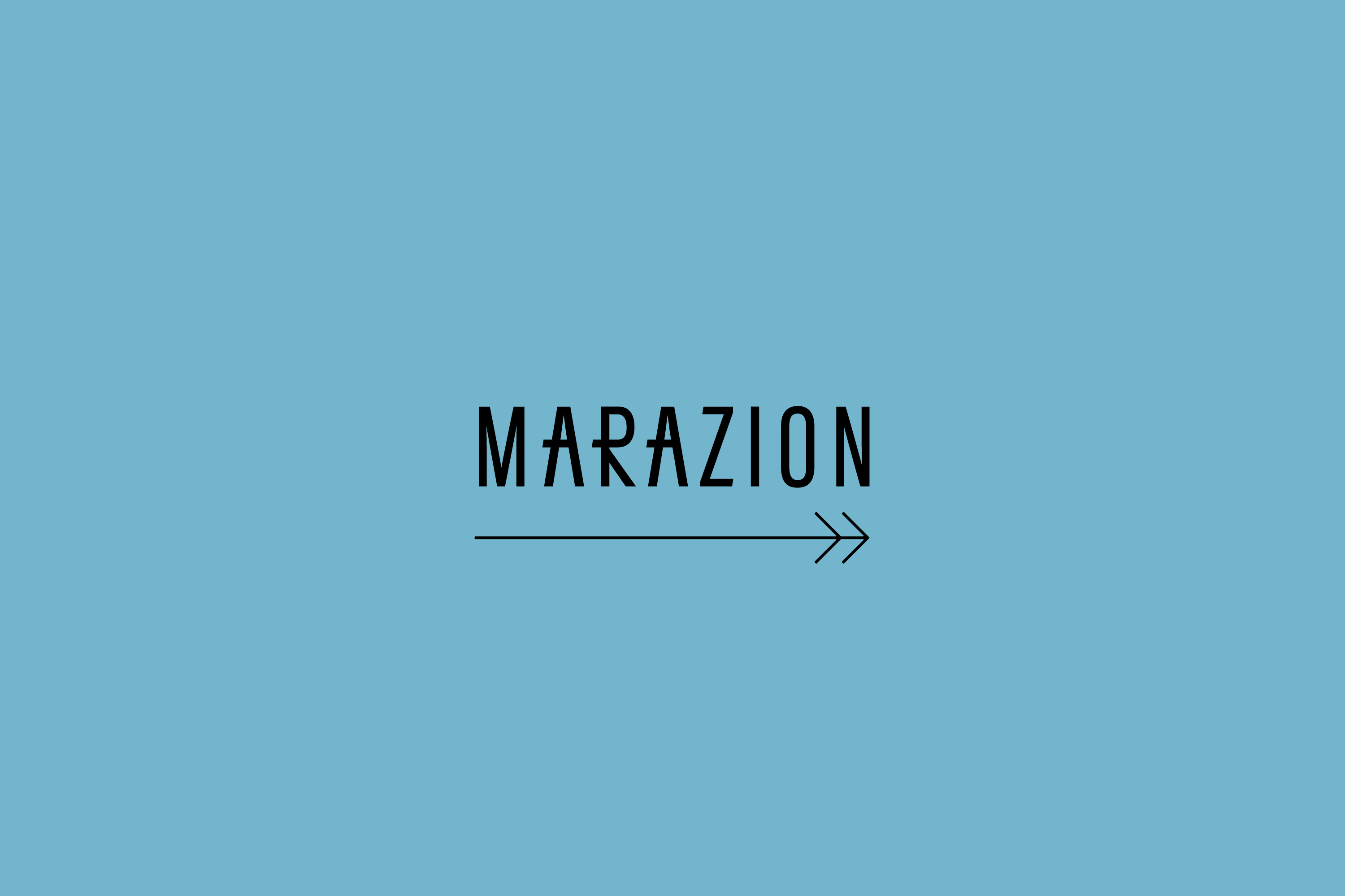
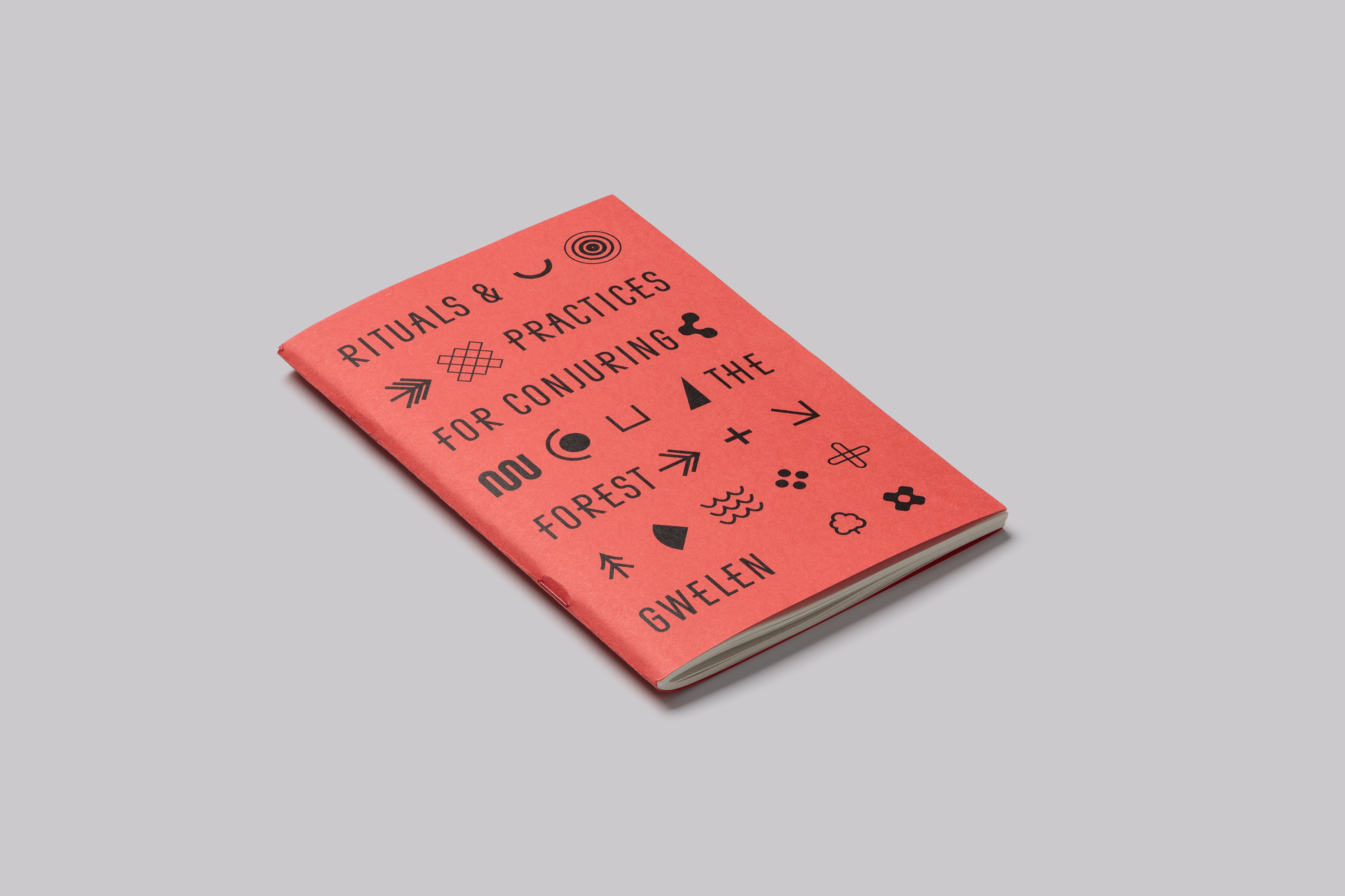
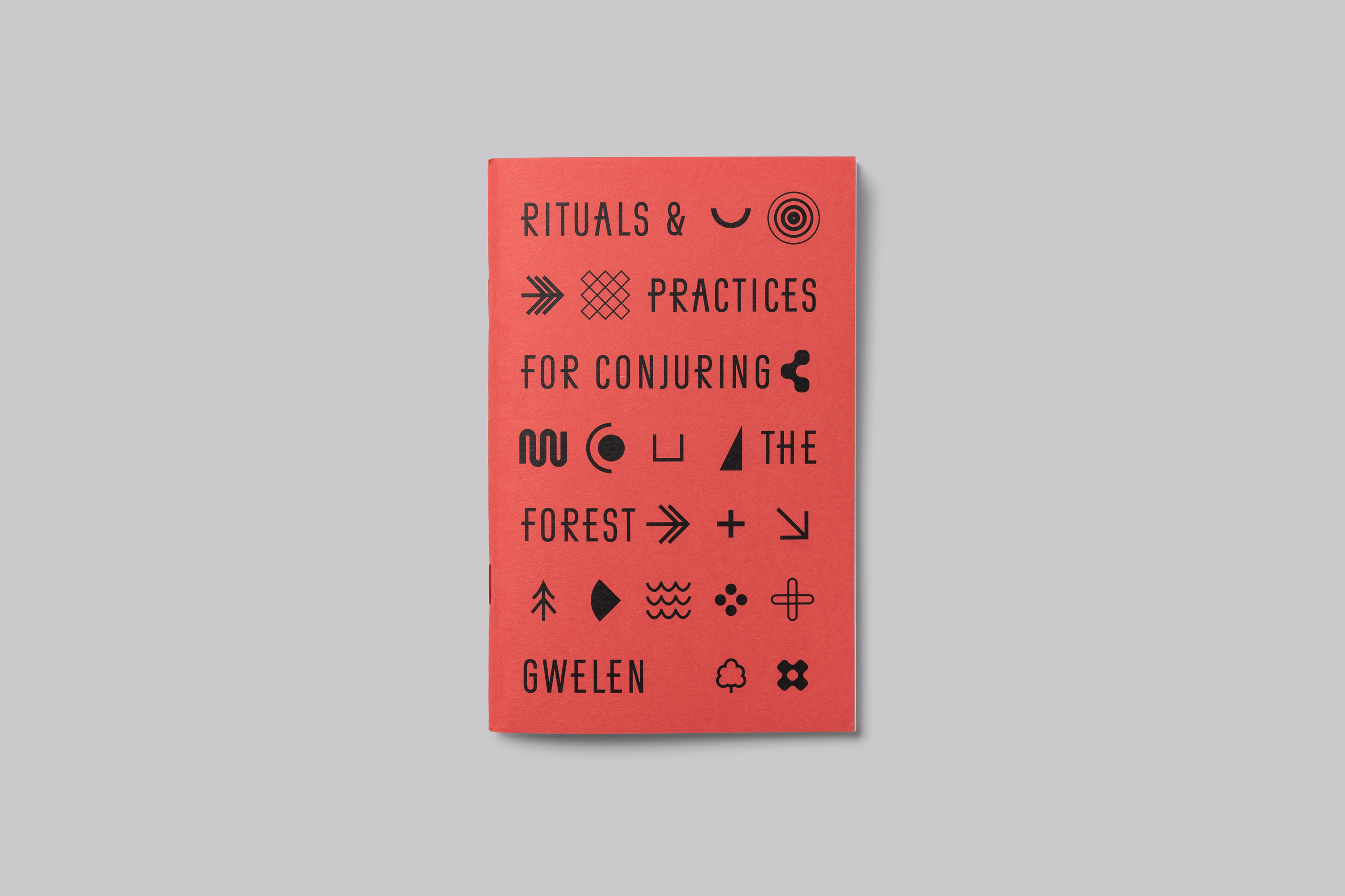
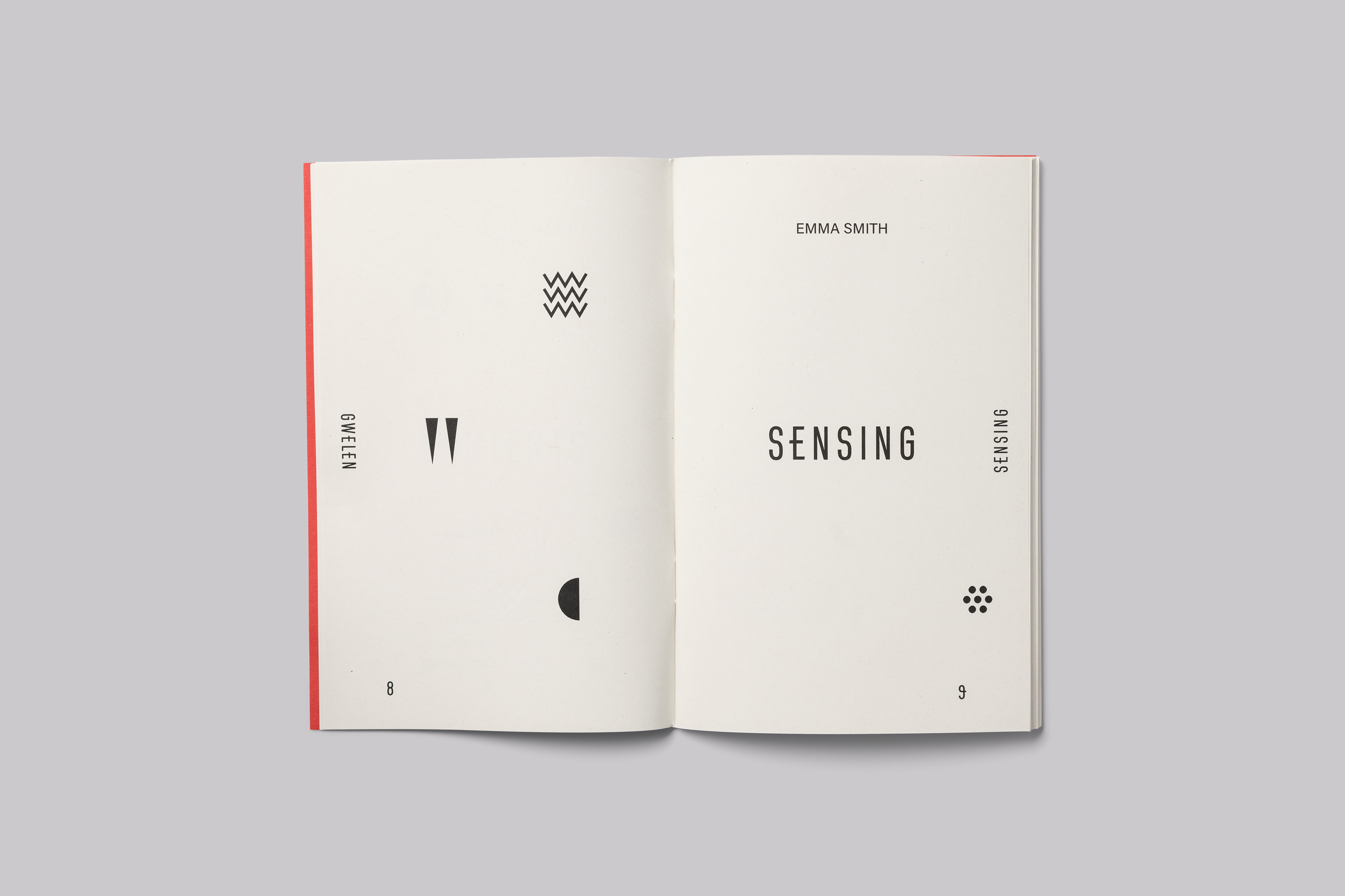
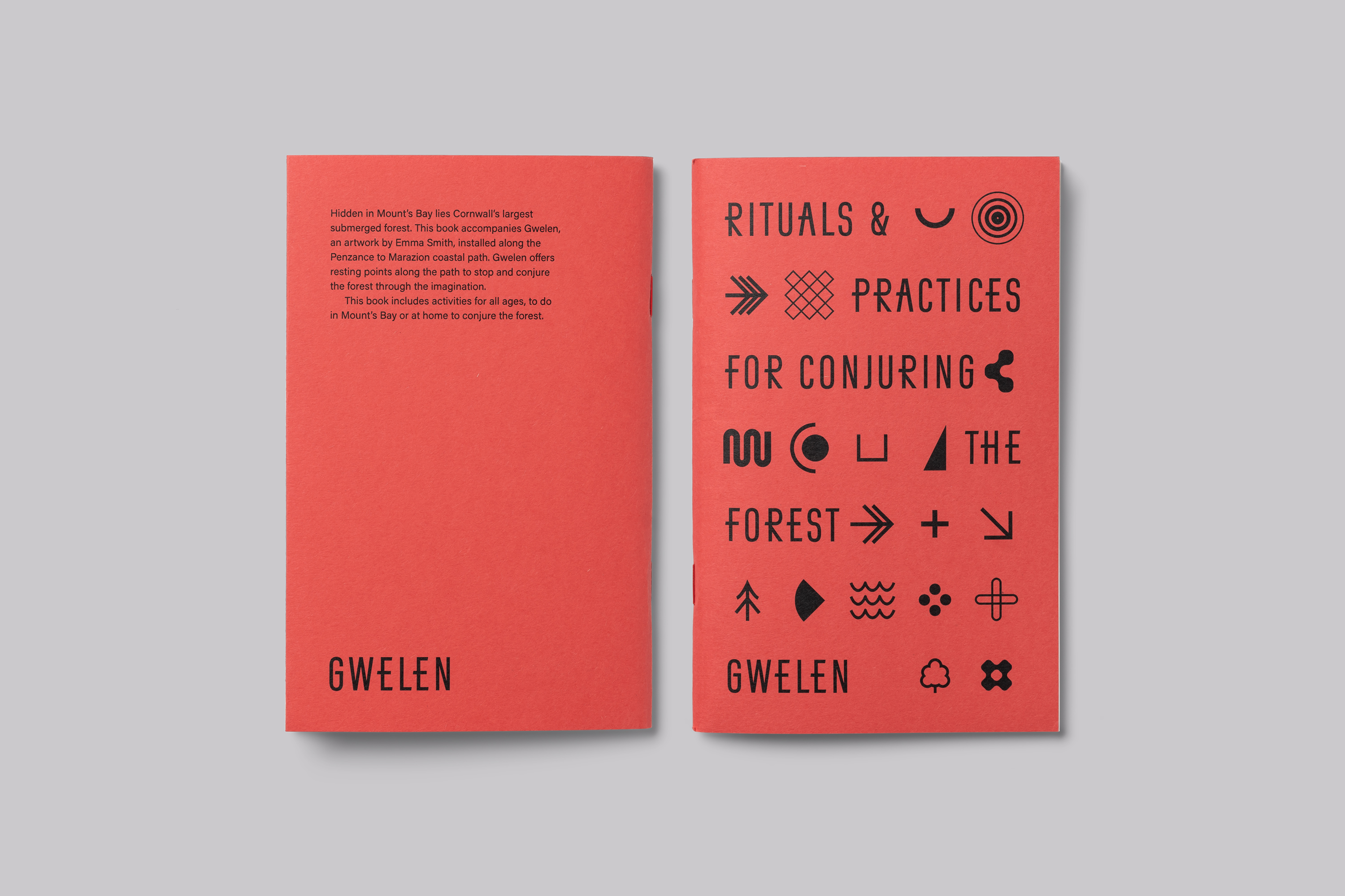
A key feature of the visual identity is an icon set that has been developed taking reference from maps, navigation, tracking and orienteering—to act as a language that communicates aspects of imagined notions that relate to the conjuring of the submerged forest.



Emma Smith, Artist

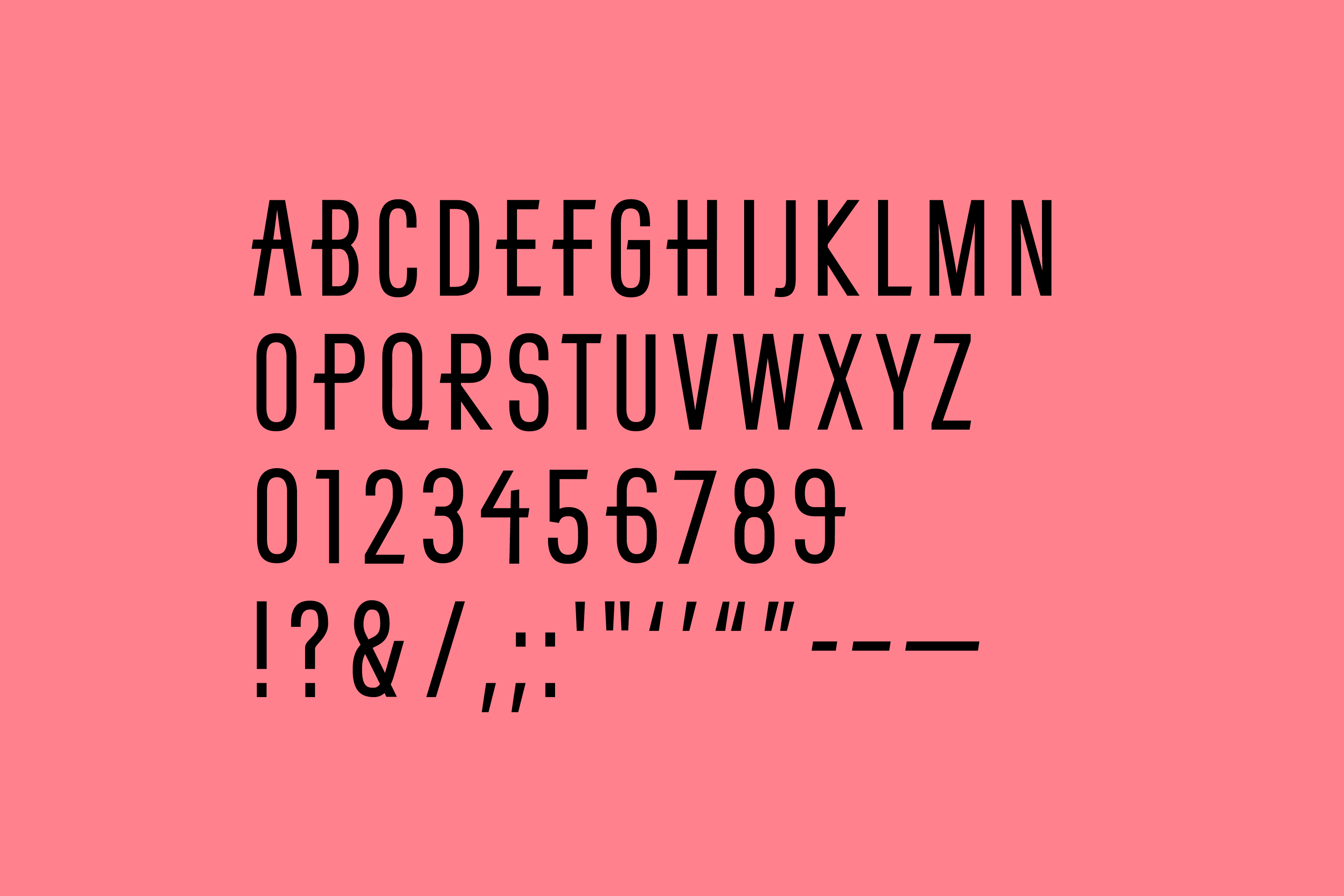
Custom Type Design
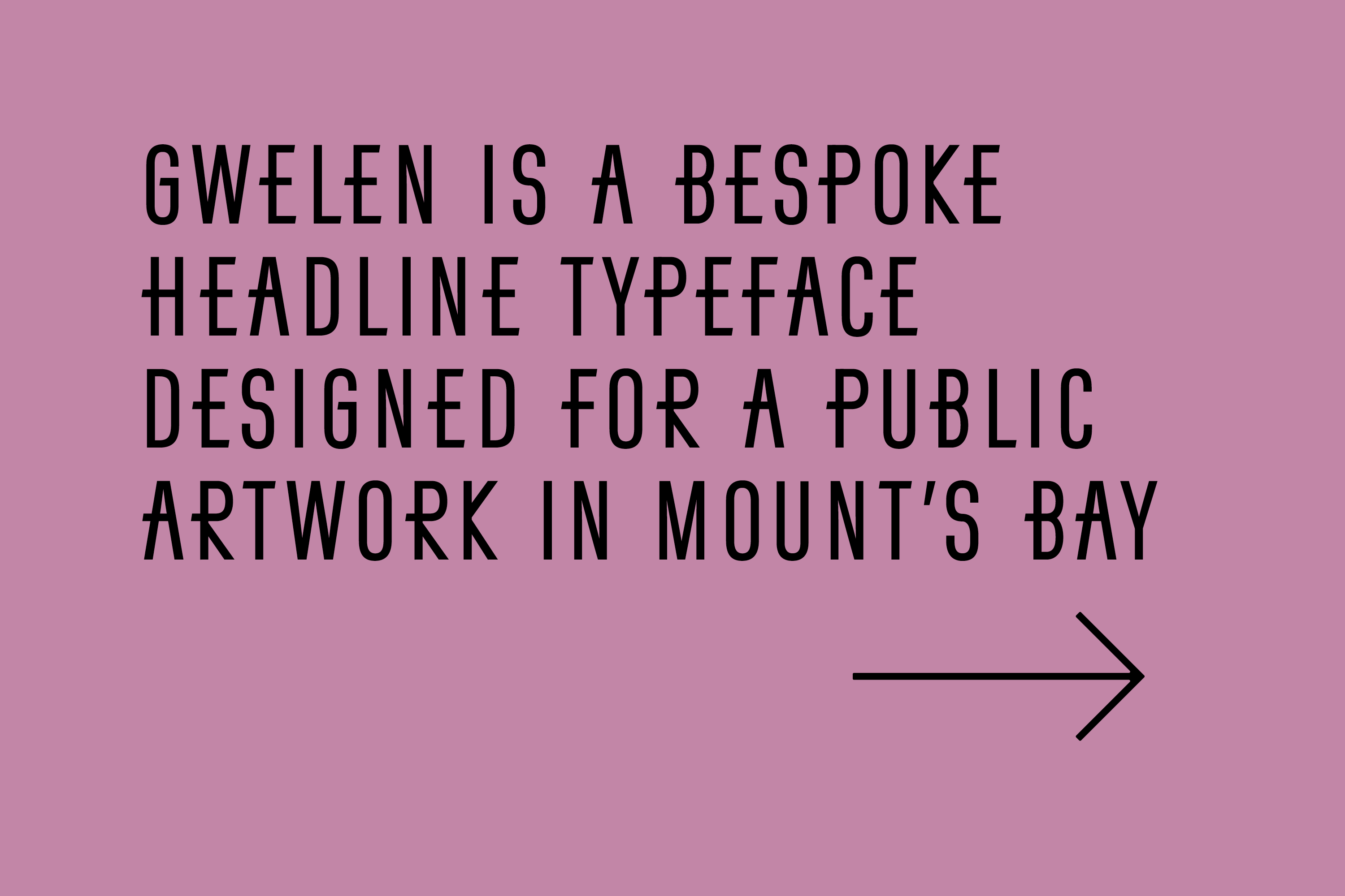
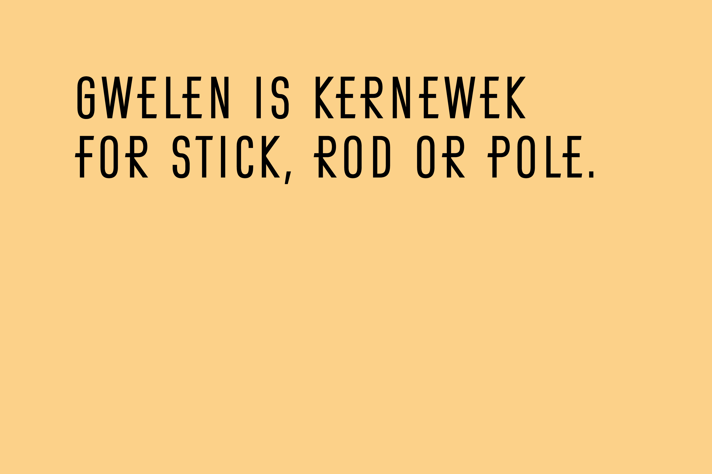
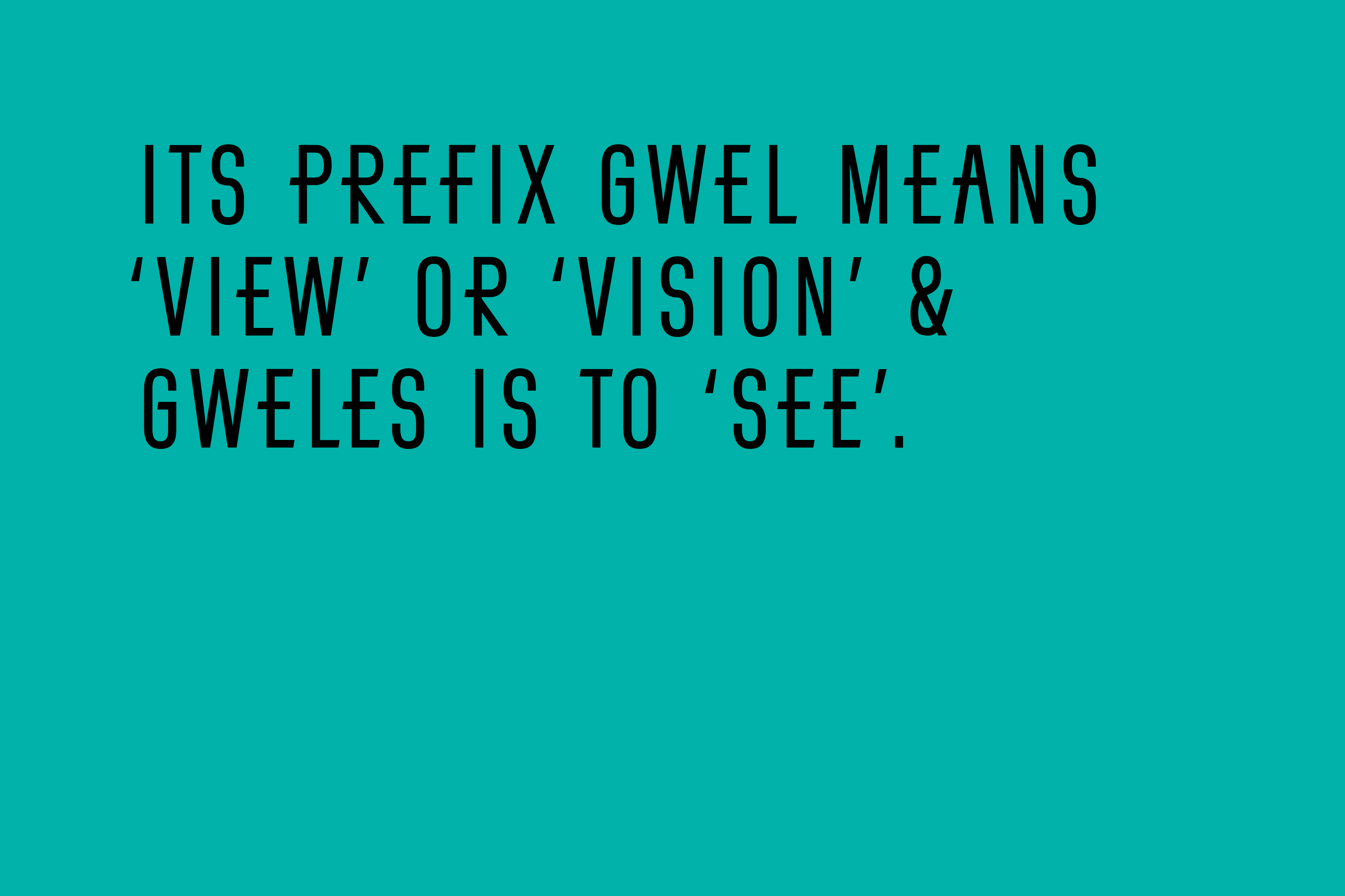
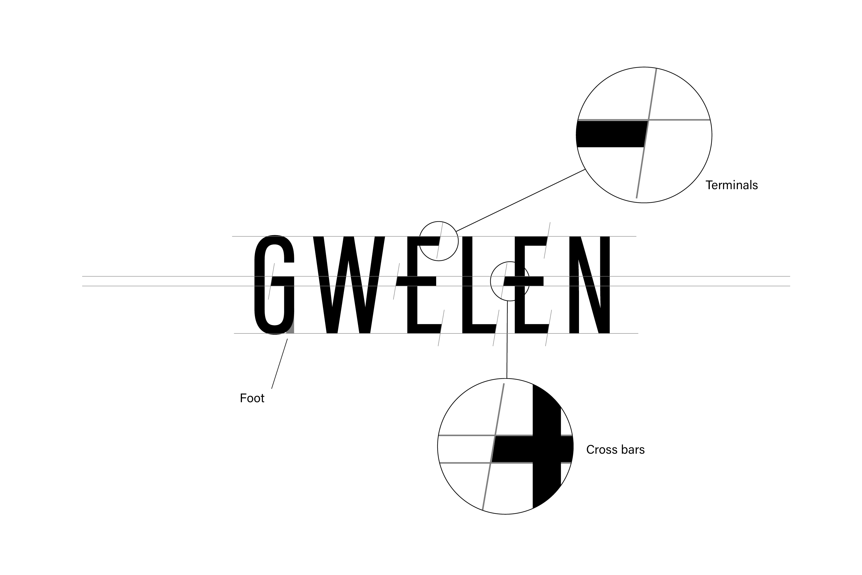
To support the icon set, Gwelen, a bespoke headline typeface, was designed for the project. A feature of the design is the enhanced sense of a middle line throughout the set, evocative of the horizon, tide line or a horizontal measure—a subtle reference to themes of the public artwork around rising oceans and the climate crisis.
Word Marque
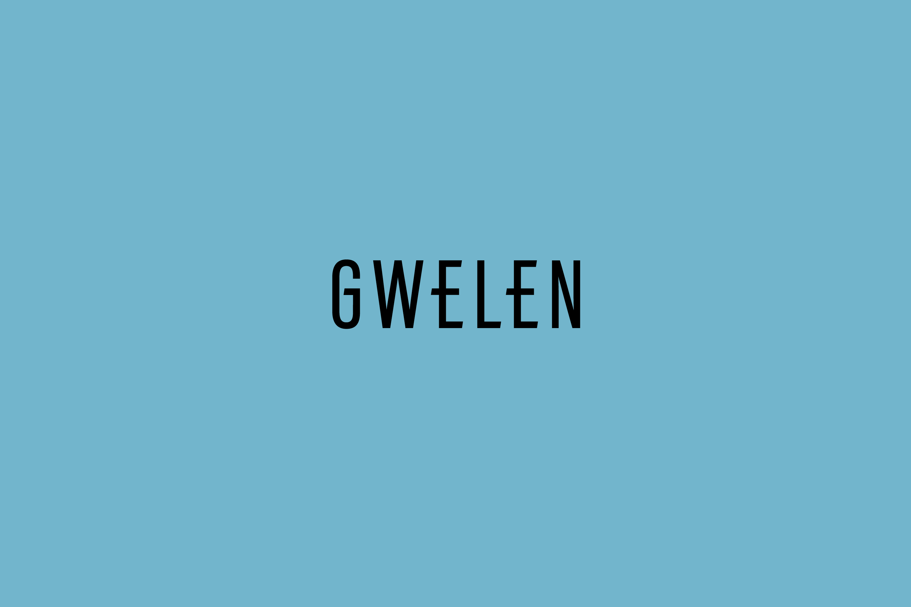
At the heart of the visual identity for Gwelen is a custom word marque. To enhance a sense of a middle line, evocative of the horizon, tide line or a horizontal measure, the cross bars of the ‘E’s have been elongated and matched with the ‘G’.
Visual Identity Framework
The visual identity is based on a framework of these elements to create communications and applications that creatively intrigue and engage audiences with a dynamic visual language.
The framework allows for a flexible and responsive approach to materials and applications whilst maintaining coherent messaging.

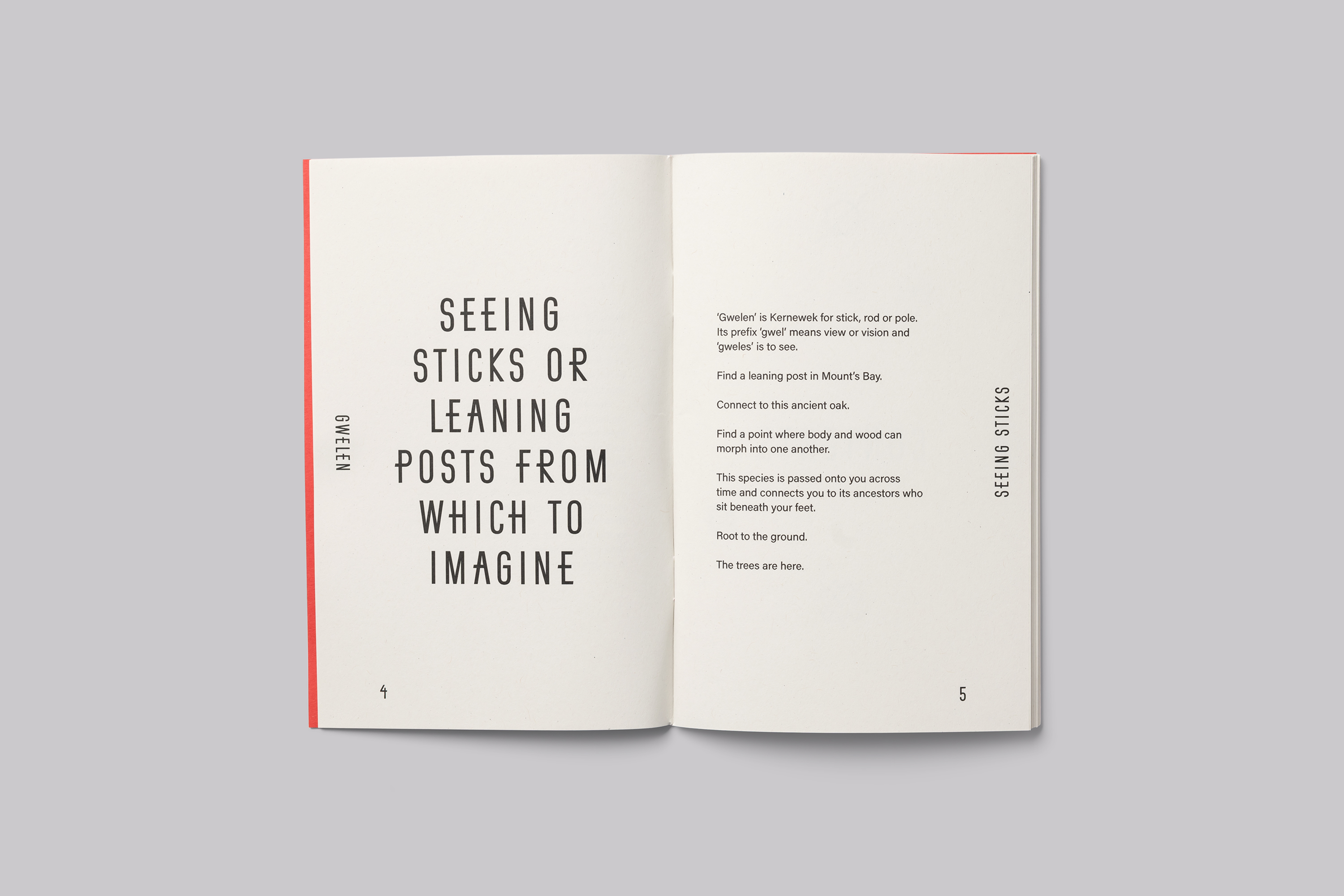
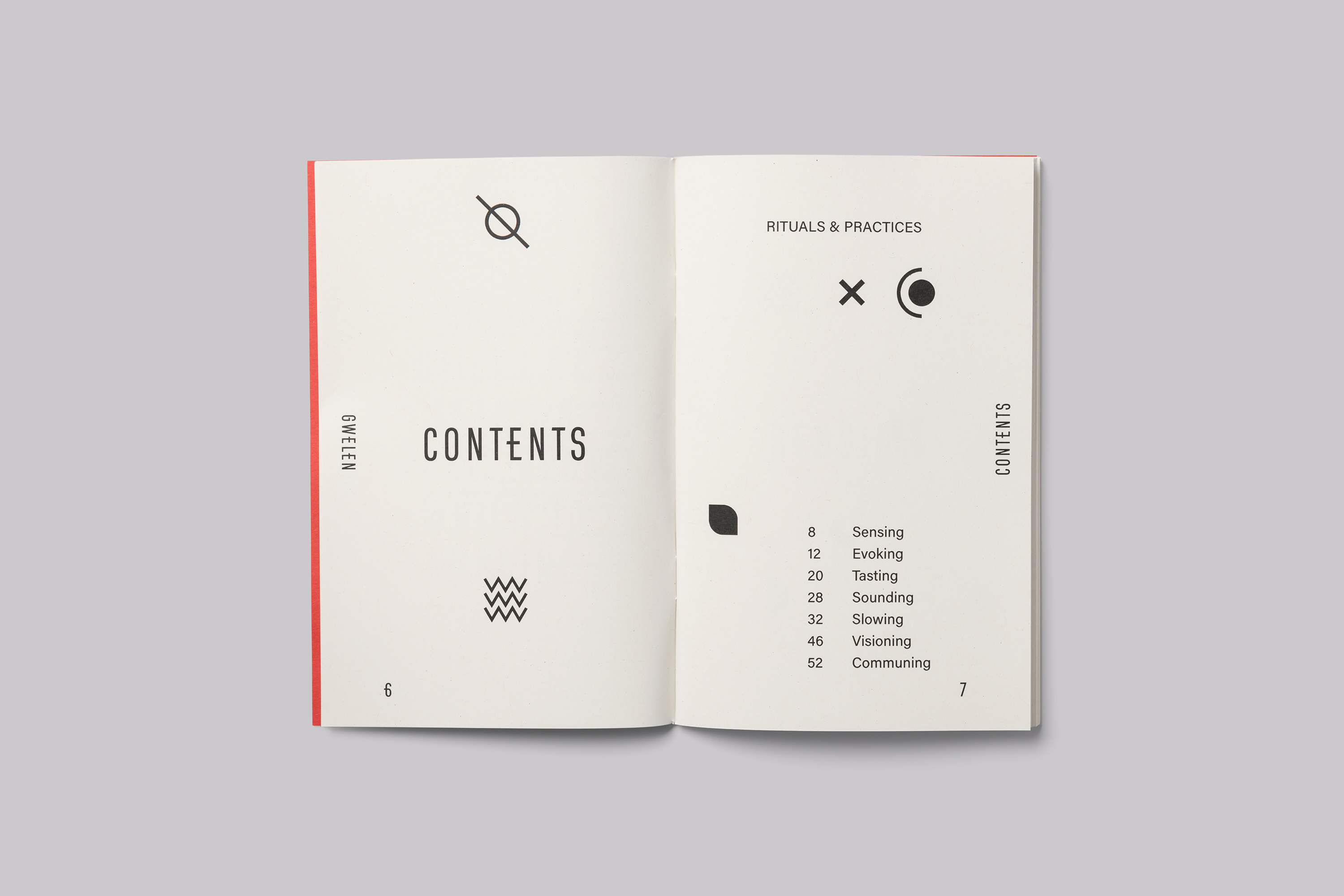
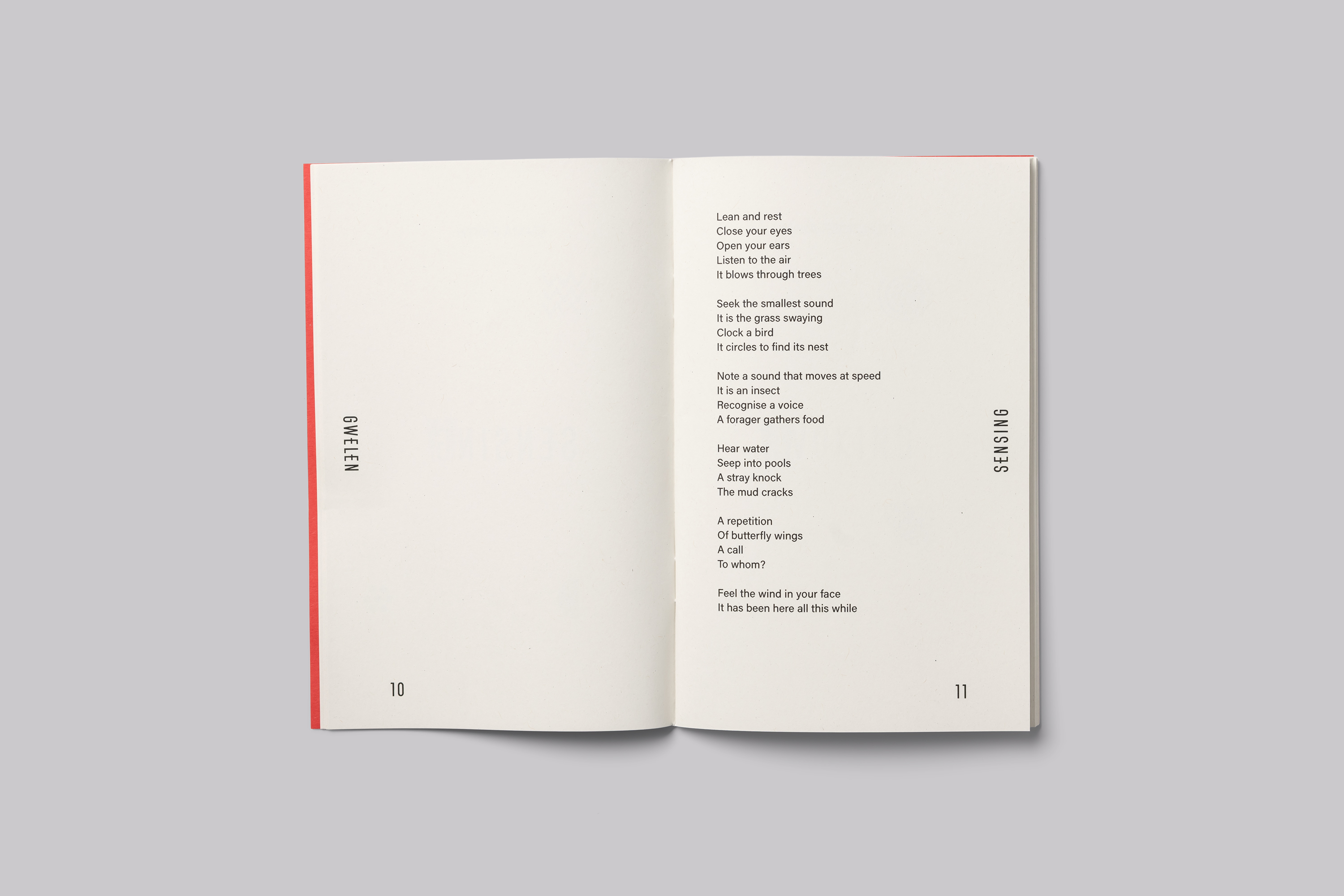
Publication Design
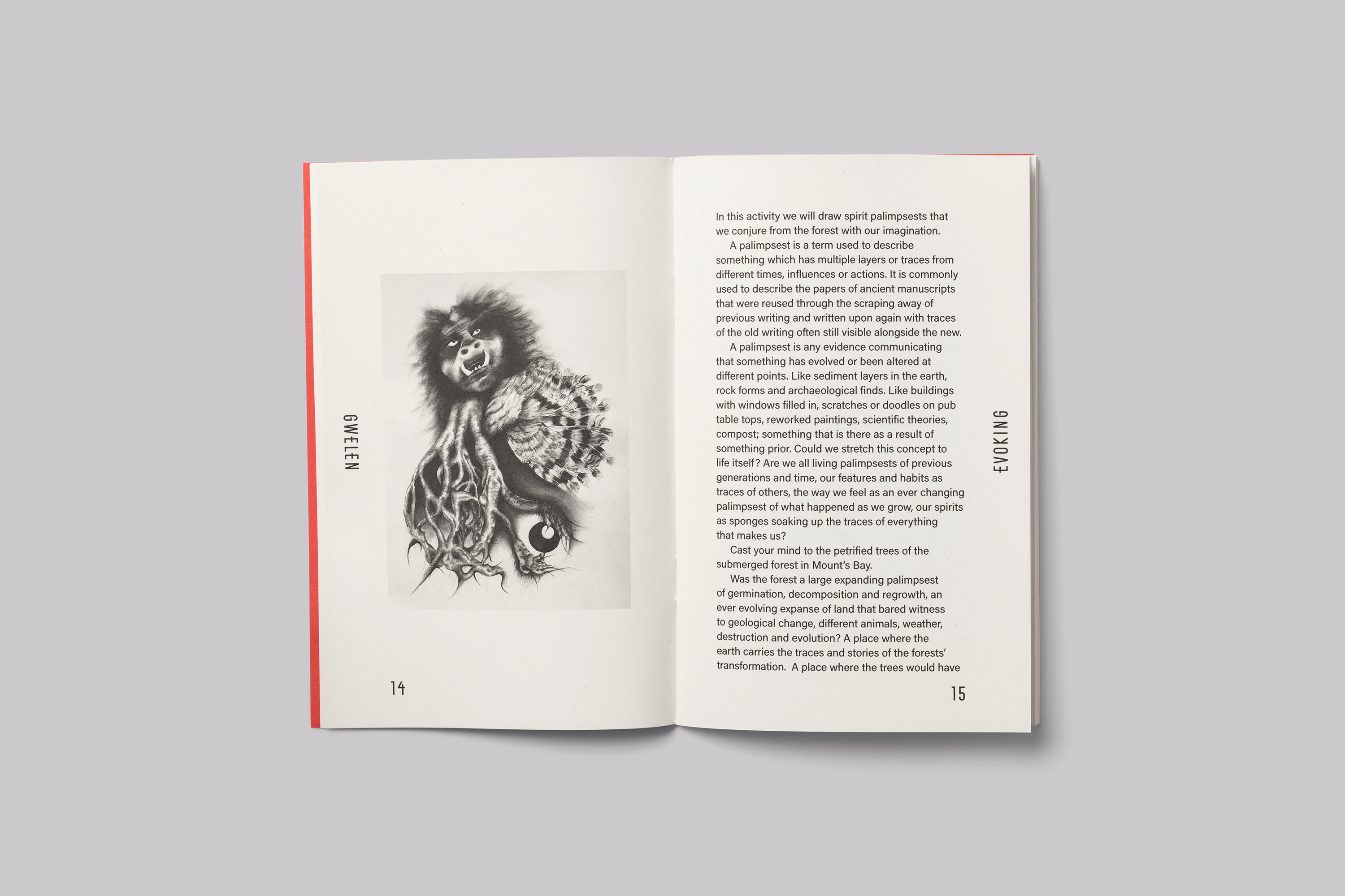
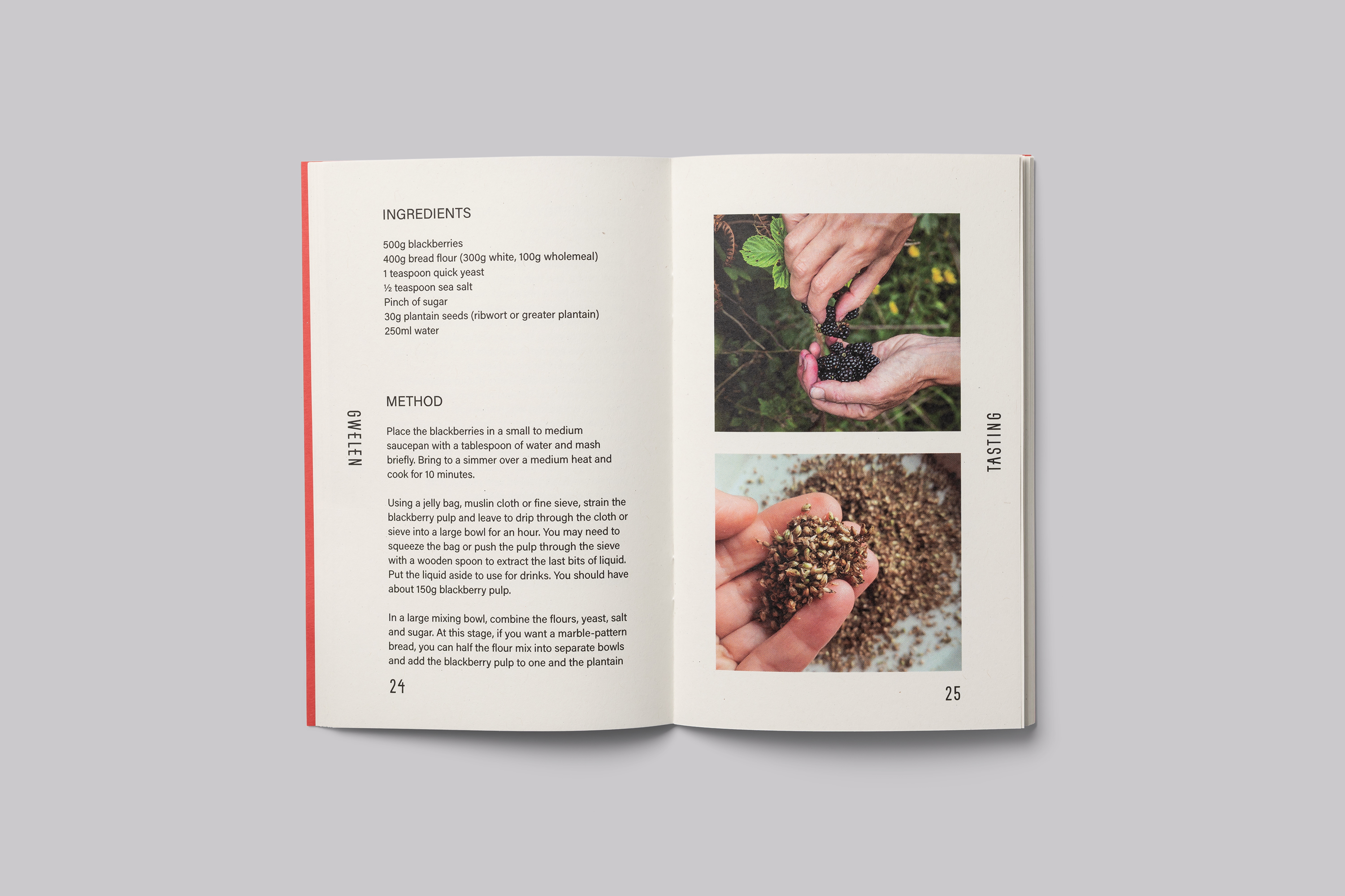
It was important for the project that the publication be produced with the minimum environmental footprint.
The publication was designed using 100% renewable energy and printed by Pureprint a CarbonNeutral® company, certified by the World Land Trust, based in the UK. Pureprint are an ISO 14001 and Forest Stewardship Council (FSC®) certified printer.
Consideration was given to the amount of ink used and only 16 pages are printed in 4-colour. The rest is printed in black only to reduce the extent of the materials used to produce the publication.
The cover is printed on Extract from G.F Smith, FSC® paper made from used disposable paper cups that would otherwise have been destined for landfill. And the text is printed on Cyclus Offset made from 100% FSC® de-inked post consumer waste paper which produces less CO₂, diverts waste from landfill and consumes much less water and energy.
Credits
Gwelen was commissioned by Cornwall Council via the EXPERIENCE project, which promotes experiential tourism and sustainable economic growth during October—March. Cornwall’s funding supports sustainable cultural tourism activities, connecting residents and visitors with the distinct historical, geographical and cultural assets of the local area and aims to leave a positive impact for the community and visitors alike. The project is co-funded by the European Regional Development Fund (ERDF) through the Interreg France (Channel) England Programme under the Natural and Cultural Heritage funding category.
Services
Consultancy
Strategic Positioning
Brand Identity Design
Custom Typeface Design
Integrated Campaign
Printed & Digital Communications
Print Management
Project Management
Related Projects