

Brand identity design for Art Centre Penryn, a major new creative space for Cornwall.
Brand Identity Design
Strategy & Positioning
Printed & Digital Communications
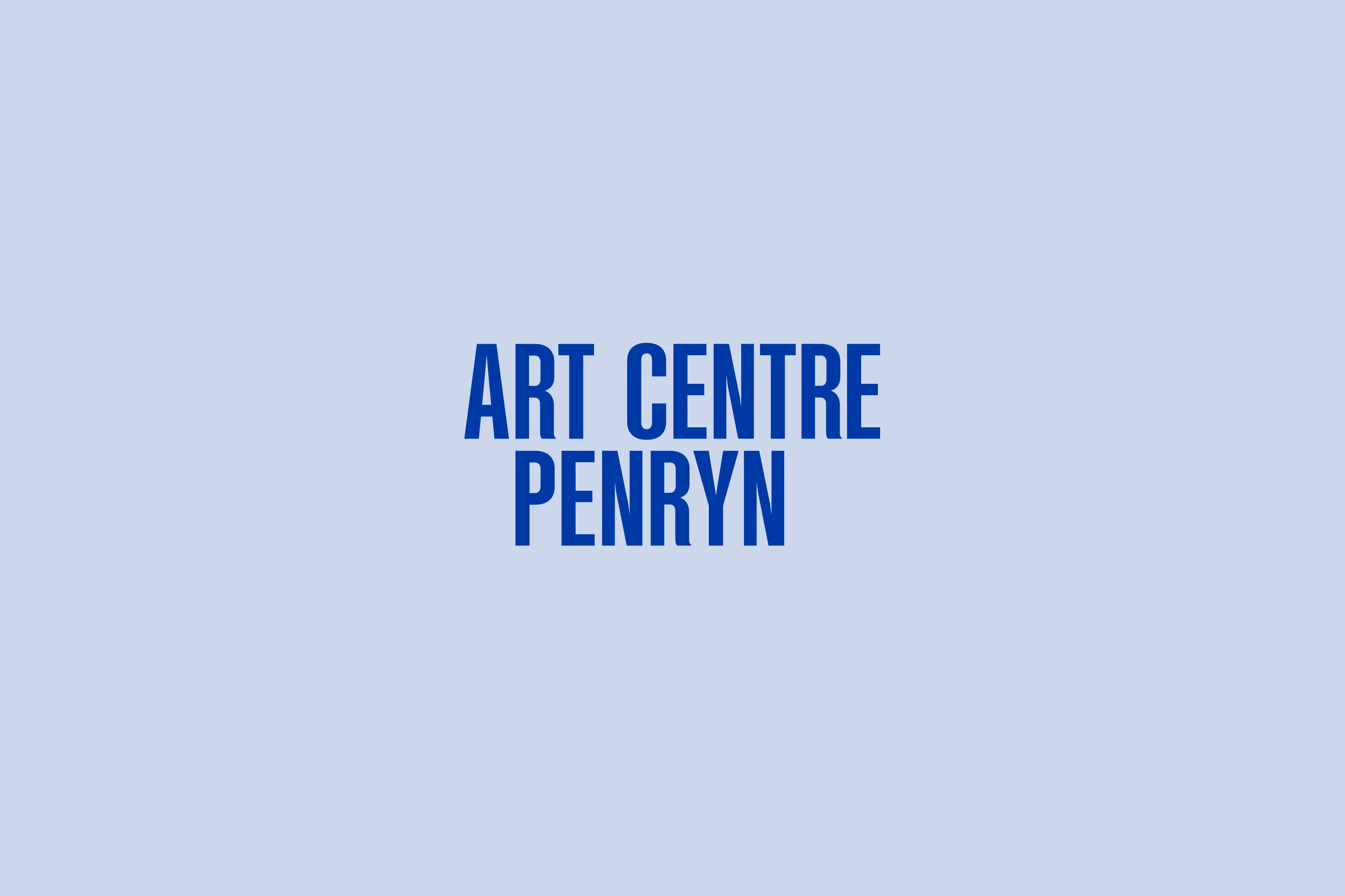
Two has designed the brand identity for Art Centre Penryn reflecting its core purpose, to connect people through art, and to establish this major new creative space for Cornwall.
Background
Art Centre Penryn is a major new creative space for Cornwall. It supports artists, engages communities, programmes contemporary art exhibitions, runs creative activities, delivers learning opportunities and provides artist studio facilities.
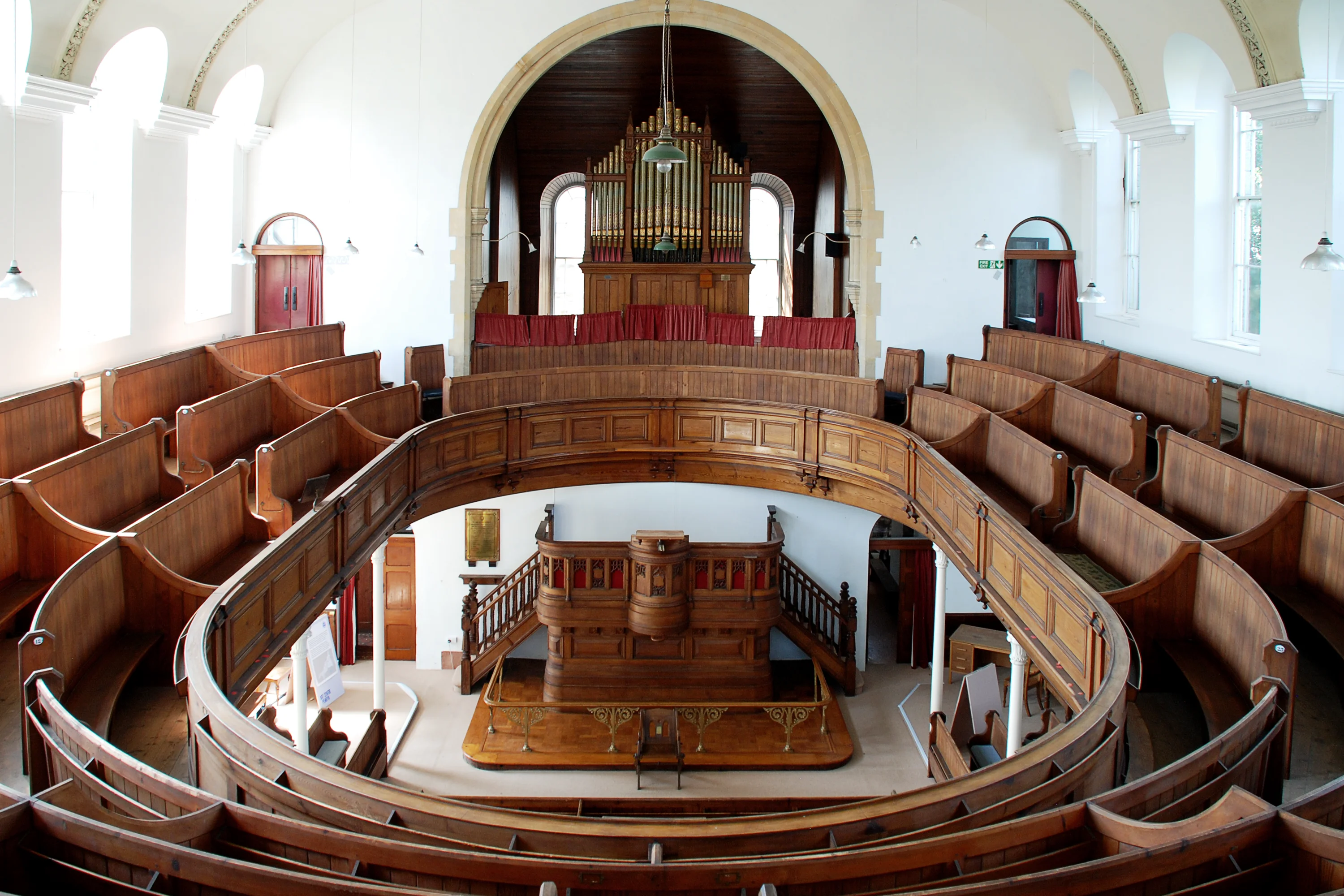
The Centre is run by GW Arts CIC, the people behind Grays Wharf, the contemporary art space based on Commercial Road in Penryn. Moving to the former Penryn Methodist Church and School Room, in the centre of Penryn, we were asked to help the organisation establish the new venture with a new name and brand identity design.
Megan Beck, Director,
Art Centre Penryn:
Design Creative
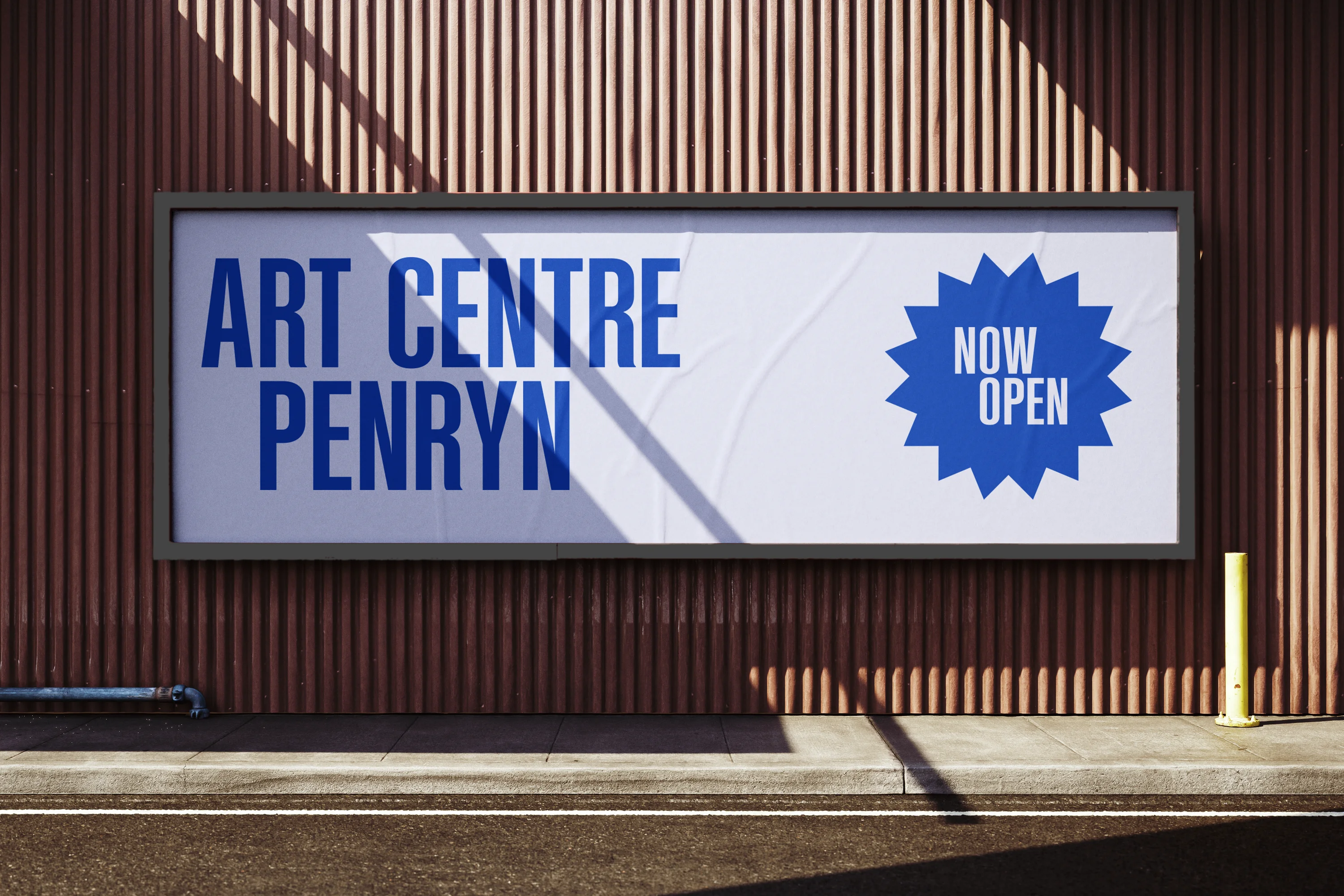
The strategic idea for the name leads with ‘Art Centre’, as the focus of the organisation and its activities, and to underpin this with ‘Penryn’, the place where the organisation, and the Art Centre, reside. The aim is to avoid an inherent expectation that ‘Penryn’ owns the ‘Art Centre‘, or that its a municipal institution owned by the local authority. Art Centre Penryn is an independent organisation and community interest company that welcomes everyone, and relishes in an open and diverse community.
‘Centre’ not ‘centred’
Orientated around the idea for an Art Centre in Penryn, Two developed the conceptual positioning, of a centre for art, that is progressive, inclusive and de-centered. The organisation is built around its core purpose, to connect people through art. And with its mission, to help improve lives through creativity, Art Centre Penryn’s ambition is to connect people through art: to one another, to culture and community, to nature, to the environment, to the personal, local, national and international, to technology and the opportunities for shared experiences and interdependency.
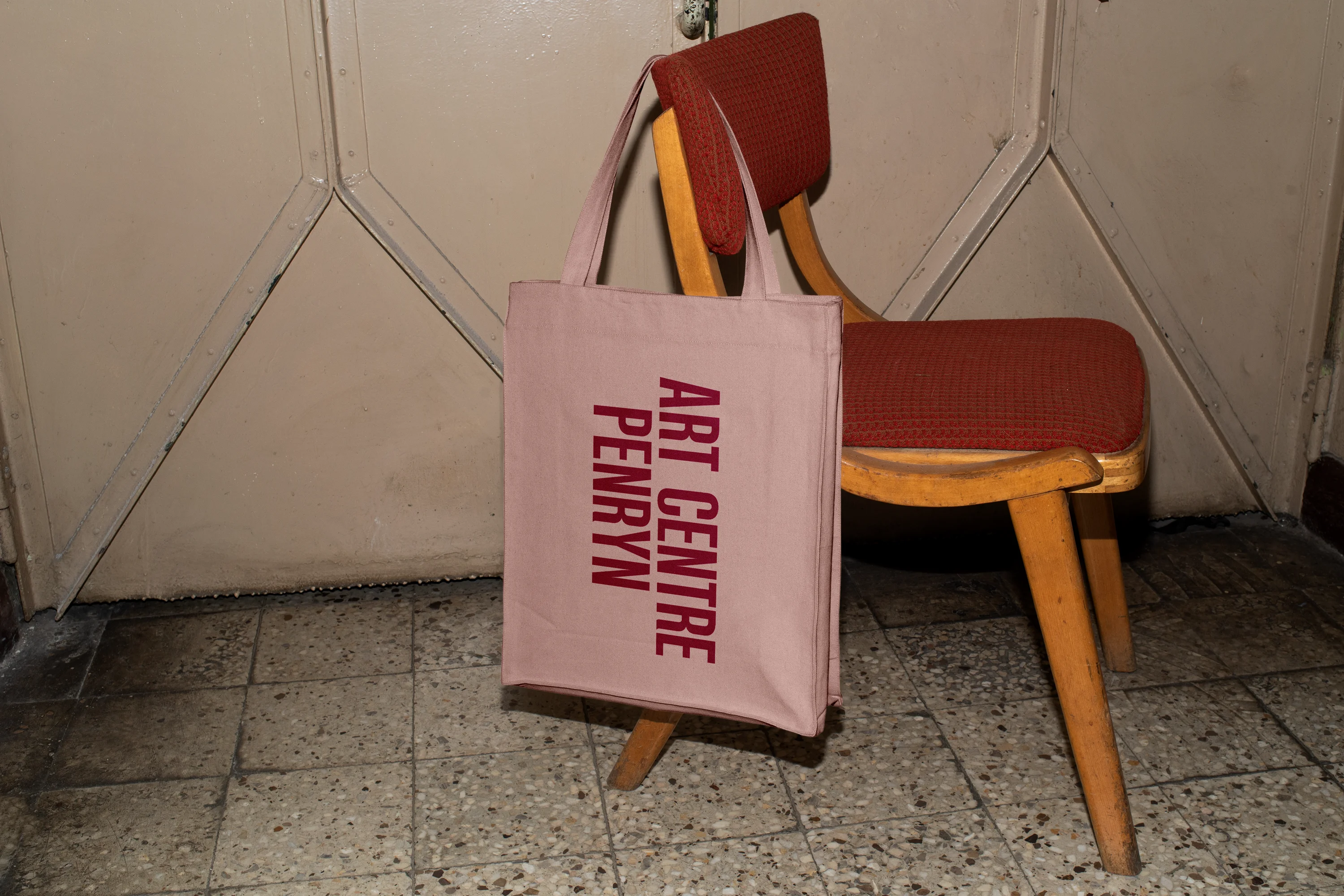
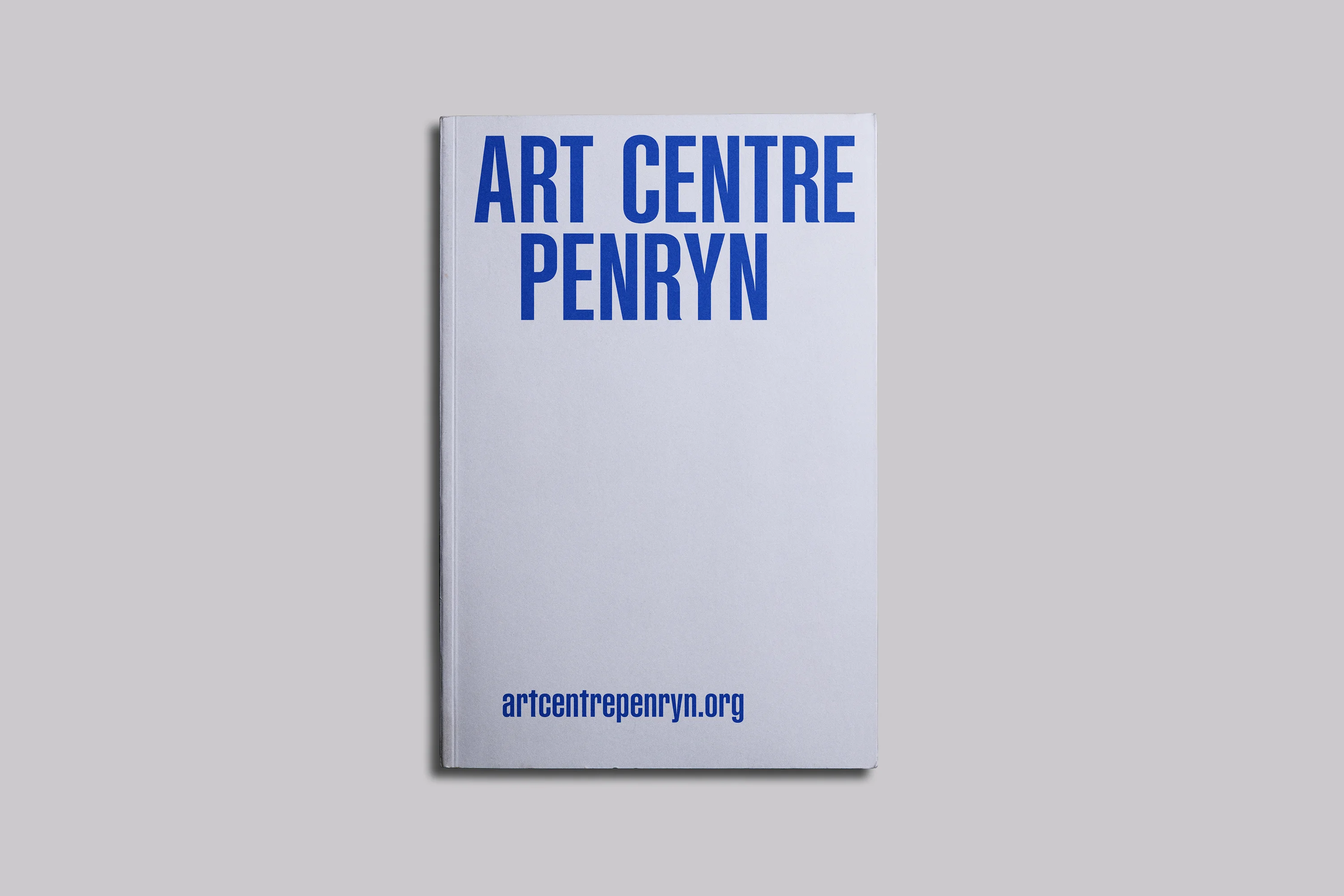
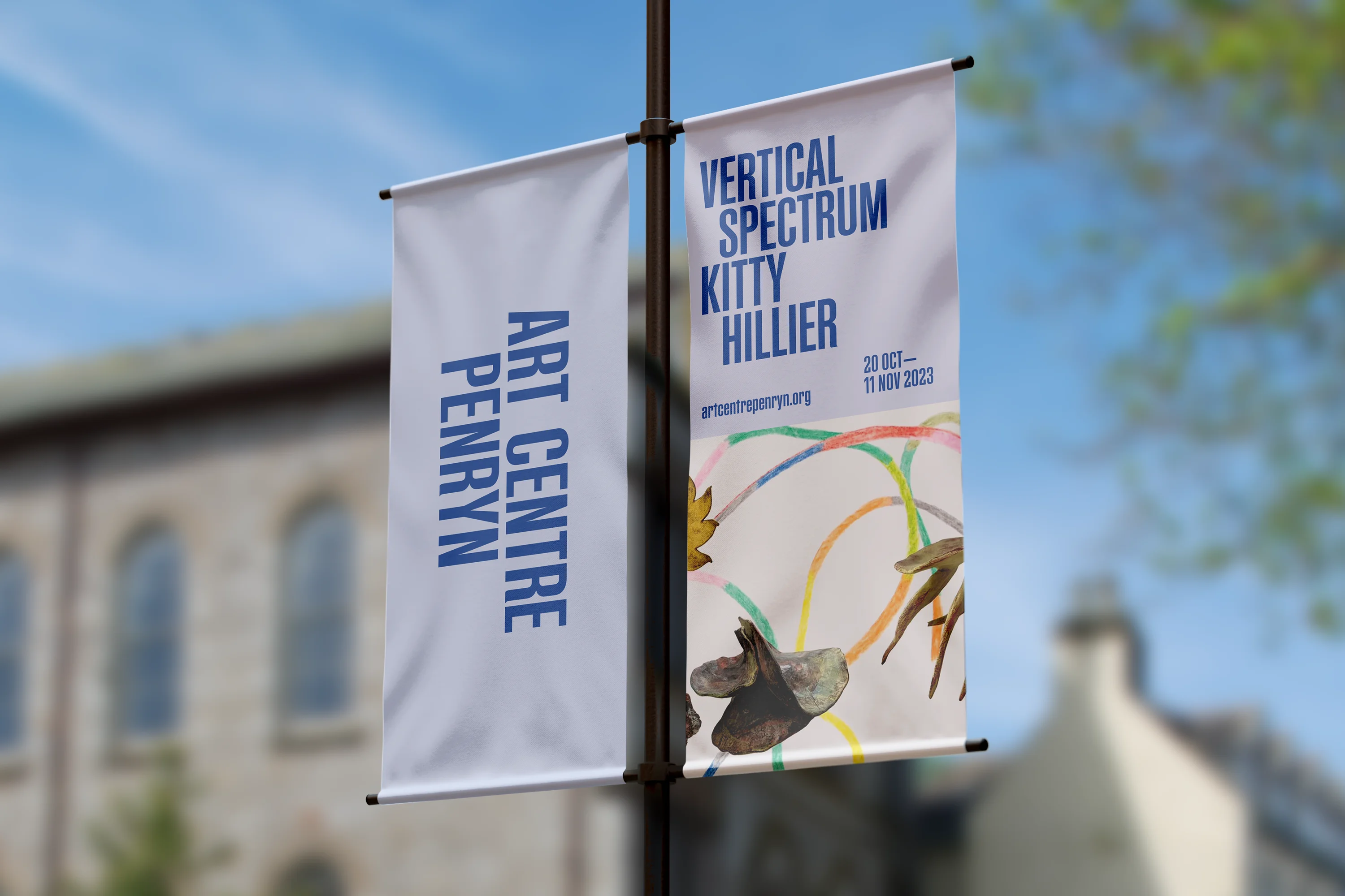
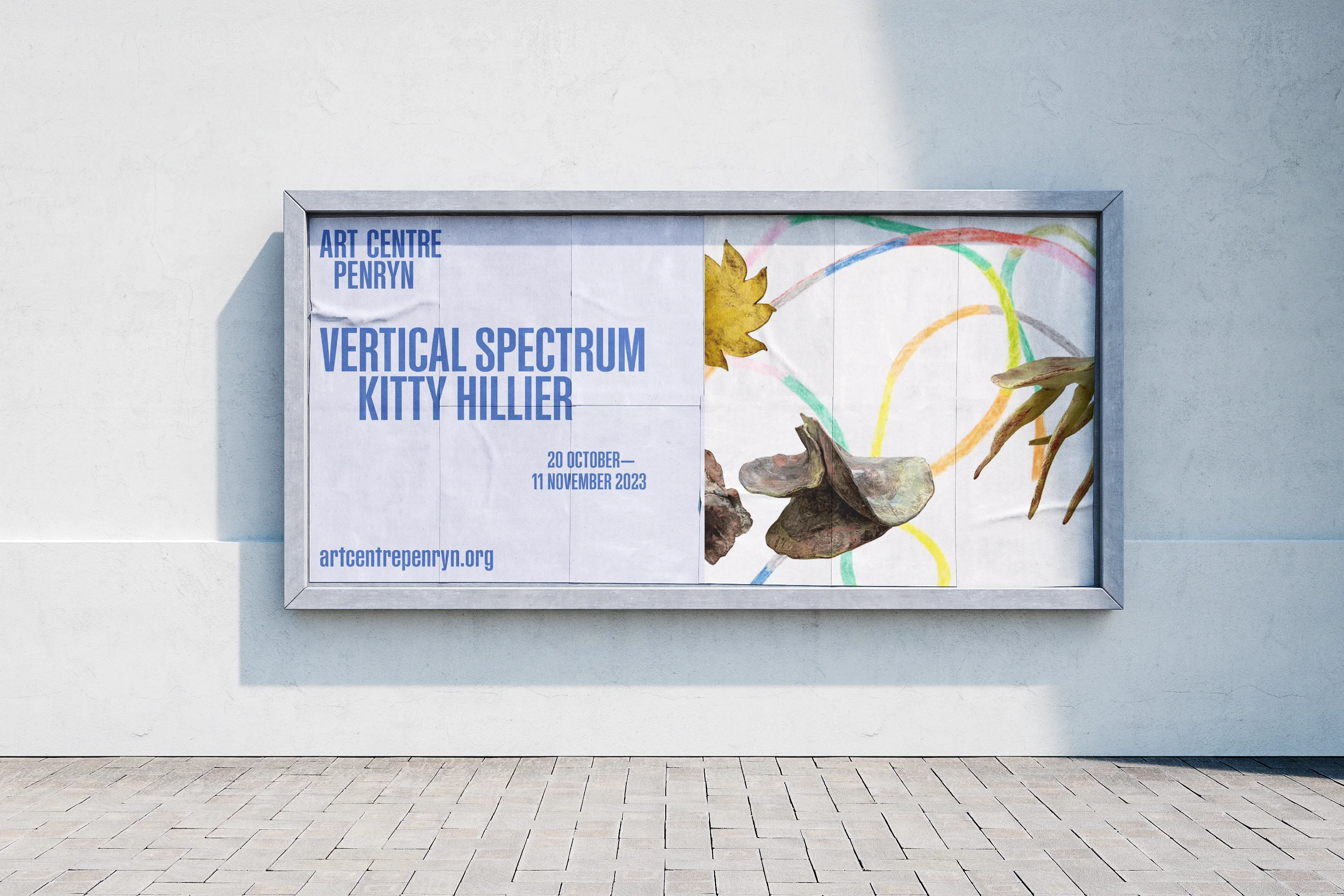
The logo design reinforces this conceptual positioning with the ‘C’ of ‘Centre’ positioned at the centre of ‘Penryn’. Instead of the words being centred, this creates an arrangement that has a refined and pleasing aesthetic design with a uniquely conceptual idea.
The shared values at the heart of the organisation are: Ambitious, Innovative, Quality, Creative, Responsible, Equitable, Kind and Connected. But, at the centre of everything is creativity: Creativity has the power to engage audiences and to positively impact lives.
Megan Beck, Director,
Art Centre Penryn:
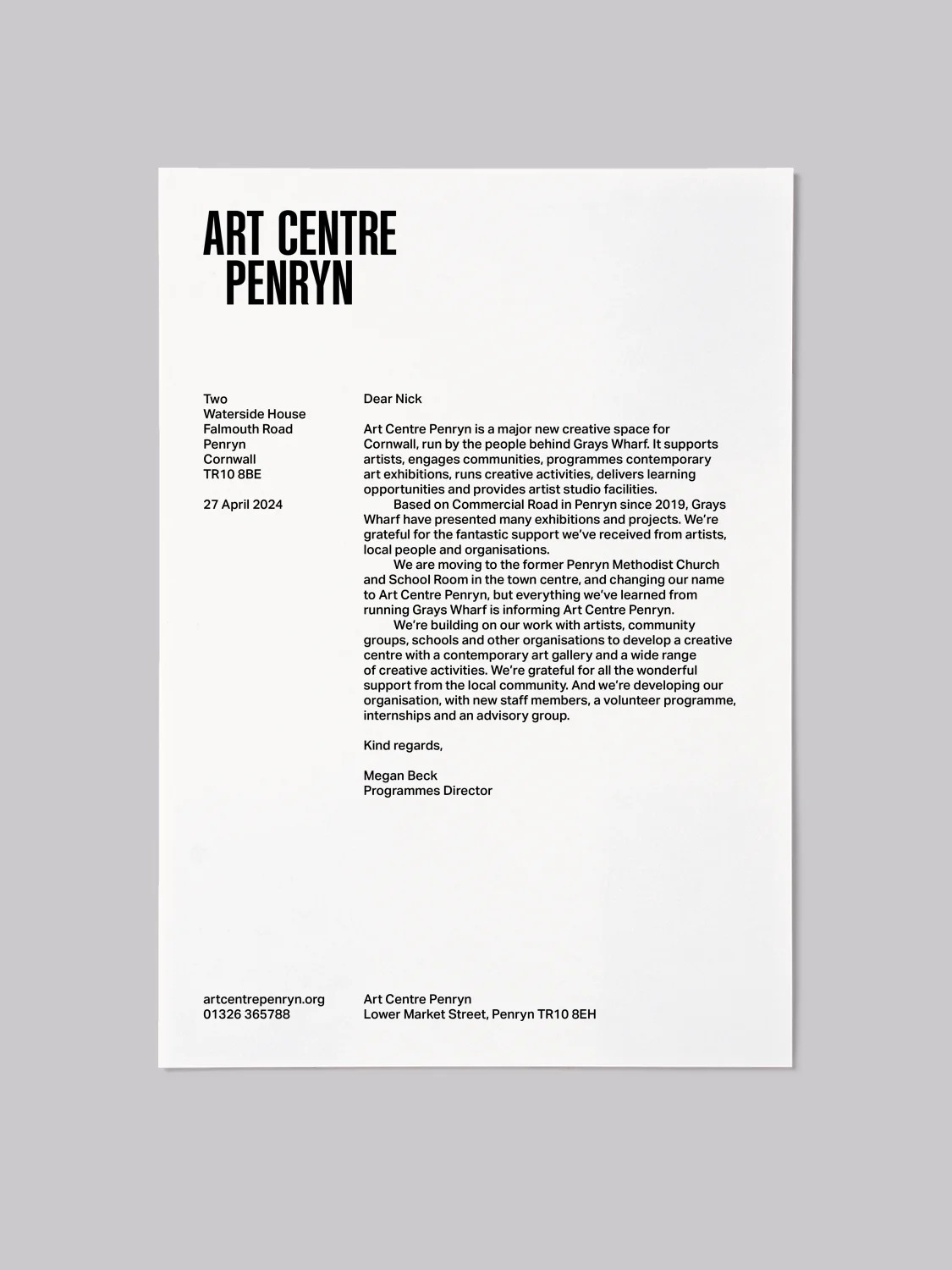
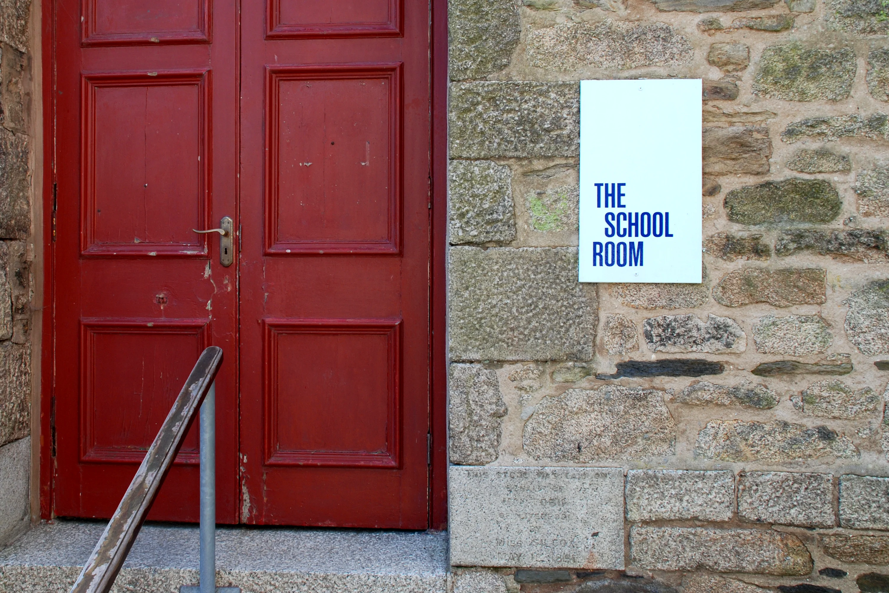
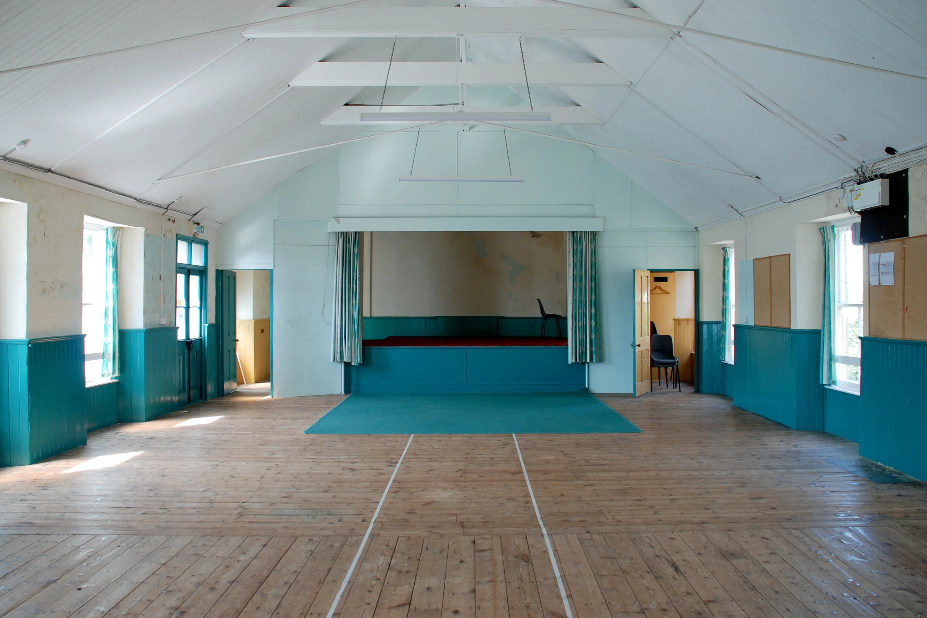
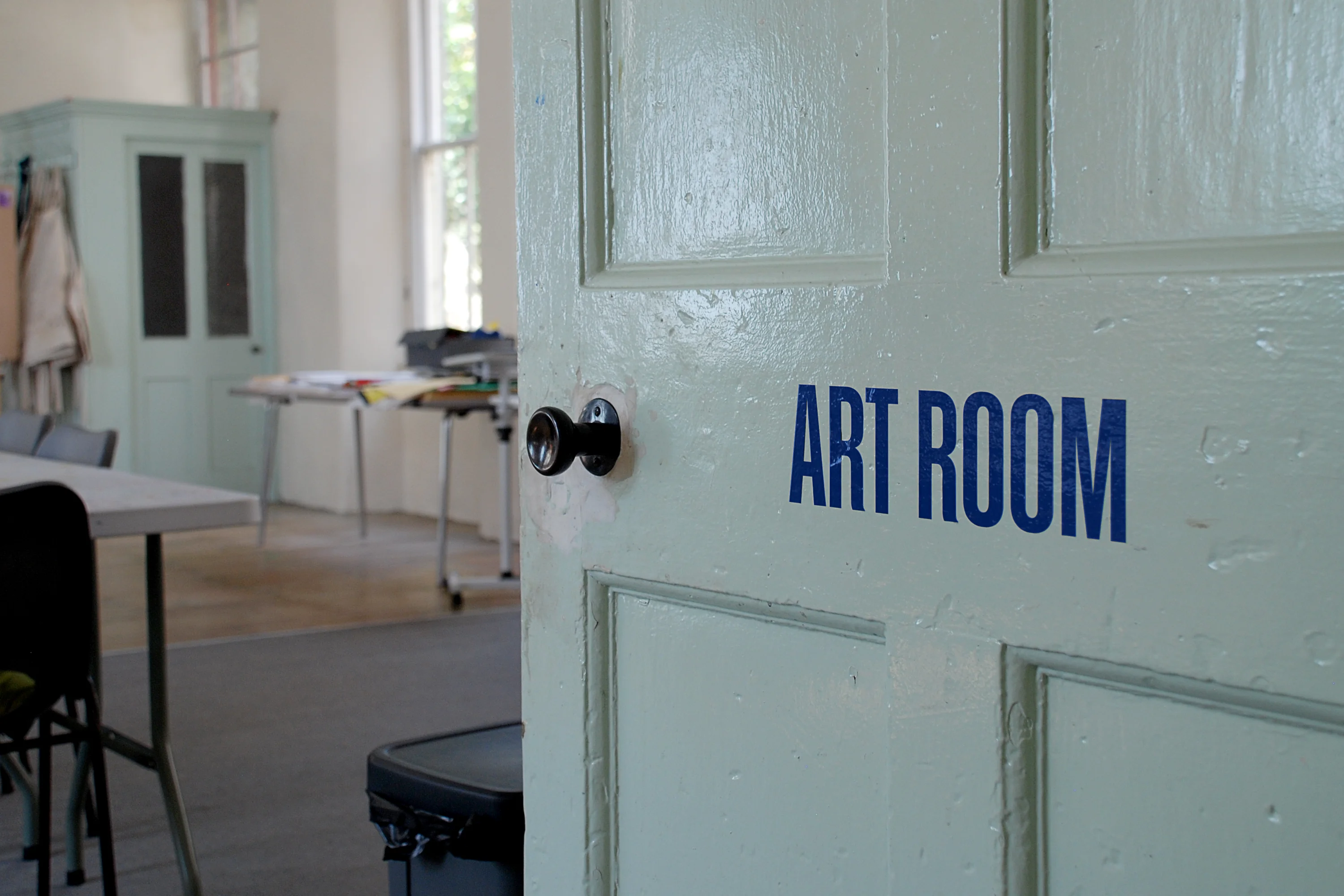
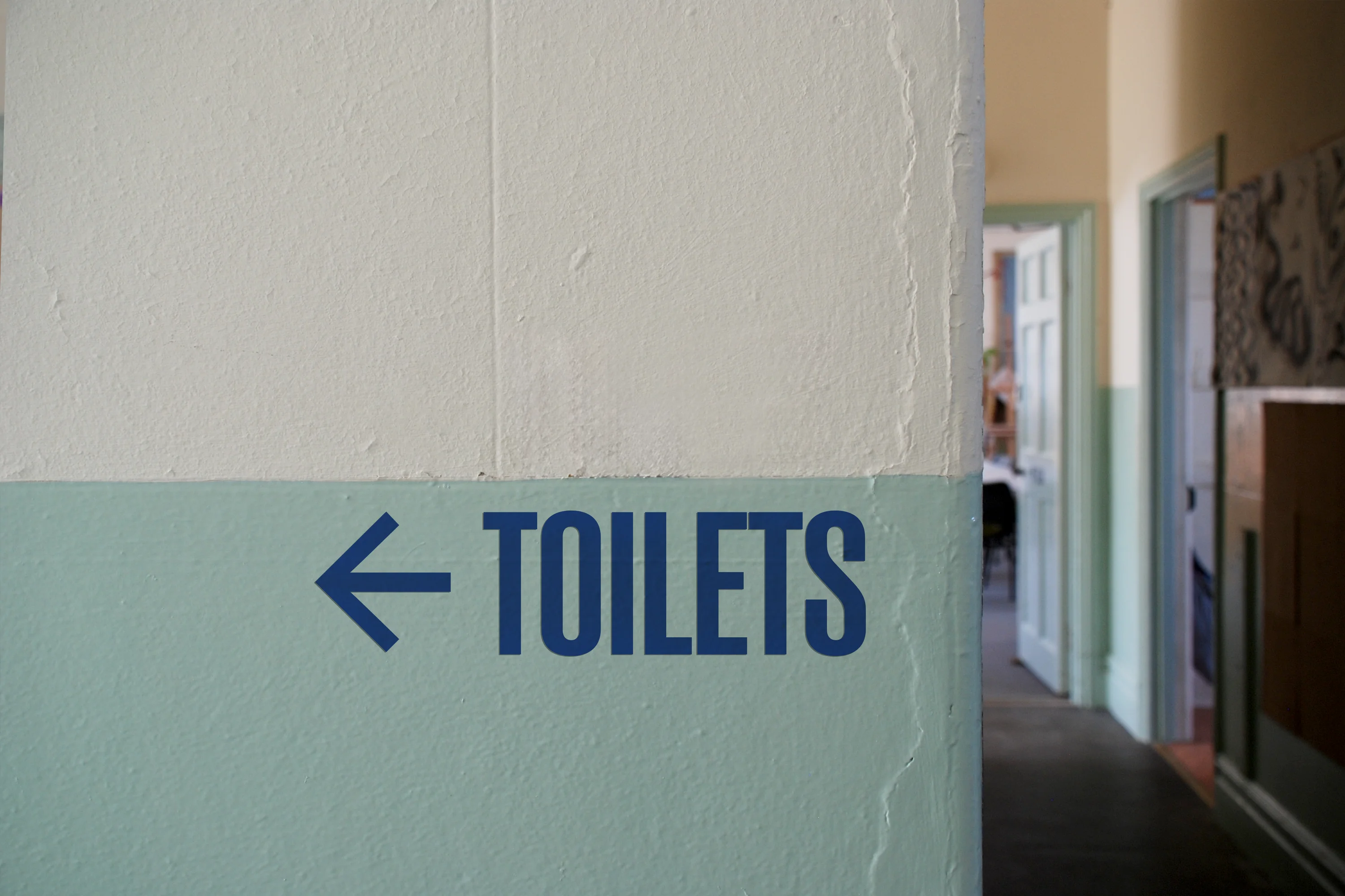

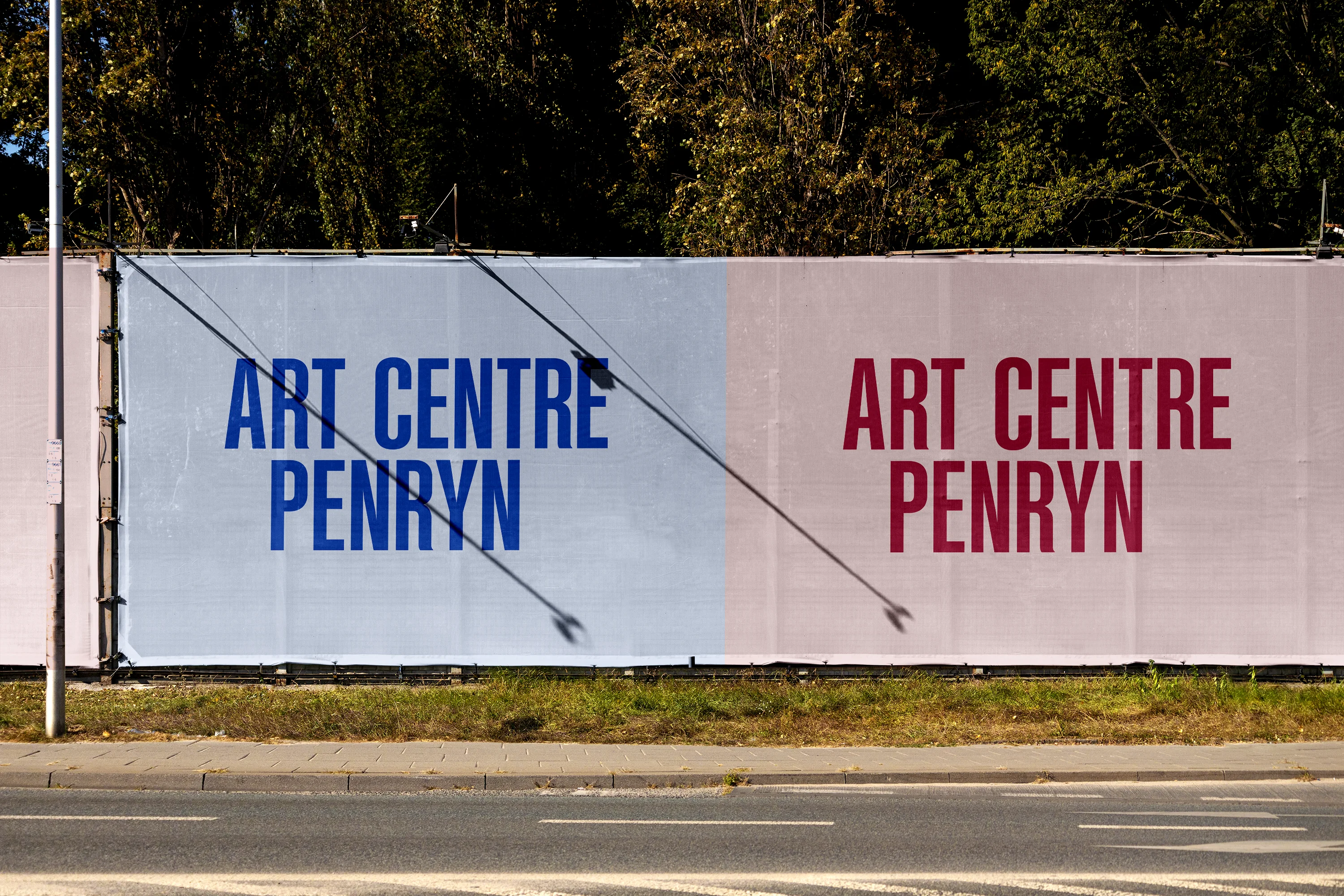
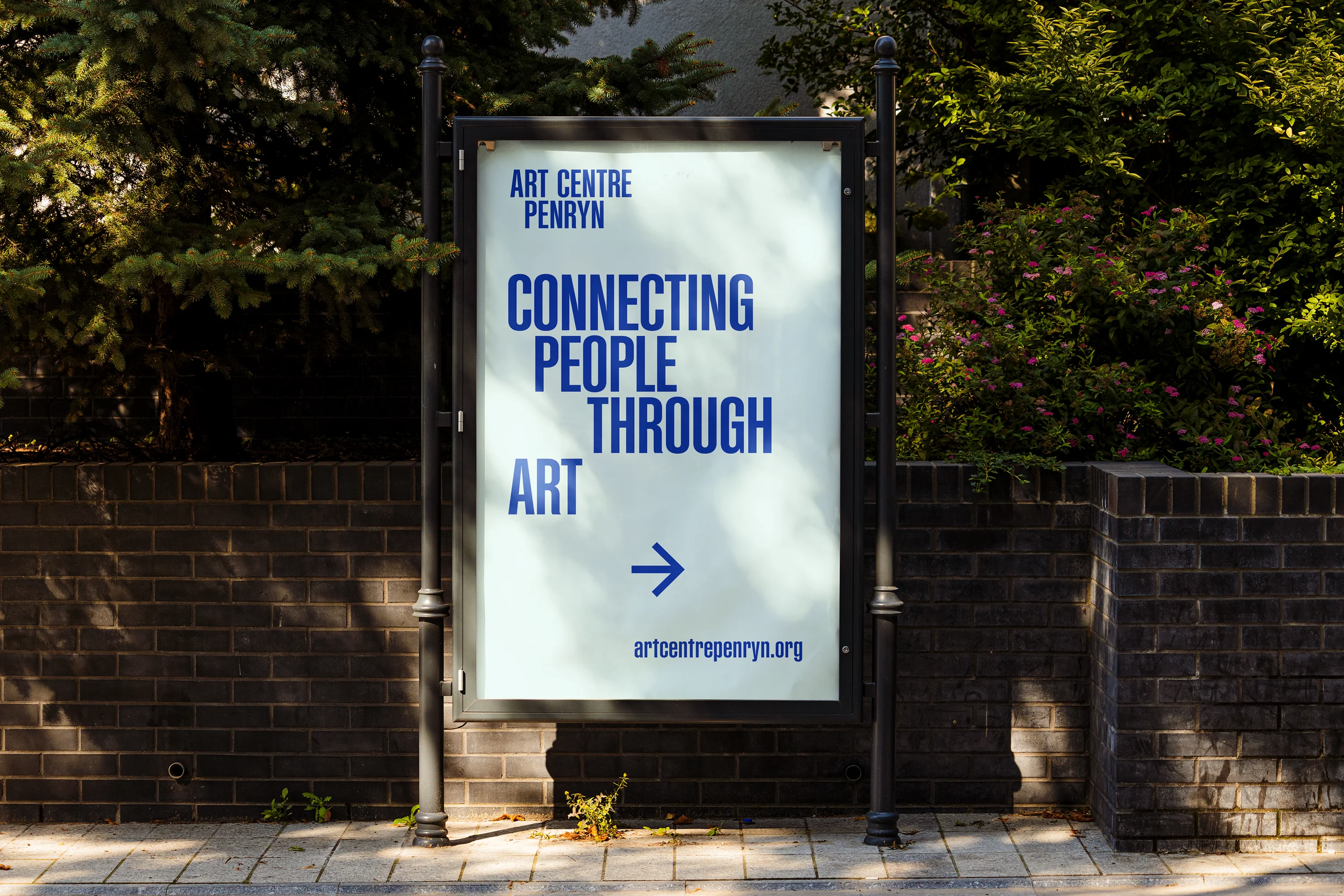
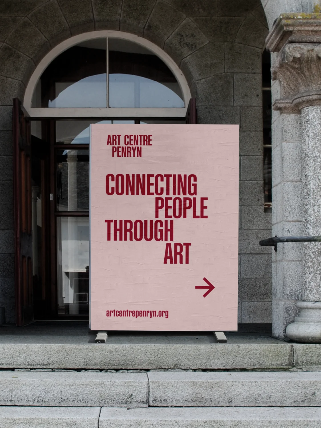
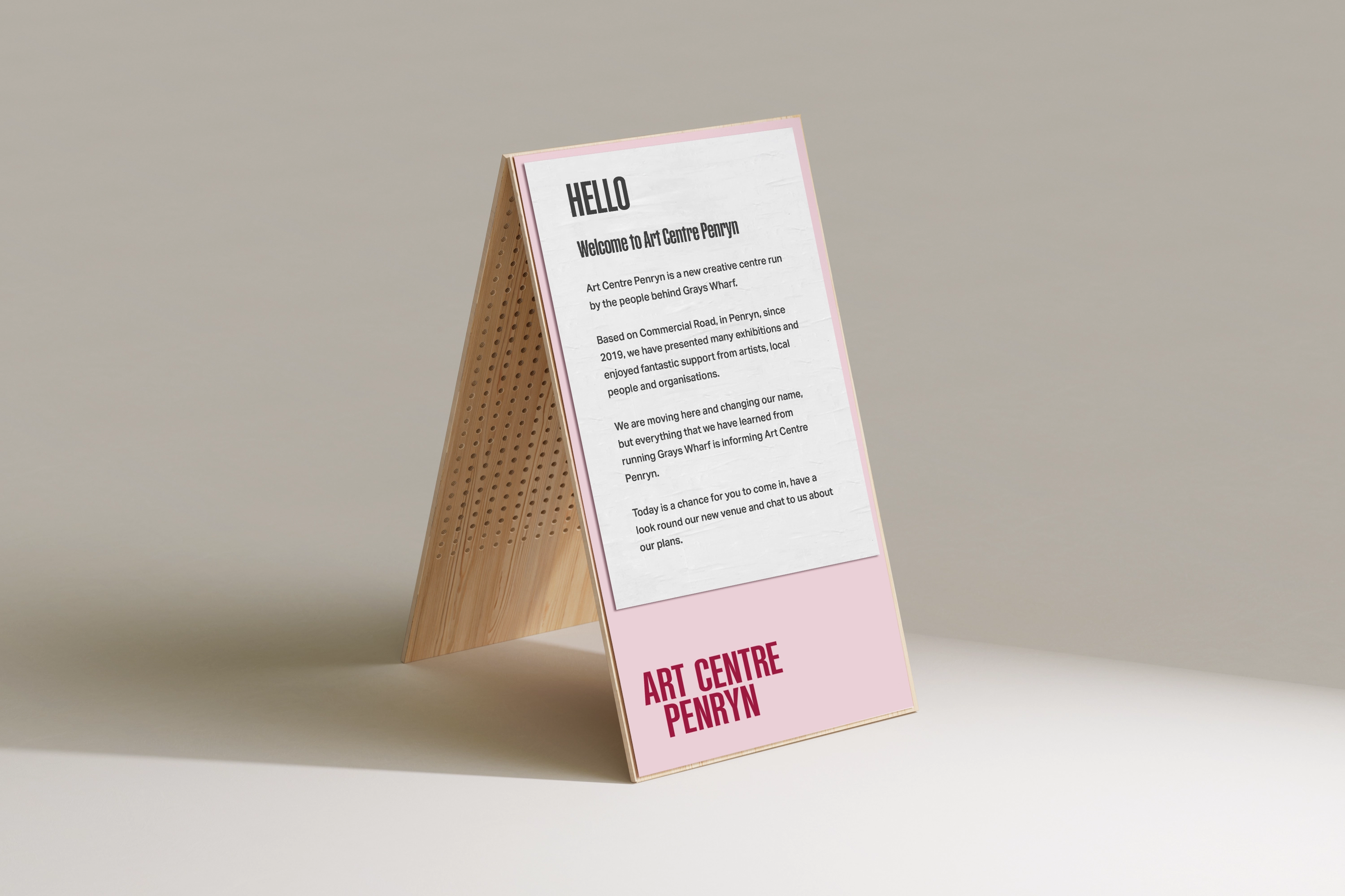
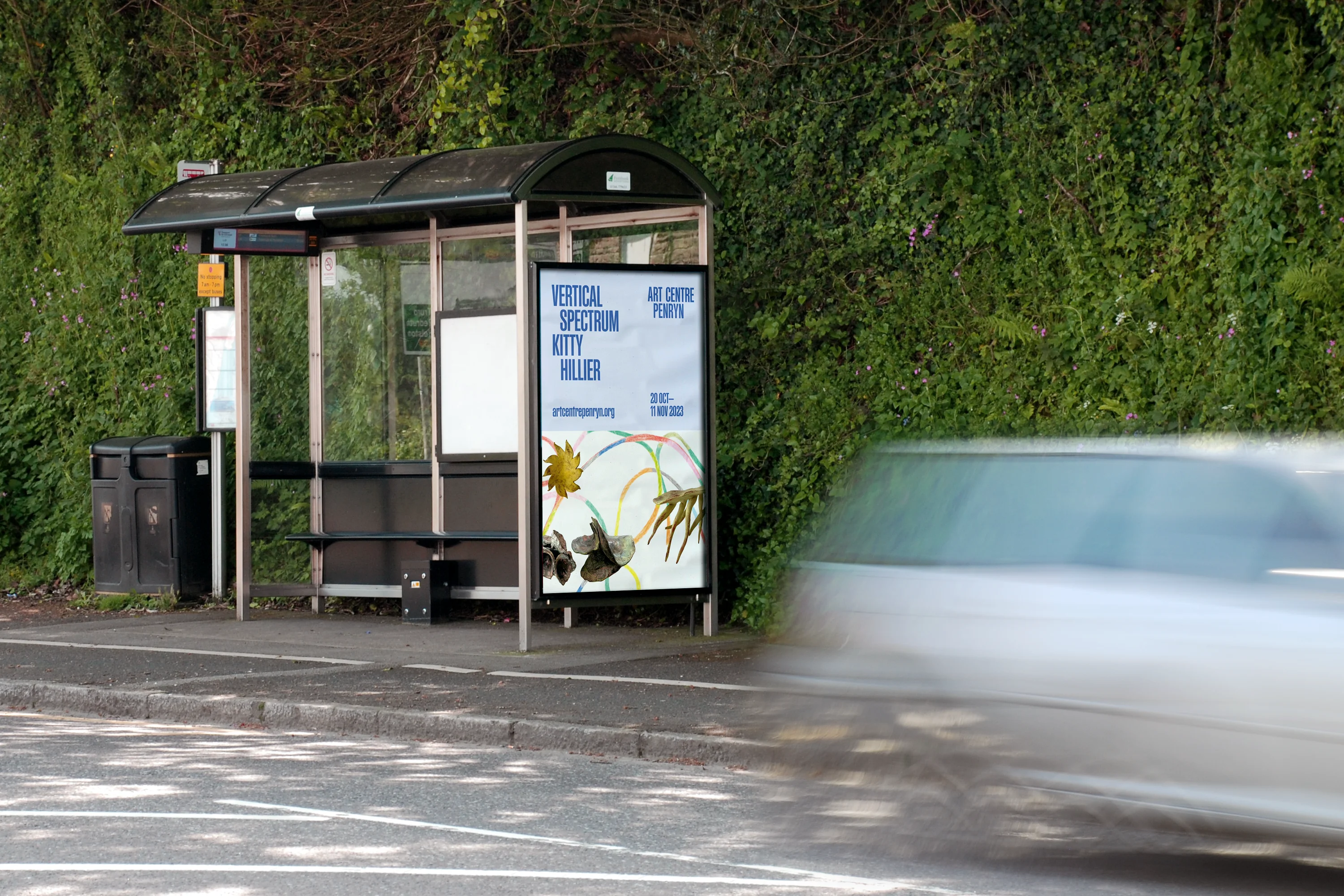
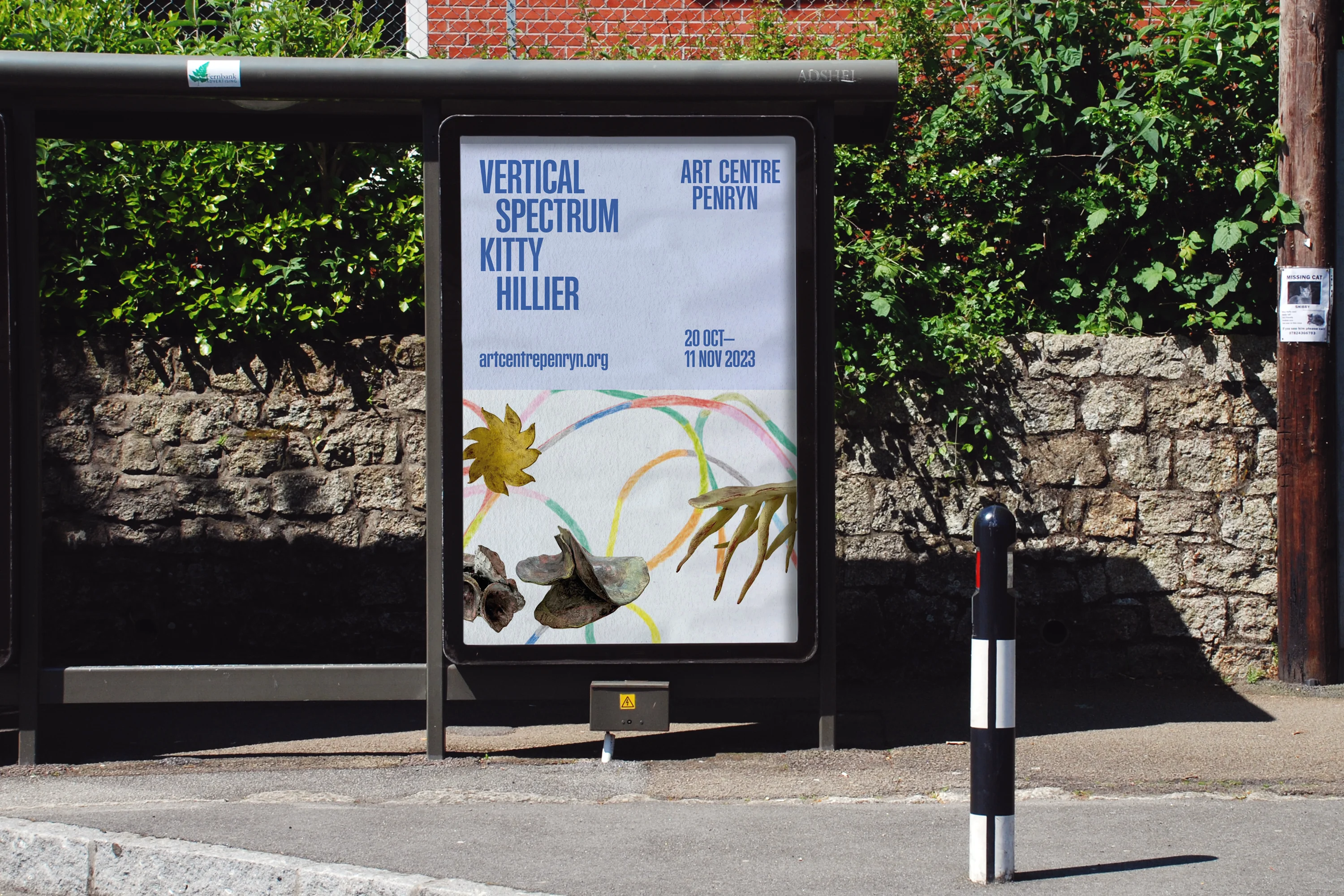
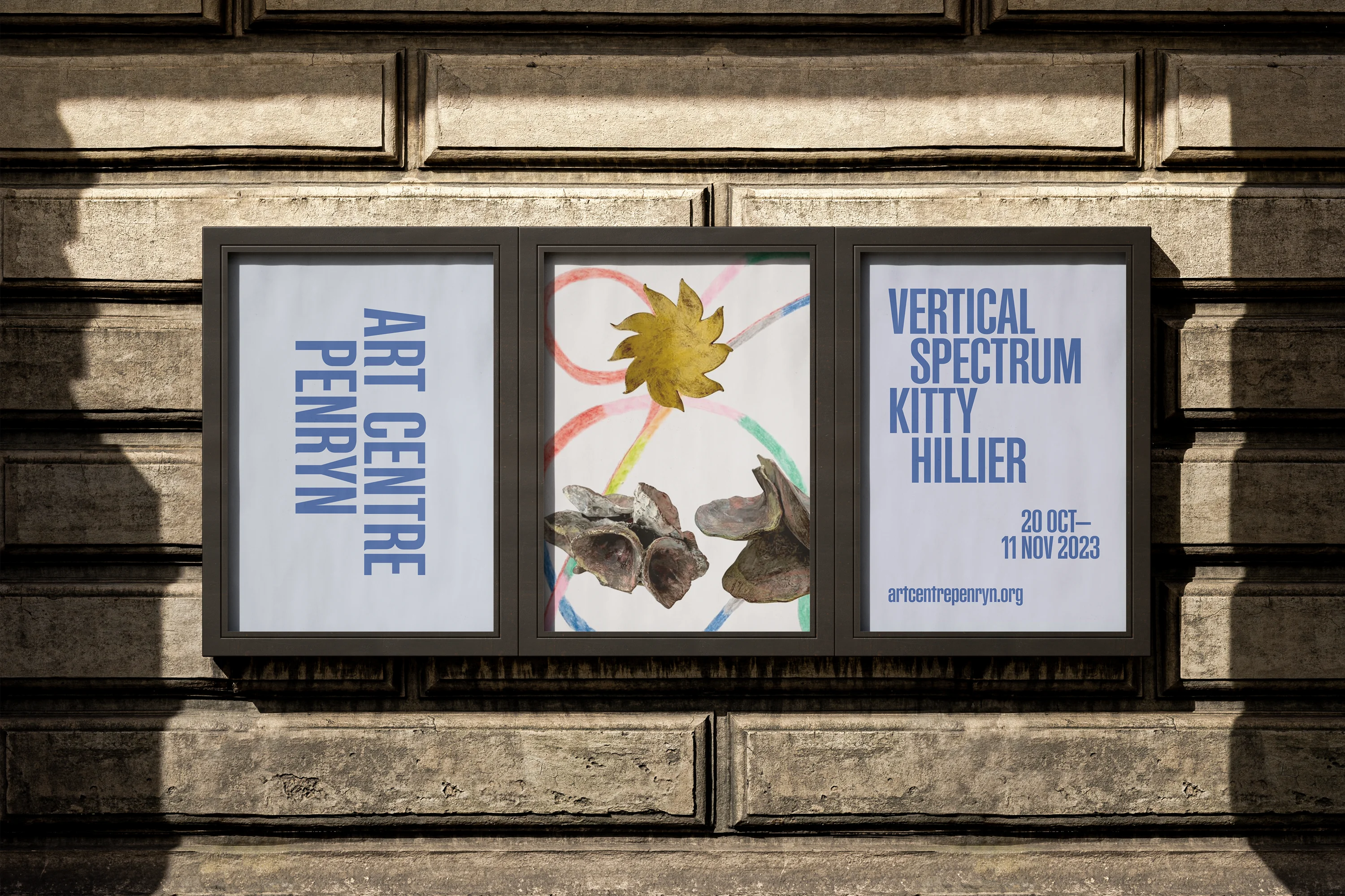
The idea, of a ‘centre’ not centred, is further expressed in the use of distinctive typography applied to applications and touchpoints. Typographic interventions each creatively respond to the particular application, building a framework of materials that are coherent and flexible.
The primary typeface is Supplement, designed by Formula Type, chosen to carry confidence across communications and materials. This is supported with Aktiv Grotesk, a secondary typeface, that is clear, communicable and easy to read.
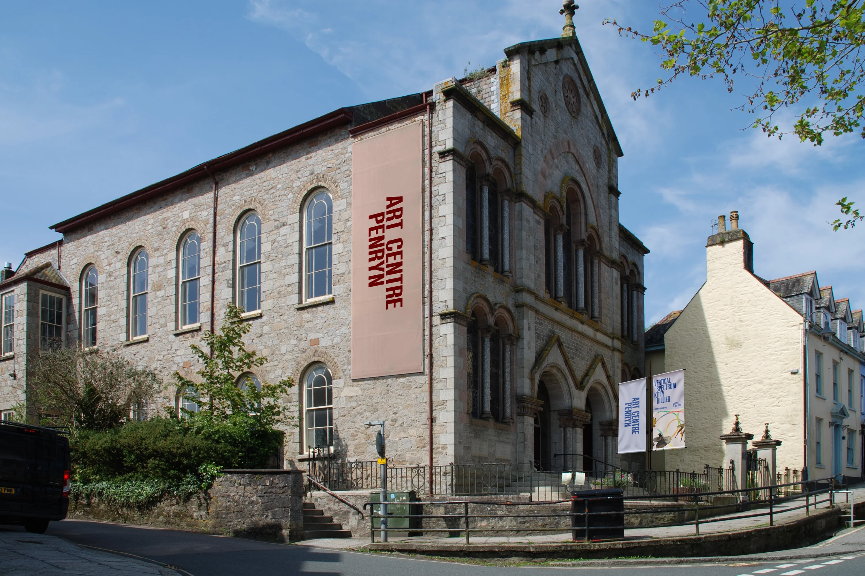
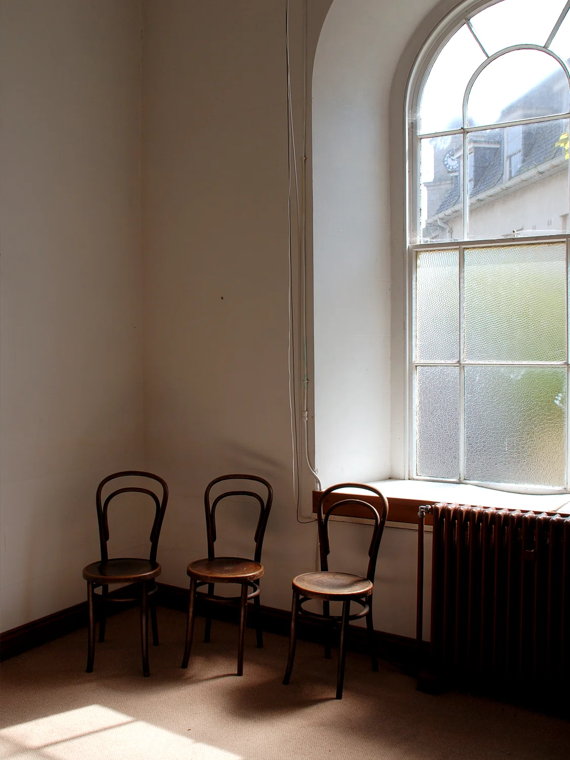
Colour is applied creatively, with the primary brand colours inspired by references in the former Methodist Church and School Room. Drawing on the historical fabric of the buildings, the colours add a sense of legacy for the heritage within the new venture.
Credits
Commissioned by GW Arts CIC
Typeset in FT Supplement by Formula Type and Aktiv Grotesque by Dalton Maag
Artwork © Kitty Hillier
Services
Consultancy
Strategy & Positioning
Naming
Brand Identity Design
Printed & Digital Communications
Project Management
Related Projects