

Repositioning Niwaki with an updated product catalogue design that celebrates the beautiful quality of their Japanese product range.
Strategic Positioning
Art Direction
Catalogue Design
Background
We were tasked with redesigning the Niwaki product catalogue. And as a mail order business this was an incredibly important piece of communication. A lot rested on us getting the design just right.
We carried out an audit of Niwaki’s product range and their communications materials and it was immediately obvious that their proposition was muddled with a mix of imagery that was confusing and a product range that was disorganised, overwhelming and disorientating for the consumer.
Through consultation with the client we determined four key objectives for the project: (1) To present the product range in a clear and engaging way; (2) To showcase the high quality, beautiful products that are built to last; (3) To engage the enthusiast, professional or hobbyist whether in the garden, workshop or home; (4) To celebrate Japanese culture and its horticultural ethos, and contextualise this and the value of buying Niwaki.
Our consultation, research and analysis led to a clear positioning statement: Niwaki passionately believe in the quality of beautifully simple products from Japan and obsessively source products that will functionally and creatively transform the lives of its customers.
Typography
Niwaki were already using Myriad, a humanist typeface, for the Niwaki logo. Myriad is ideally suited to be used for headings in the brochure—in reference to the brand identity, but also as a distinctive display style typeface. We added Meta Book for the body, another humanist typeface, ideally suited to support Myriad in its proportions and comparable size and width. The combination of san serif and a serif typefaces creates an appropriate mix reflecting the brand values and personality of Niwaki: A bold simplicity and confidence mixed with creativity and approachability.
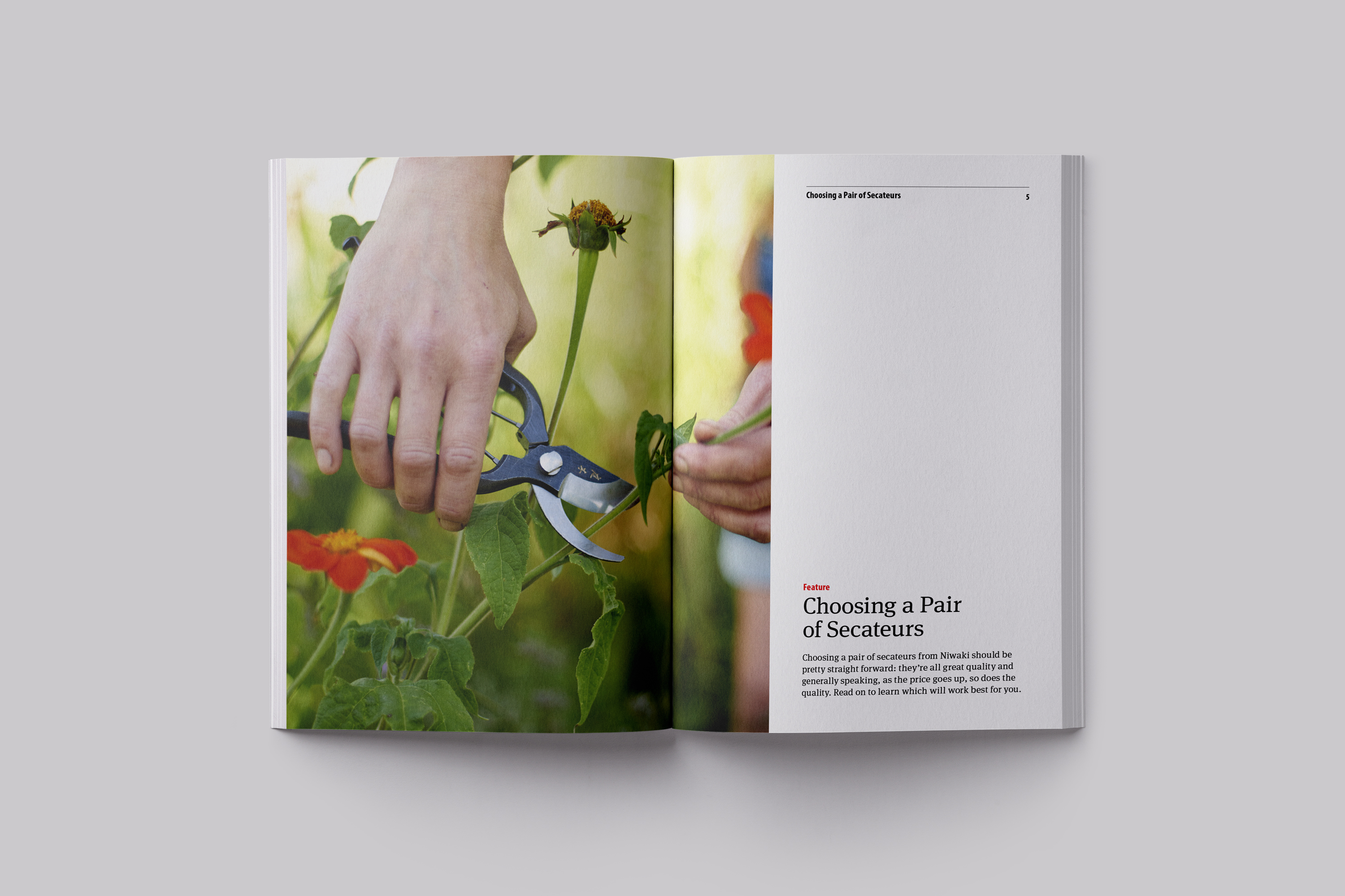
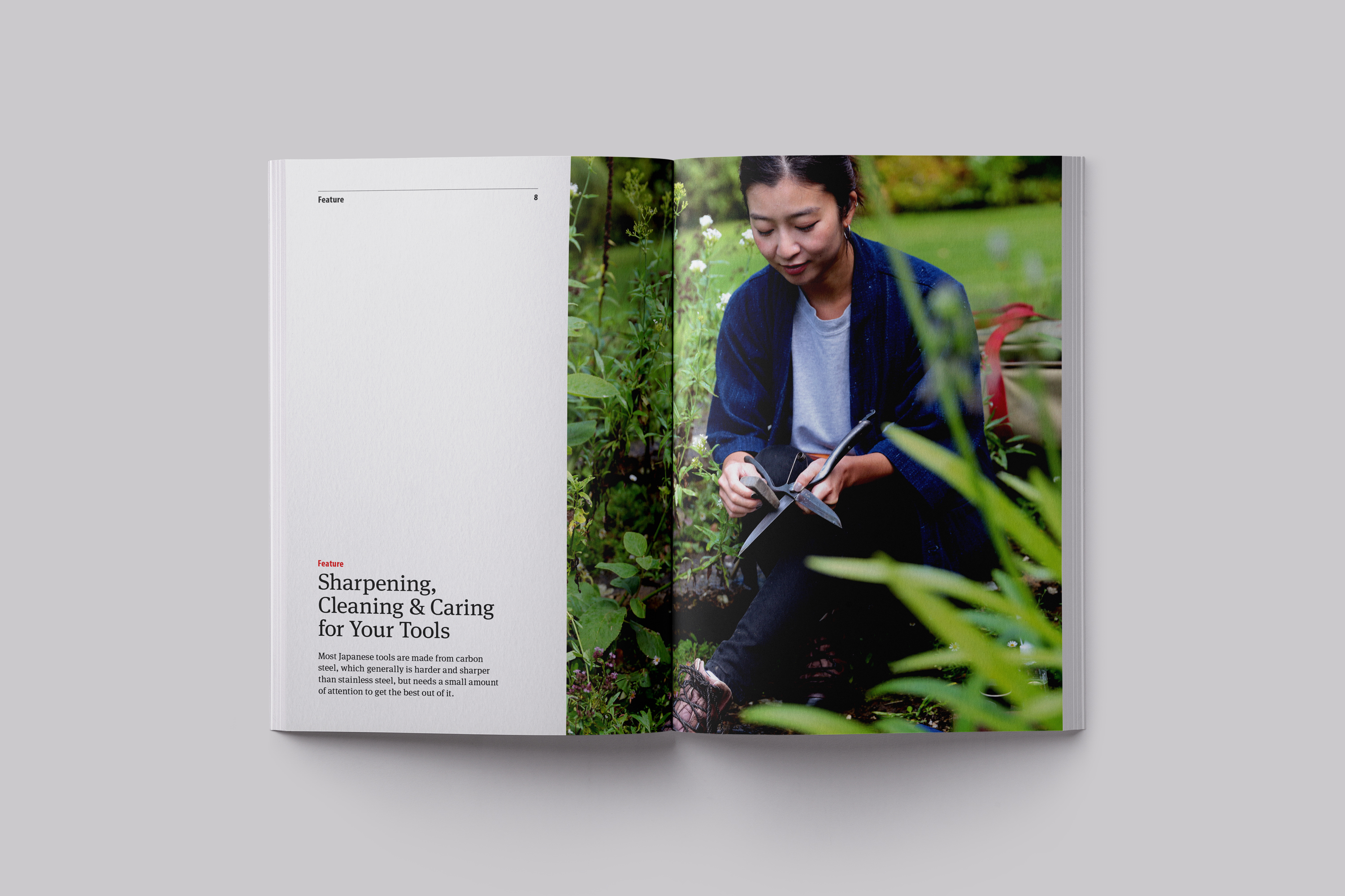
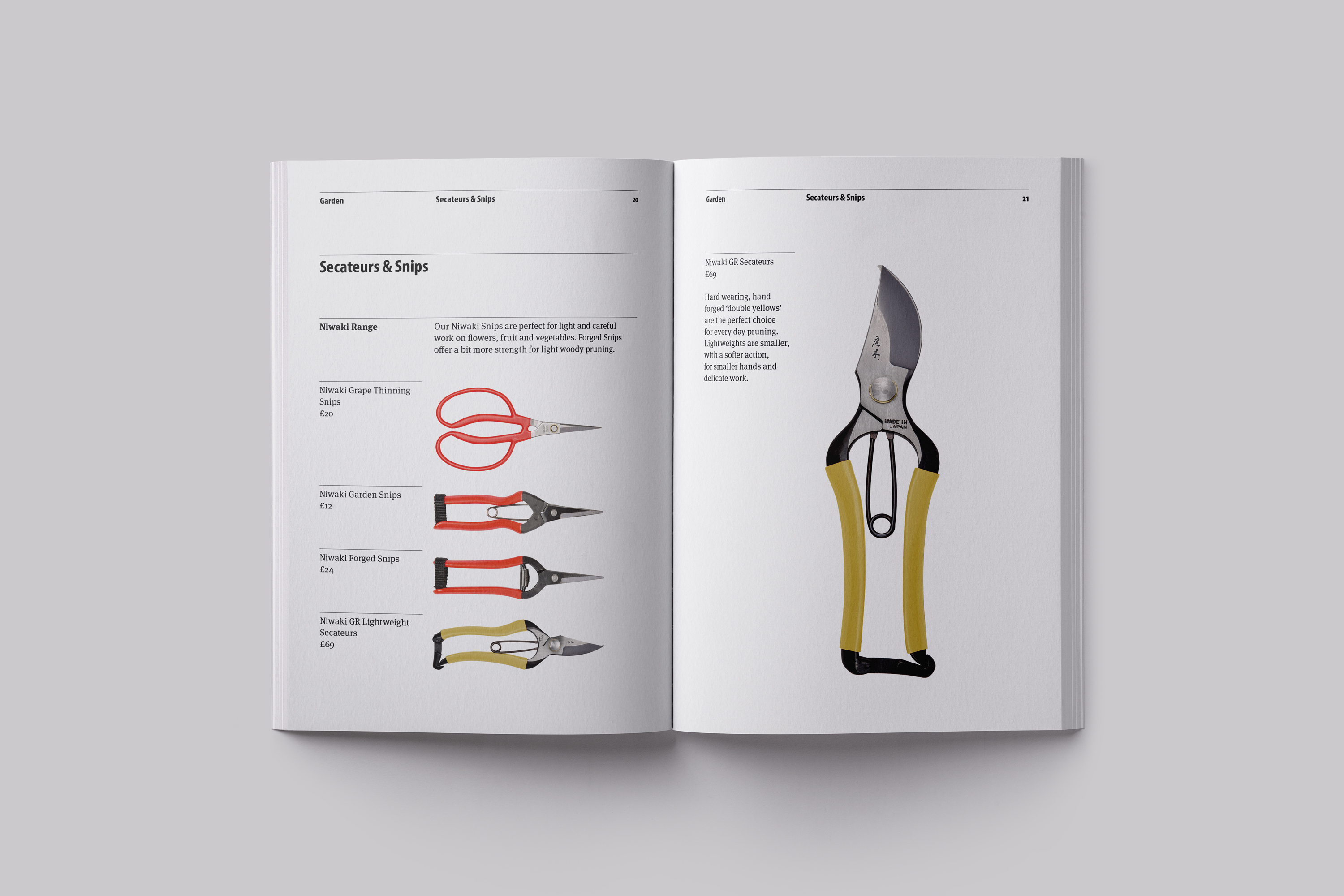
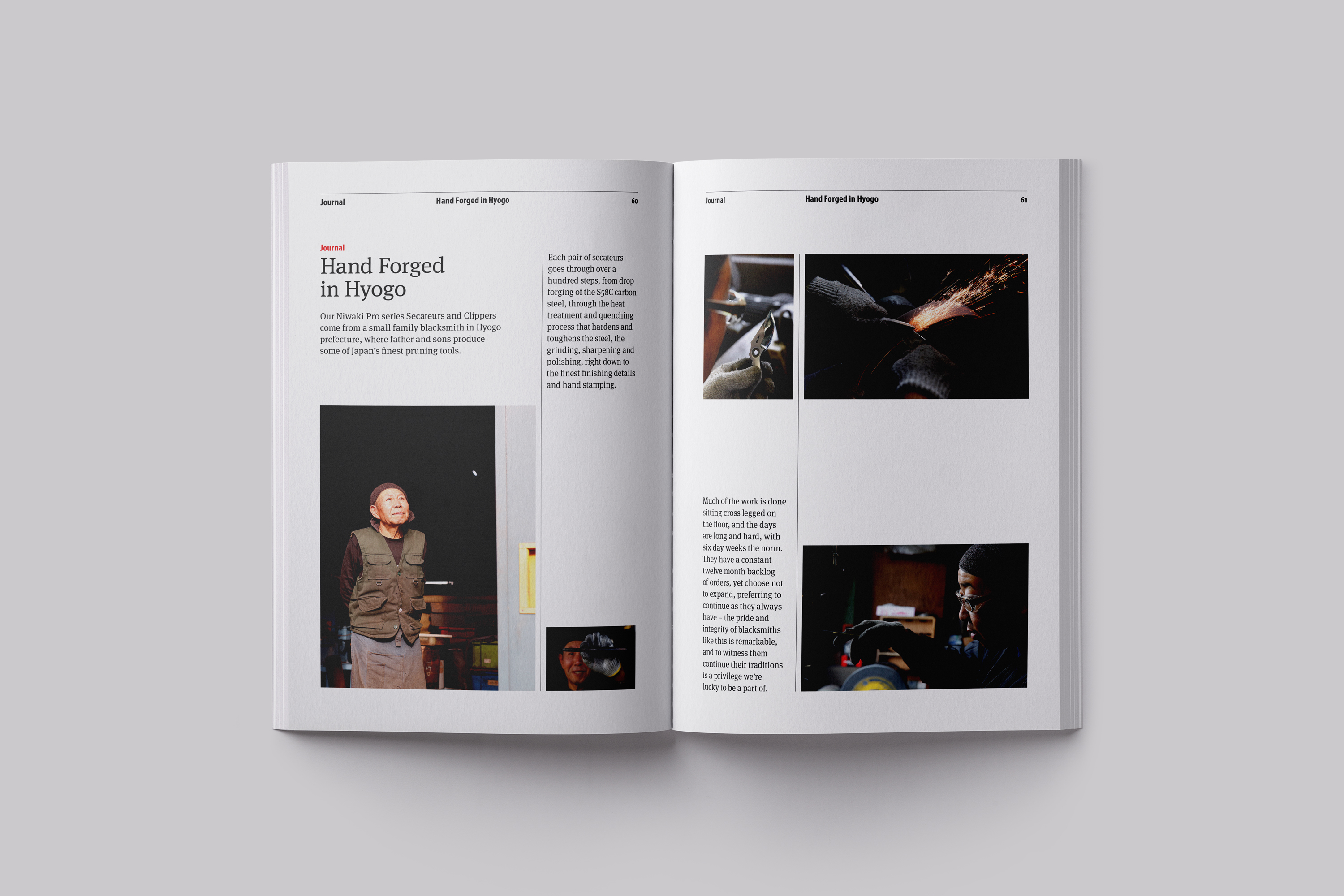
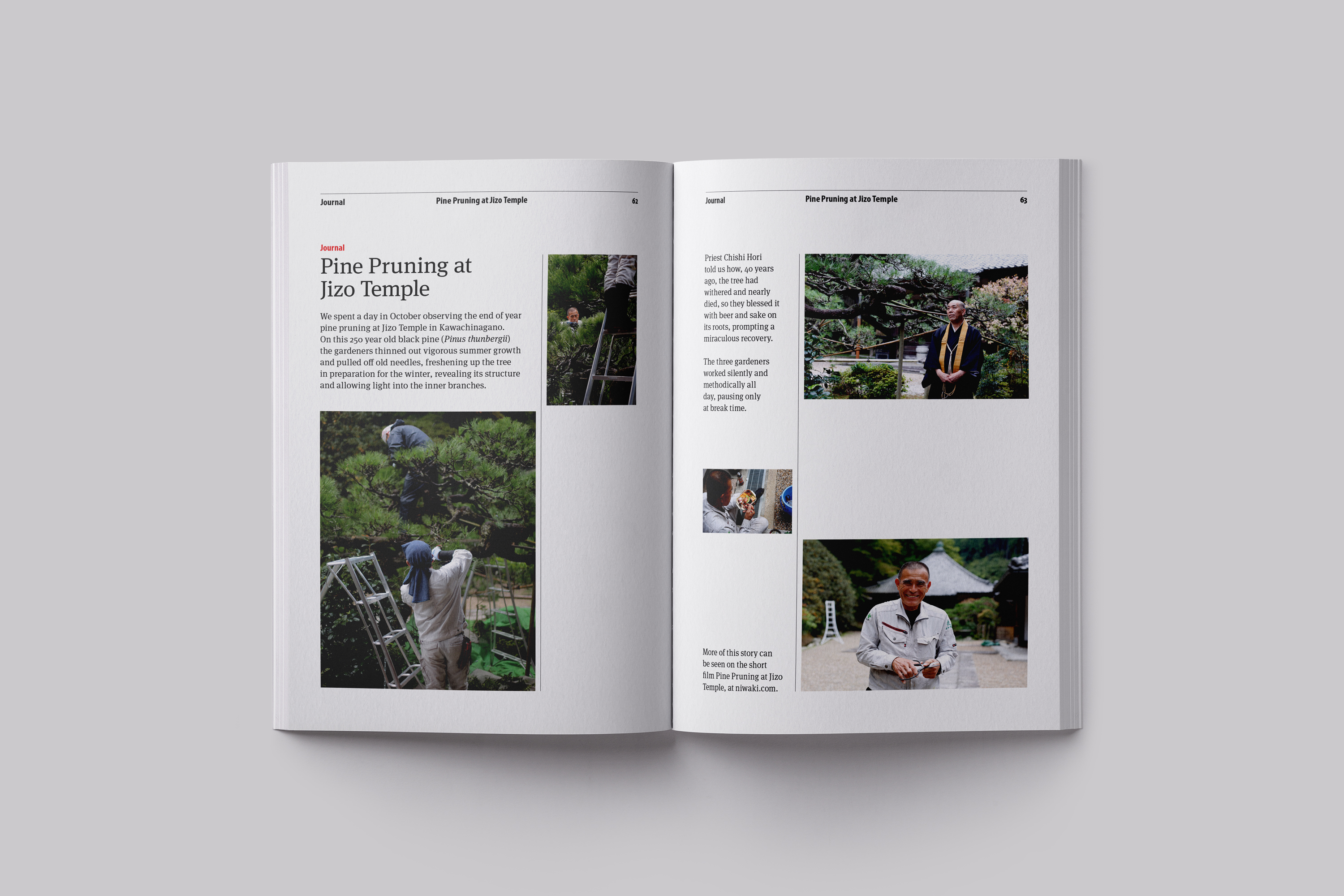
Through type application, using the same two typefaces, but in subtle variation we were able to create a distinct difference for the reader between the types of content being presented in the brochure which helps to clearly define the upfront editorial as distinctly different but related to the main product page listings.
Organisation
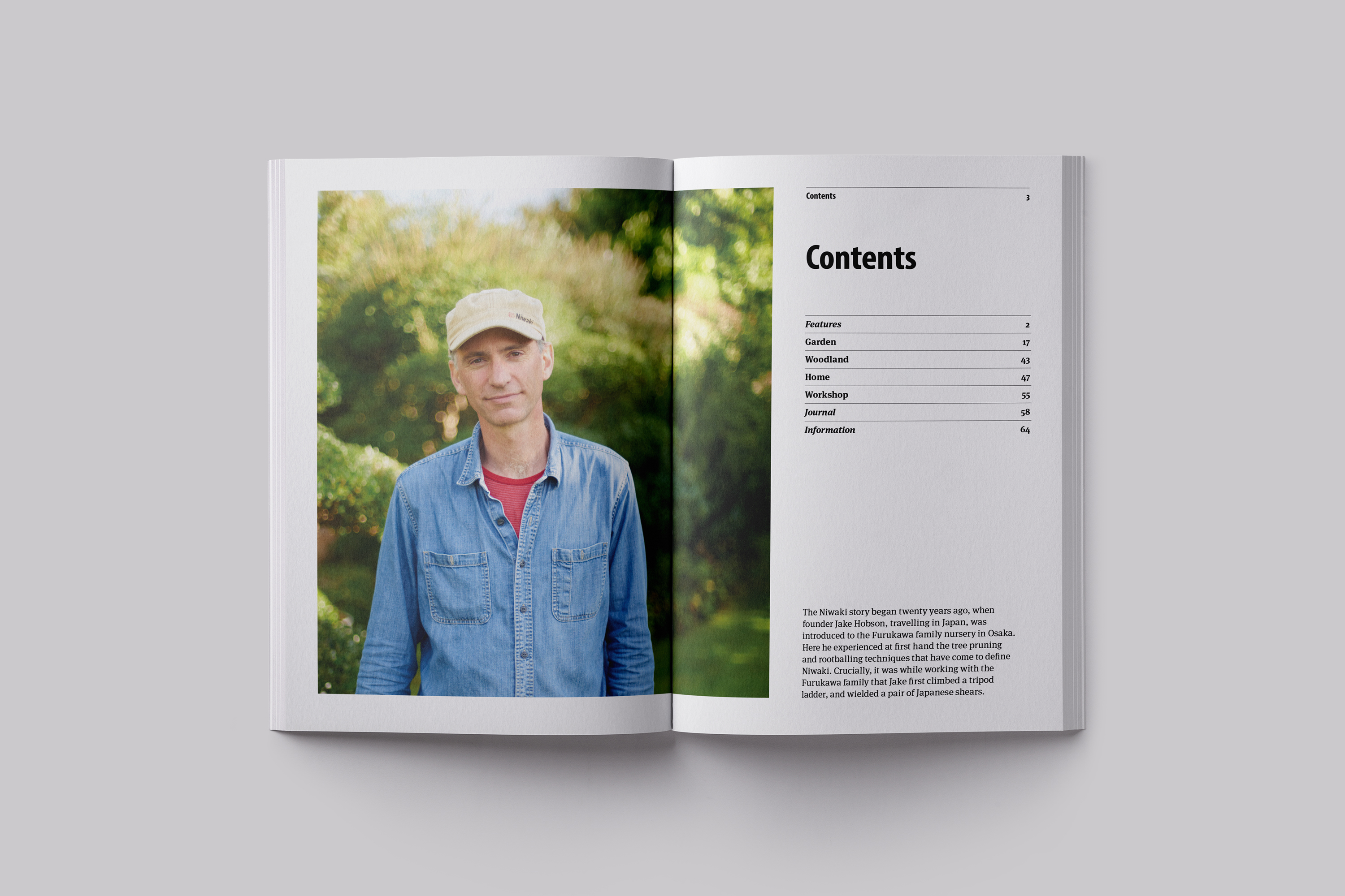
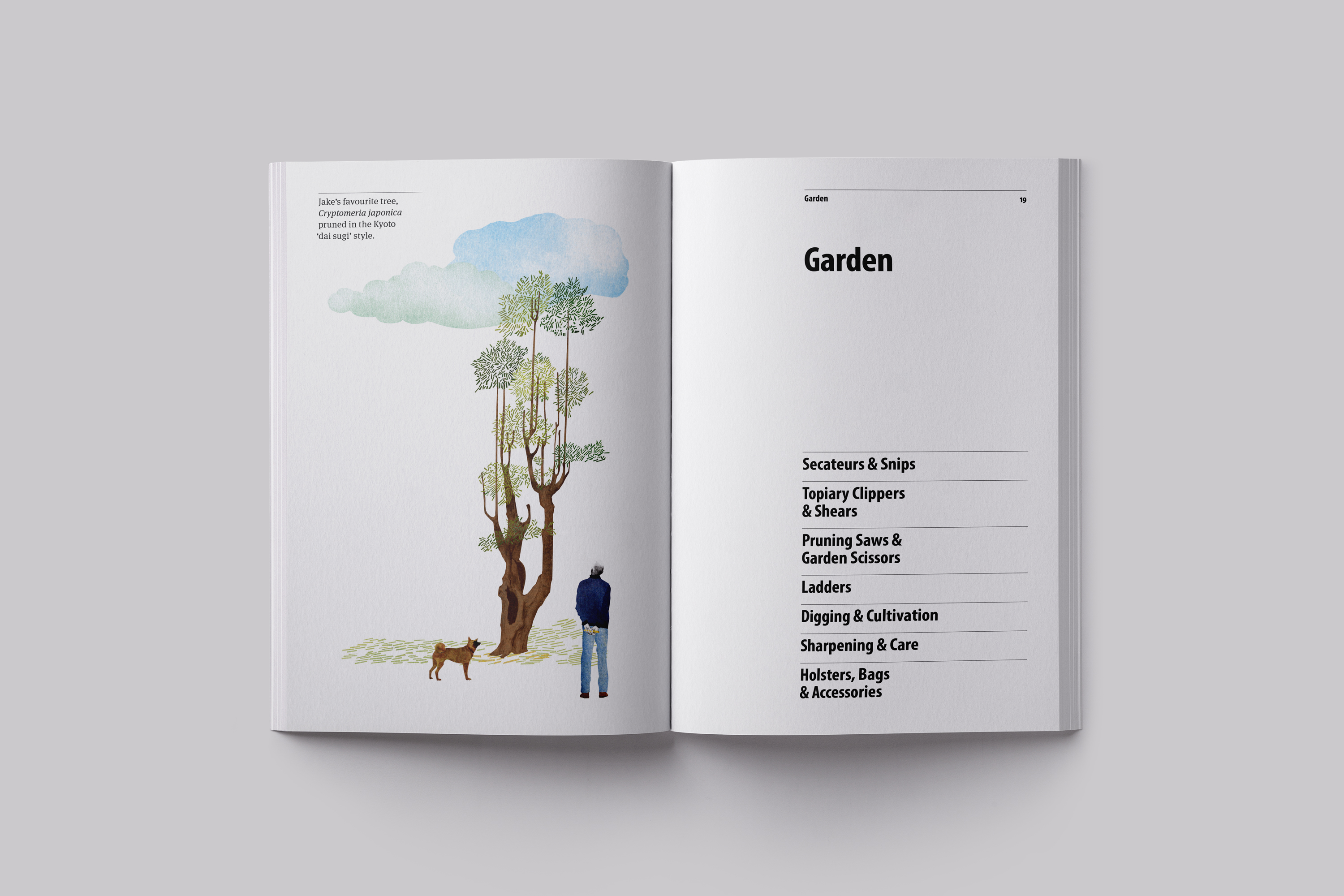
We proposed the products be arranged in a much clearer way – based around consumer activity: Garden, Woodland, Home and Workshop. And to add to this range feature sections on using and care of the products as well as insight and information about the people making the products—to create a product story, and brand story, based on Niwaki’s experience and expertise, that consumers could better appreciate and engage with. And, ultimately feel a clearer sense of connection with Niwaki, and why to buy from them.
Product Listings
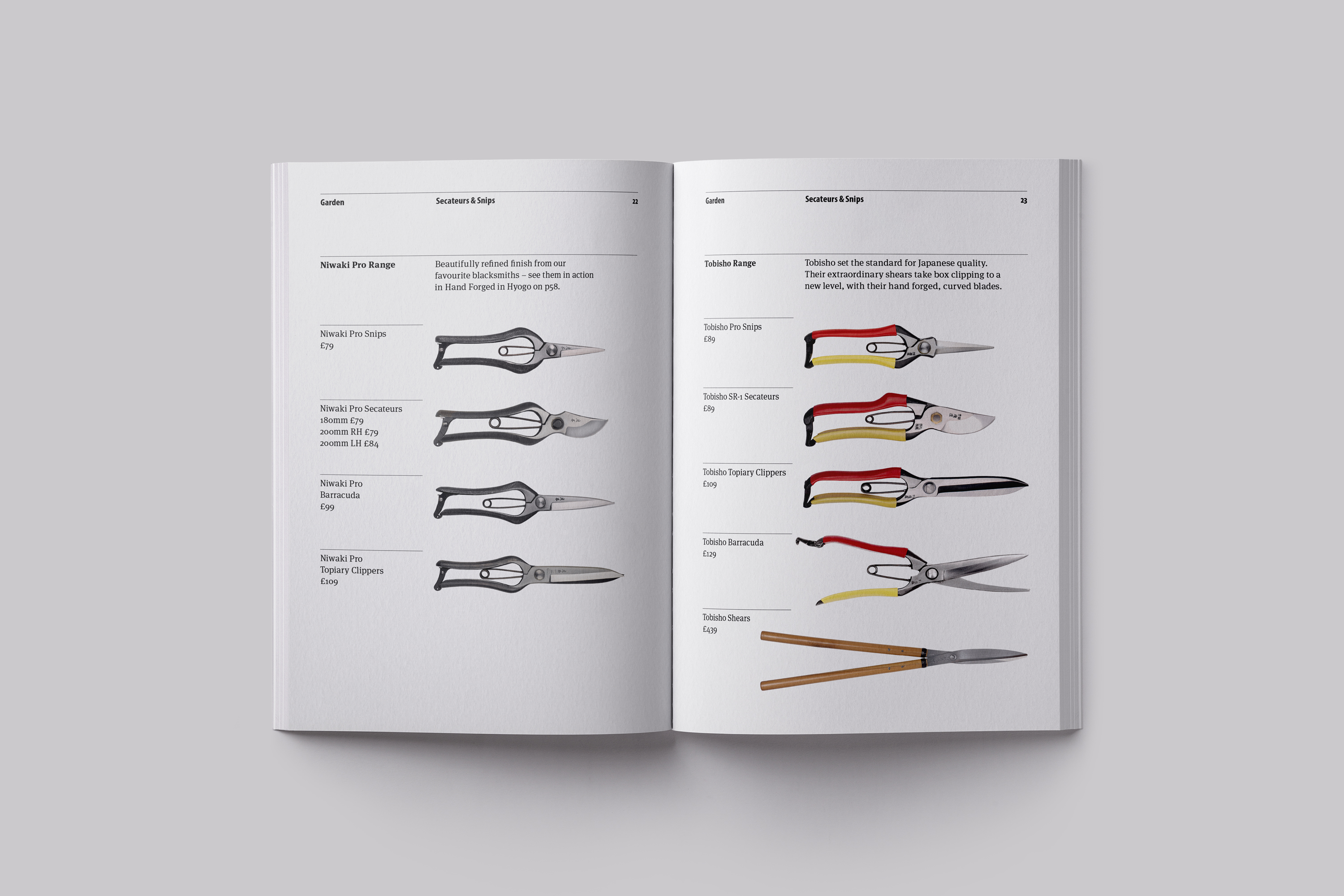
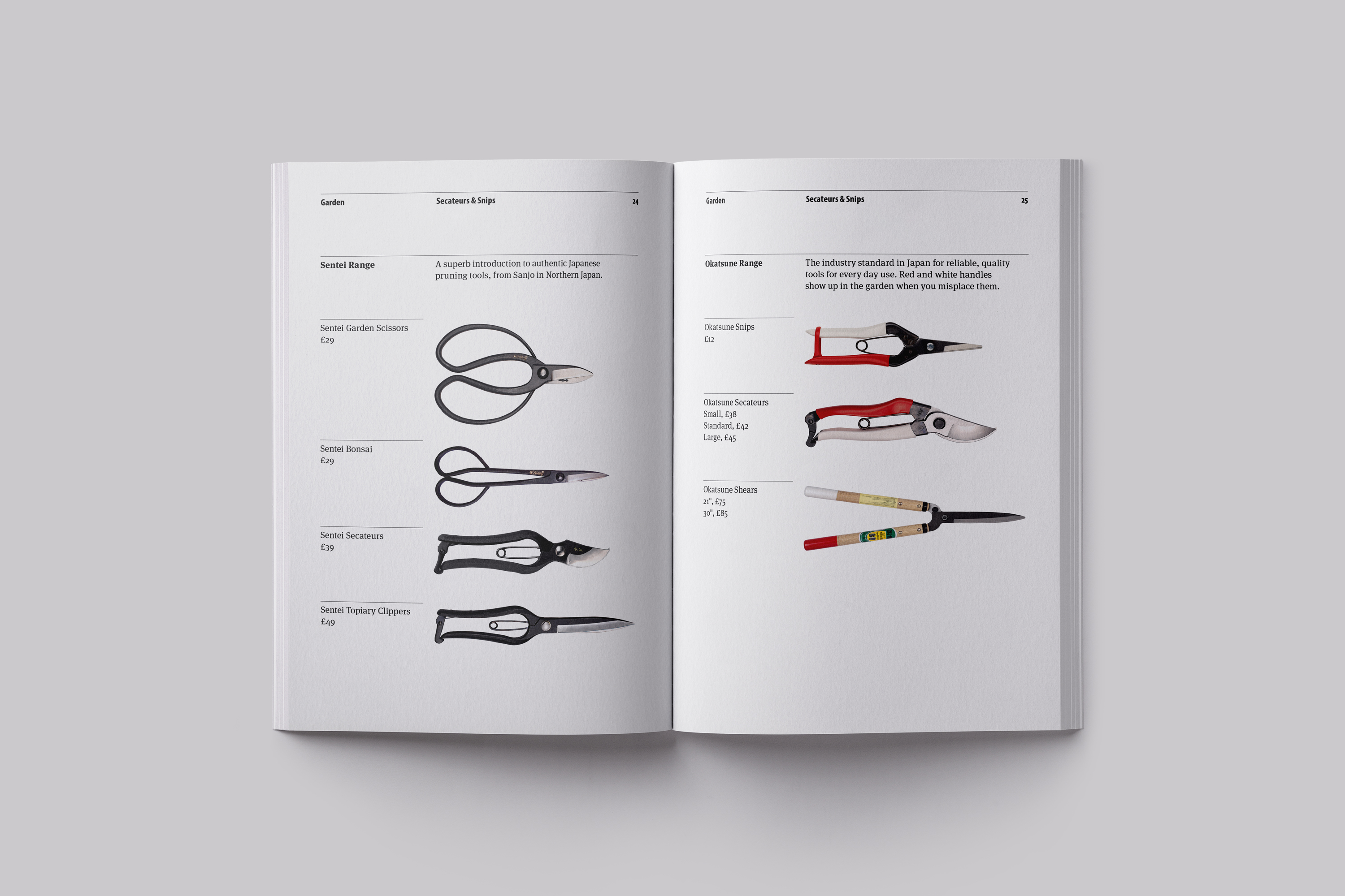
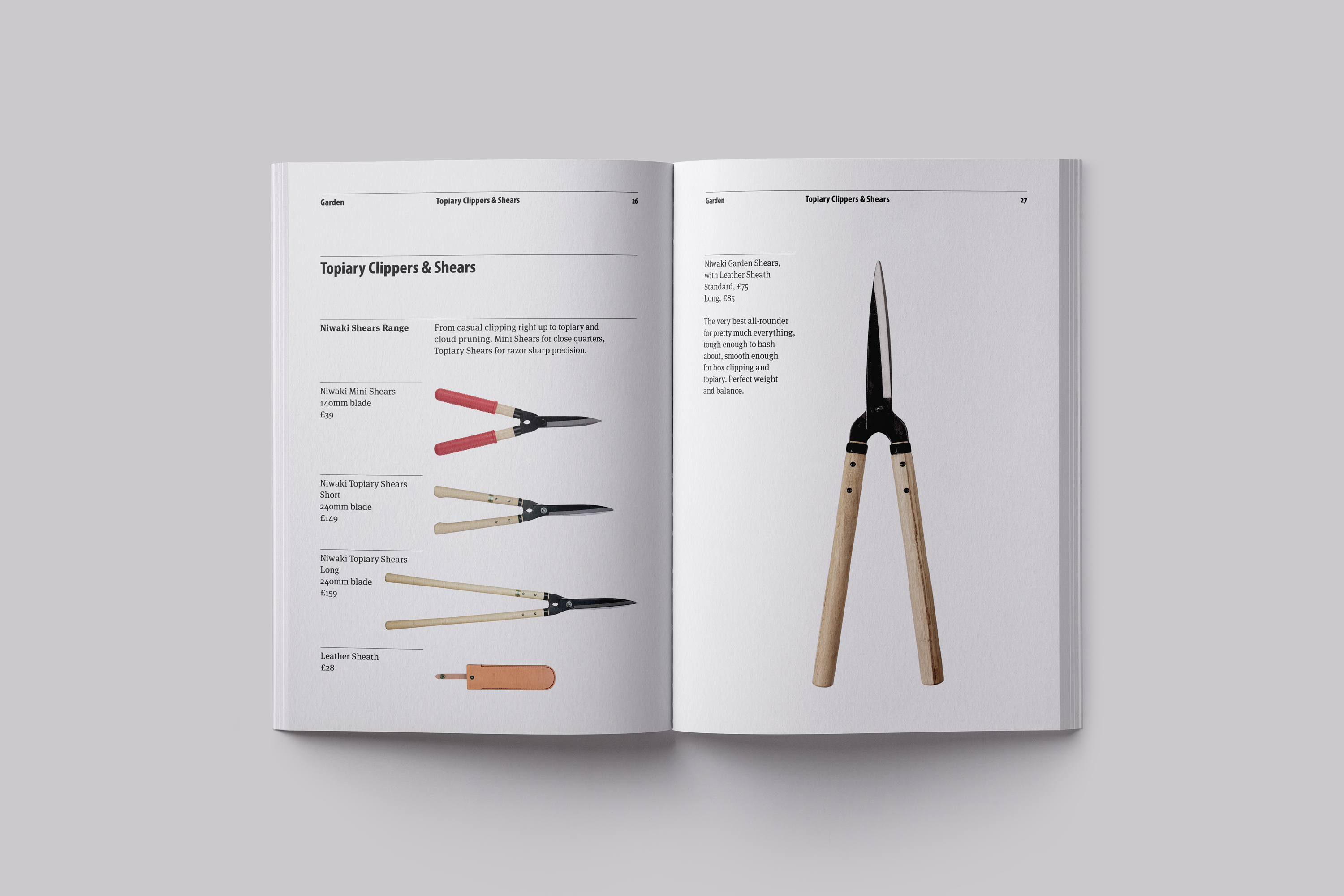
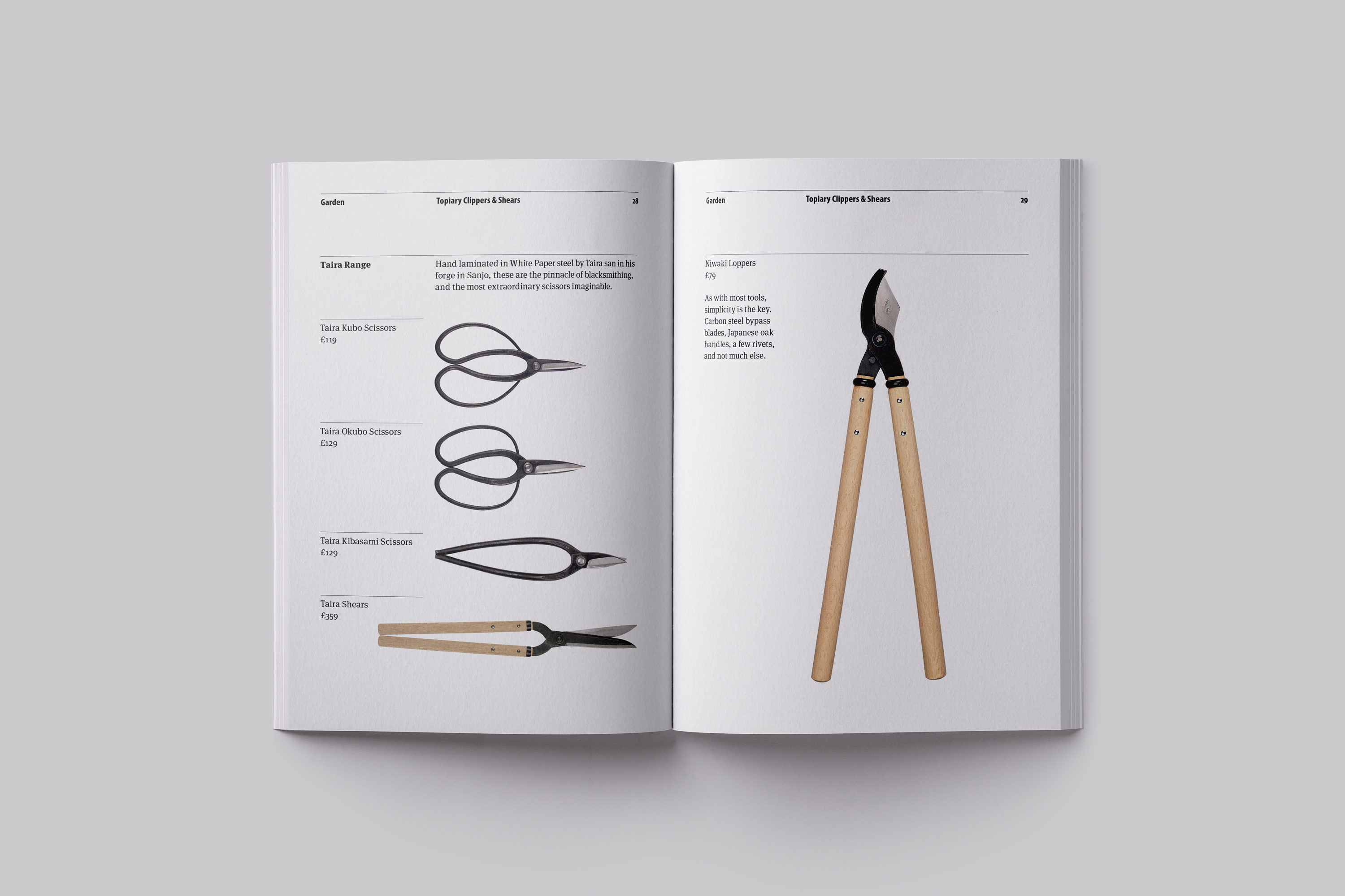
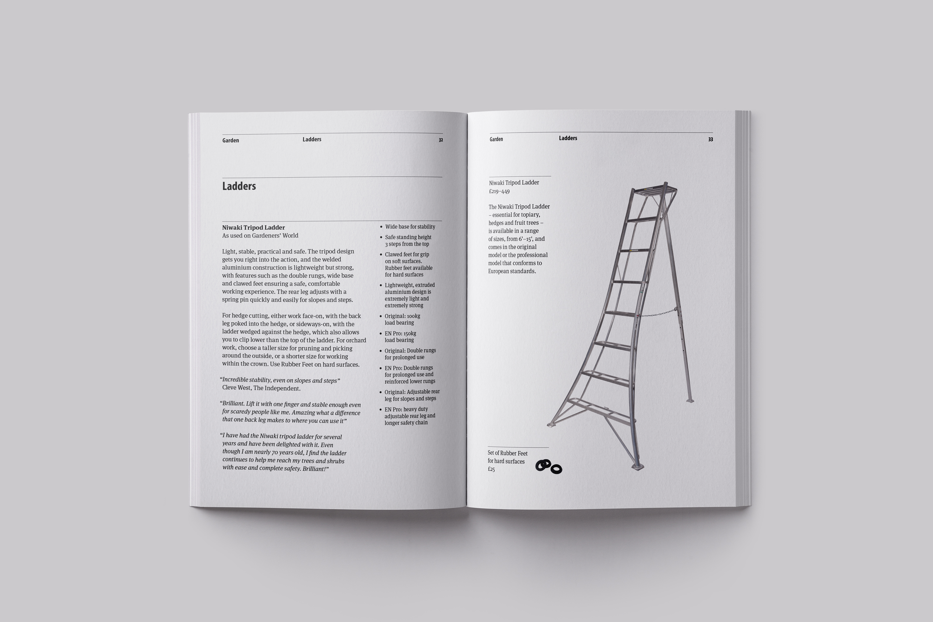
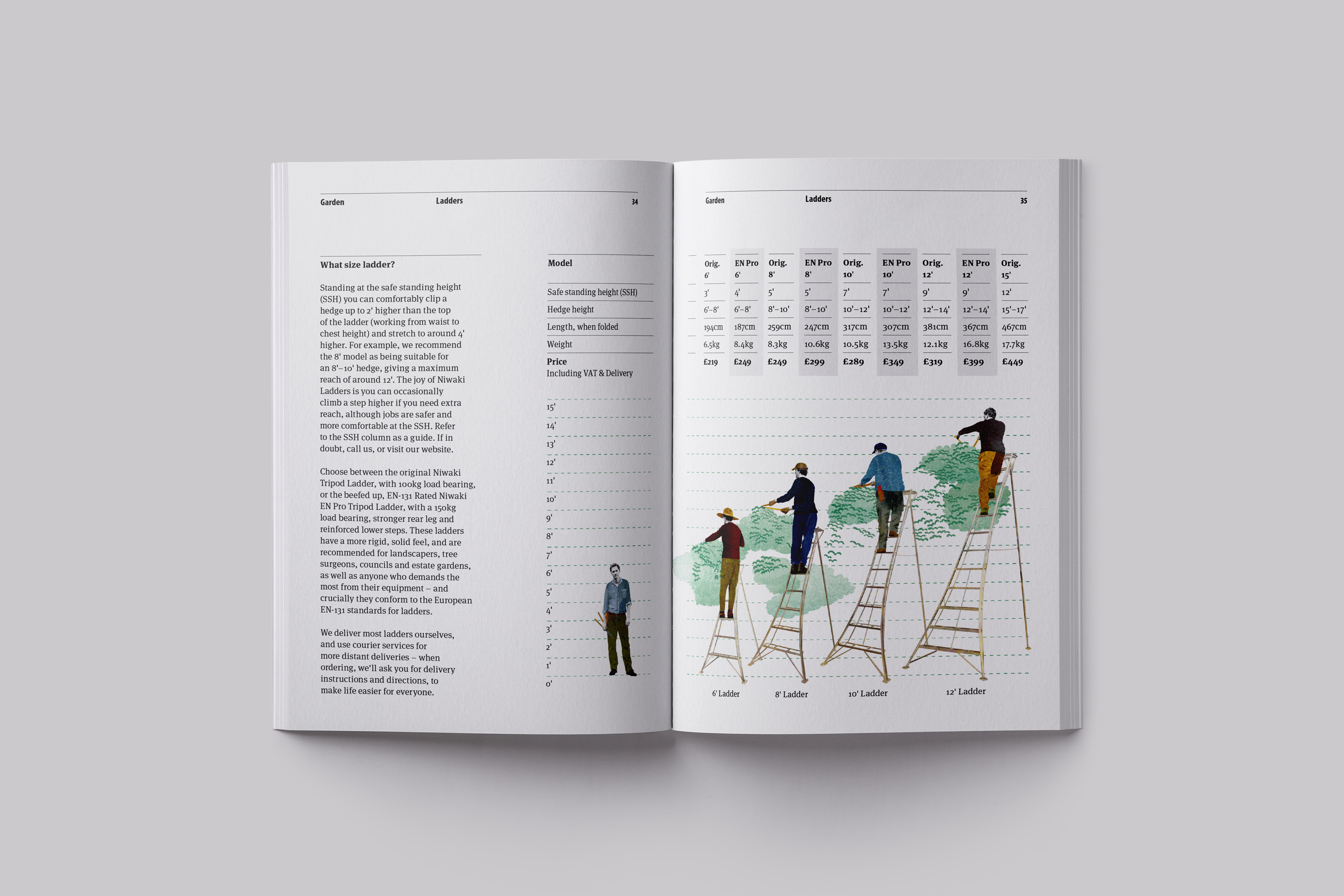
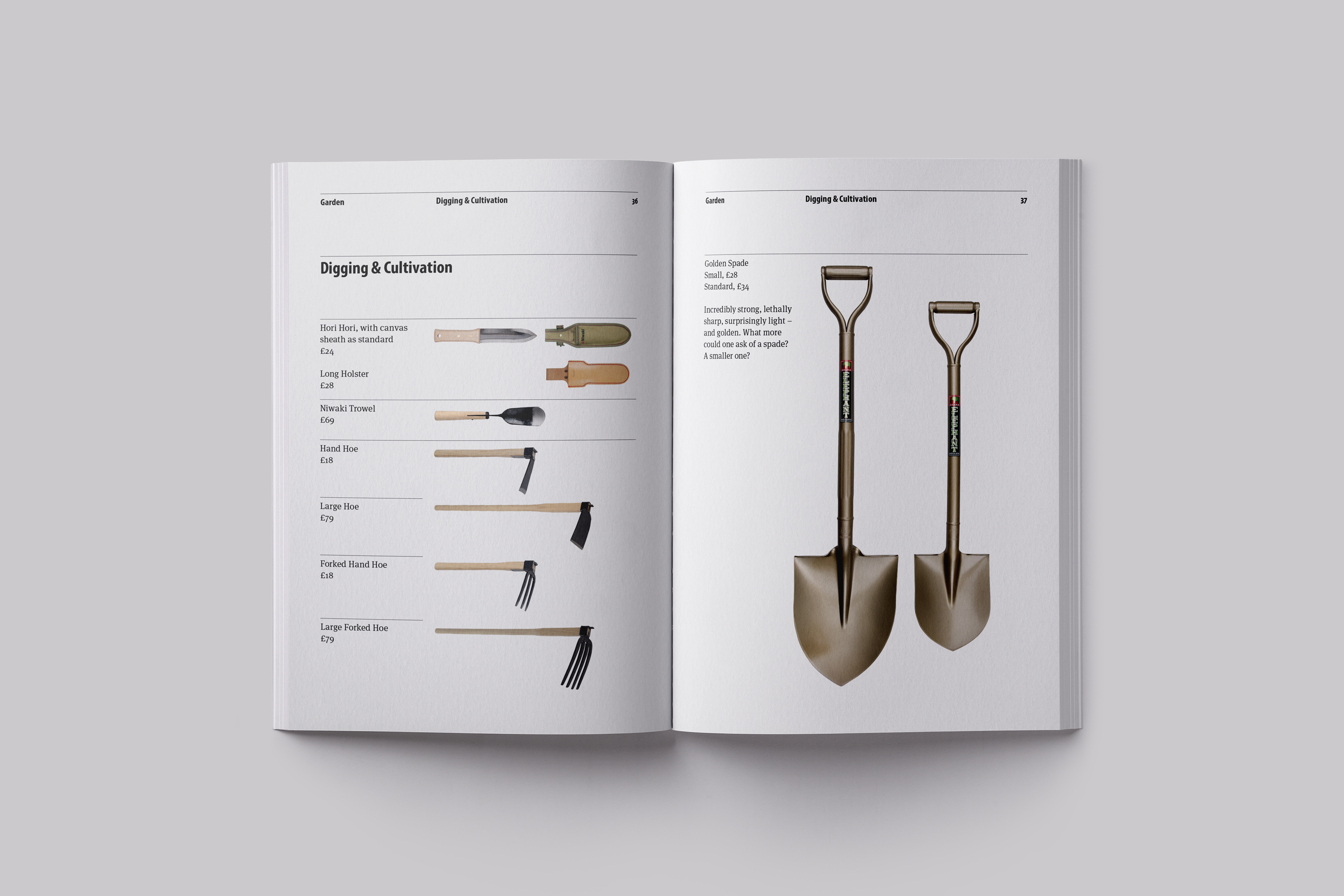
Products are presented at relative sizes, ordered by use and range. And key products are showcased larger to give hierarchy and create interest. This aids a feature led approach driven by Niwaki’s curatorial expertise and can be tailored for the seasons or other key highlights through the year.
Illustrations
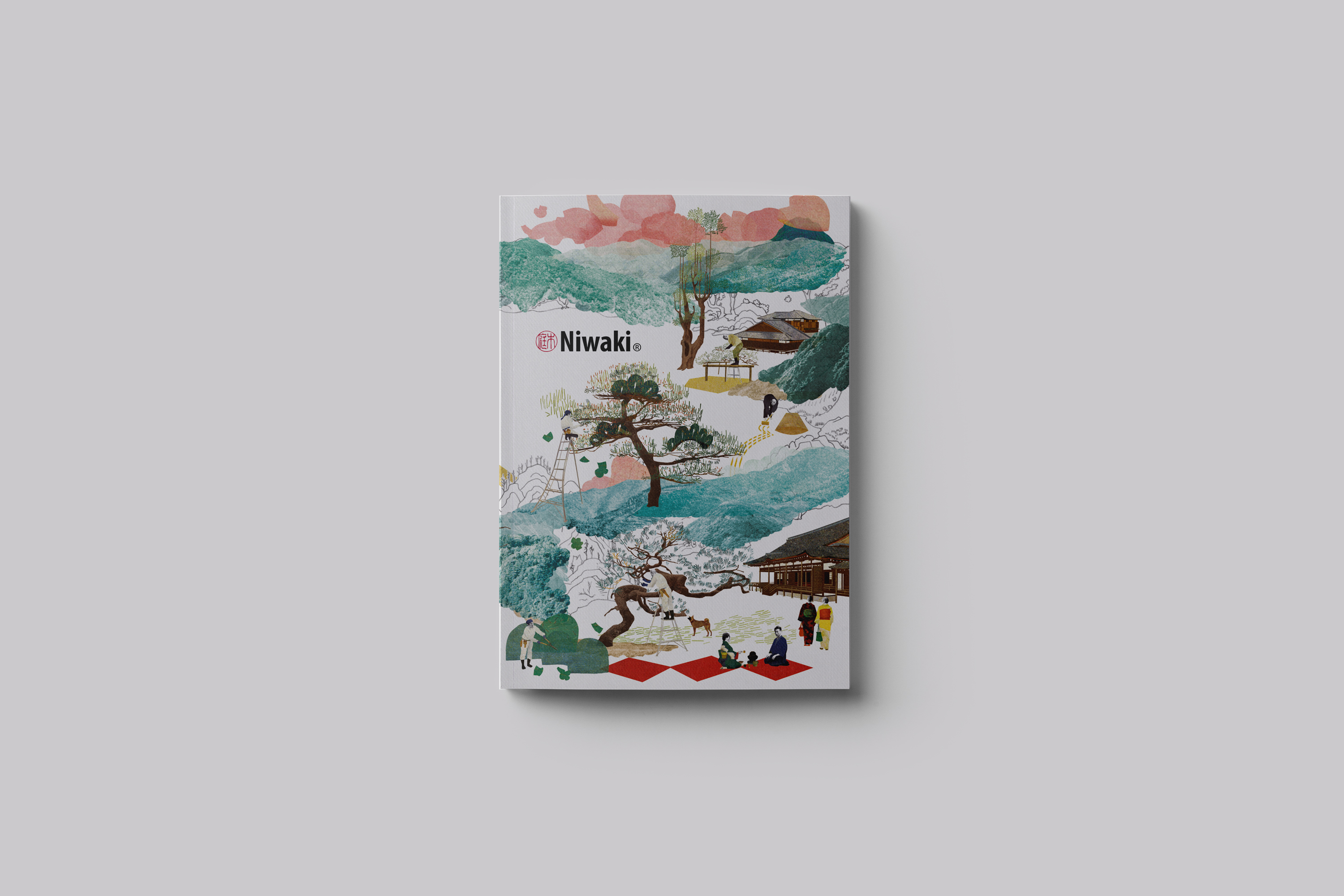
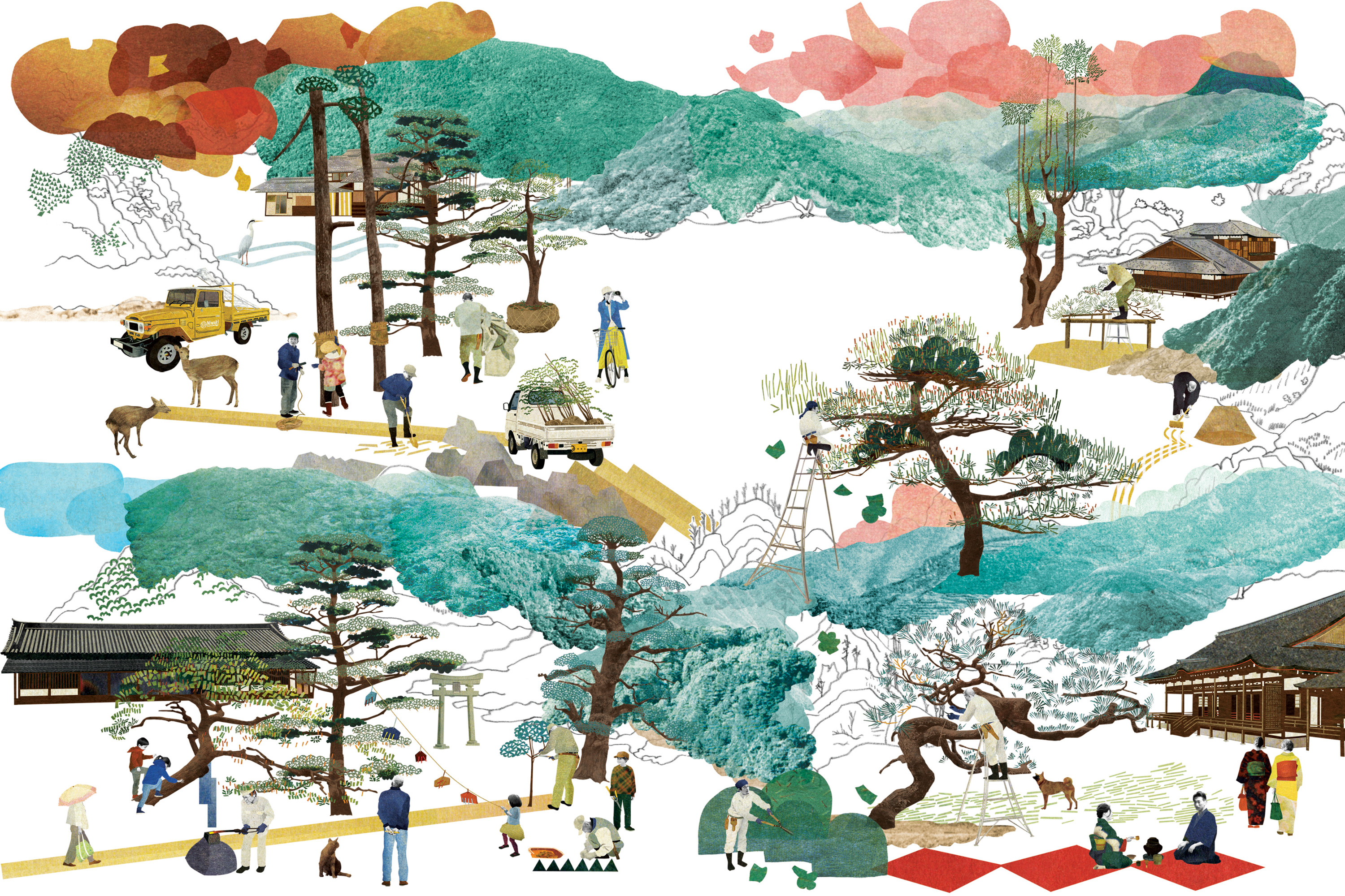
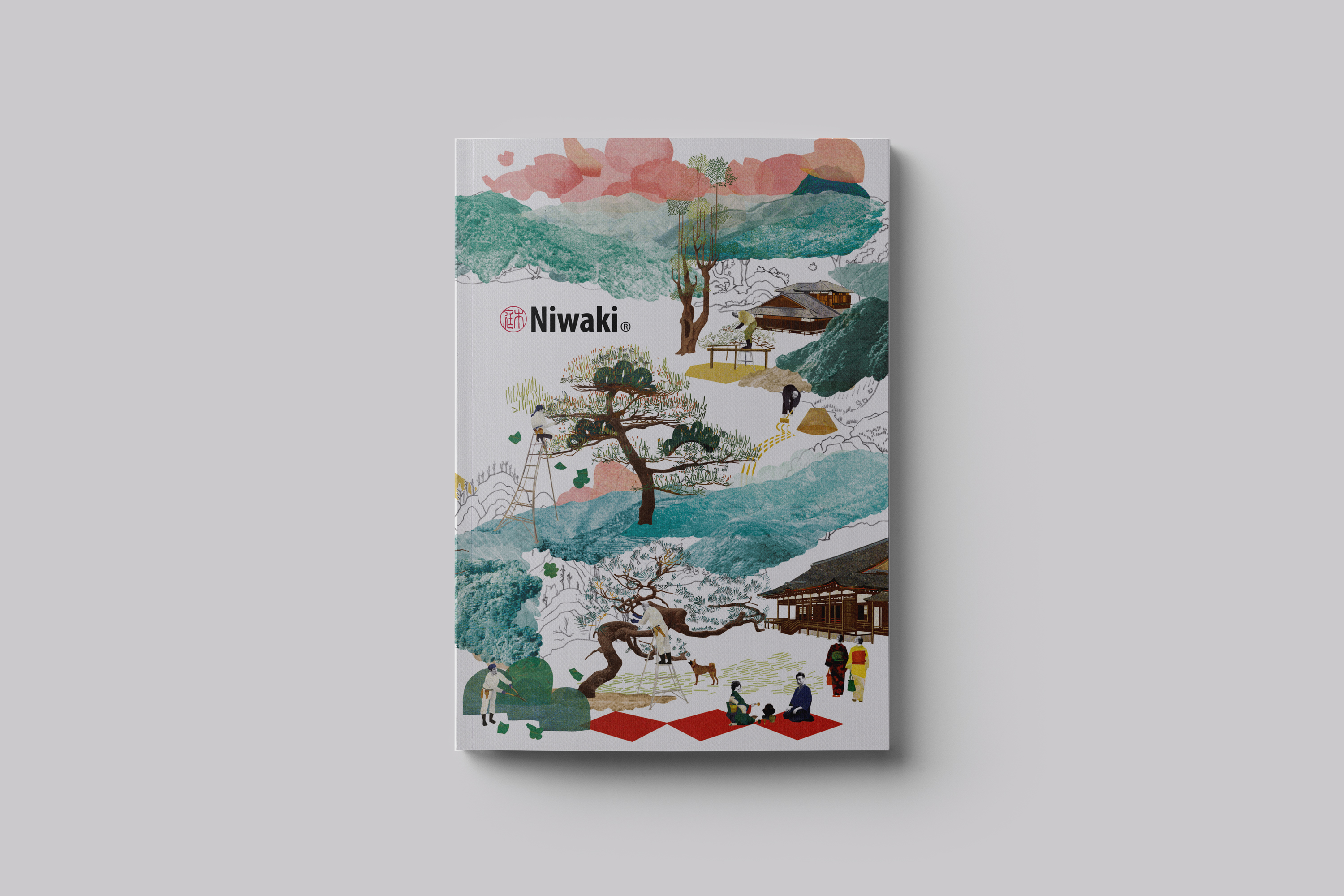
The aim with the illustrations for the publication was to bring a cohesive voice that could run through it. Japanese illustrator Natsko Seko was commissioned to create the cover illustration and spot illustrations to be used throughout on section breaks. With her individual style Natsko was able to bring something uniquely Japanese that was both creative and informative. Working with Natsko gave us creative freedom to work in a number of products into the editorial scene that she created.
Niwaki customer:
“I’m lucky enough to have received a Niwaki catalogue with a recent order. It’s a joy. Nice work.”

Services
Consultancy
Strategic Positioning
Catalogue Design
Art Direction
Project Management
Print Management
Related Projects