

Design of the communication and marketing materials for 2020 KCCUK Artist of the Year: Jewyo Rhii Love Your Depot, at the Korean Cultural Centre UK, in London.
Exhibition Communications and Materials
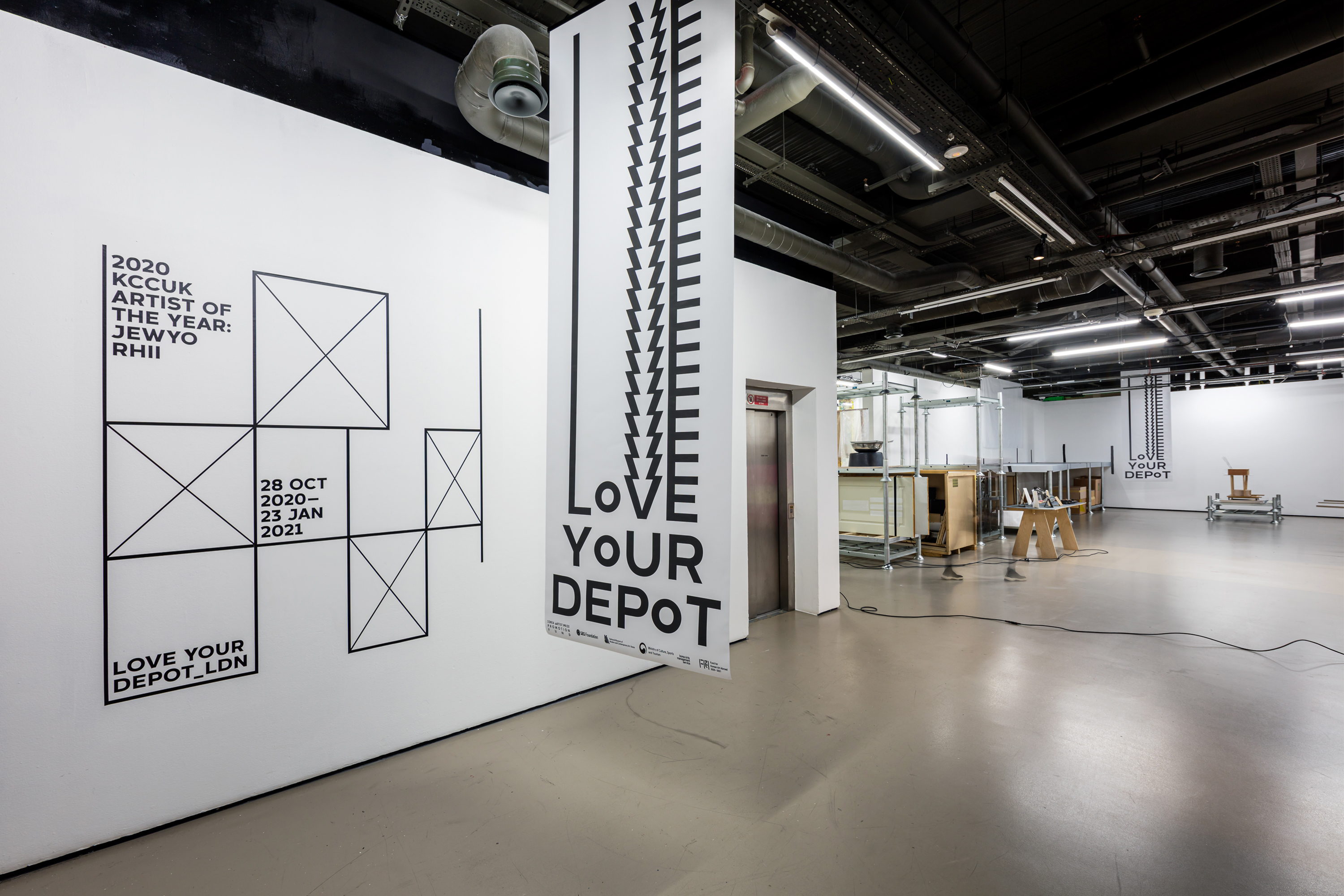
Background
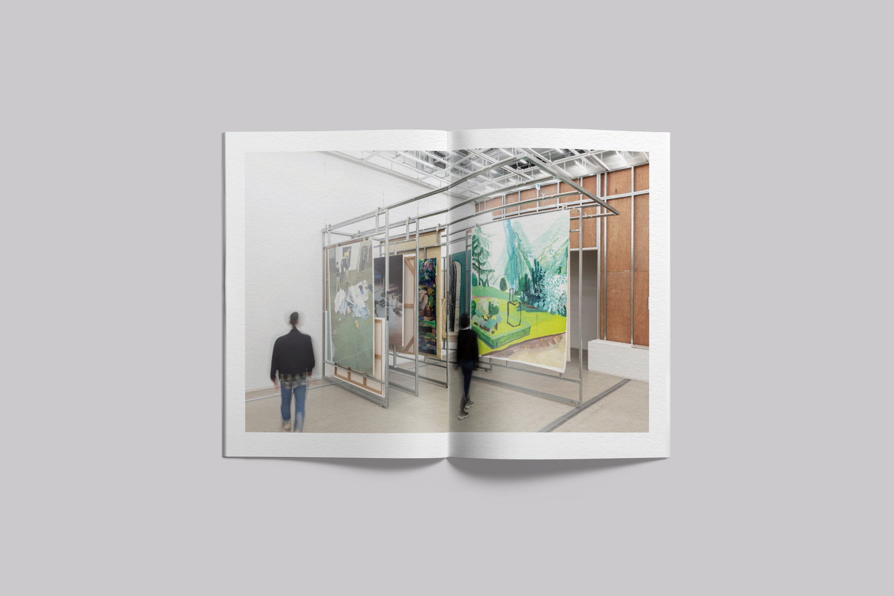
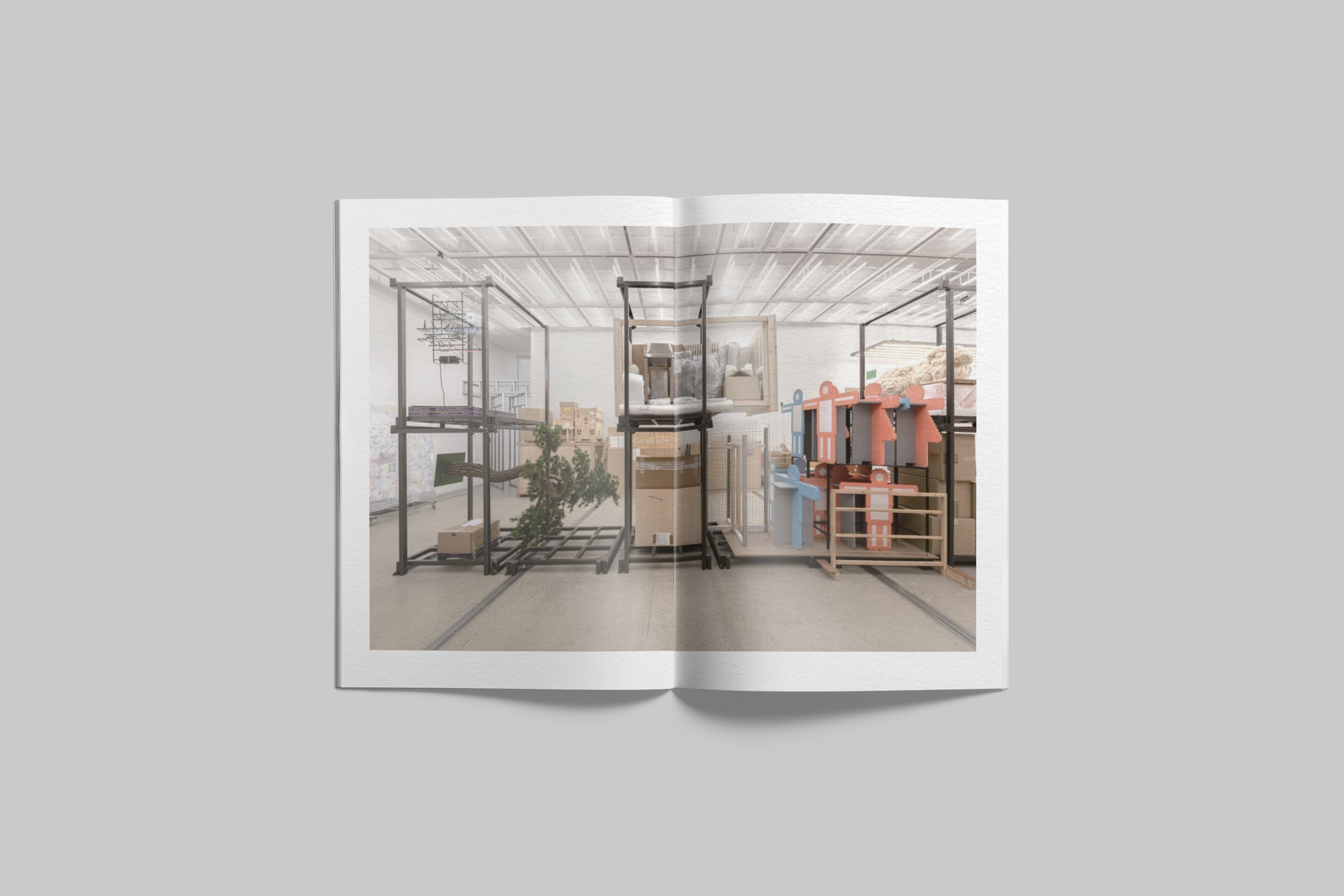
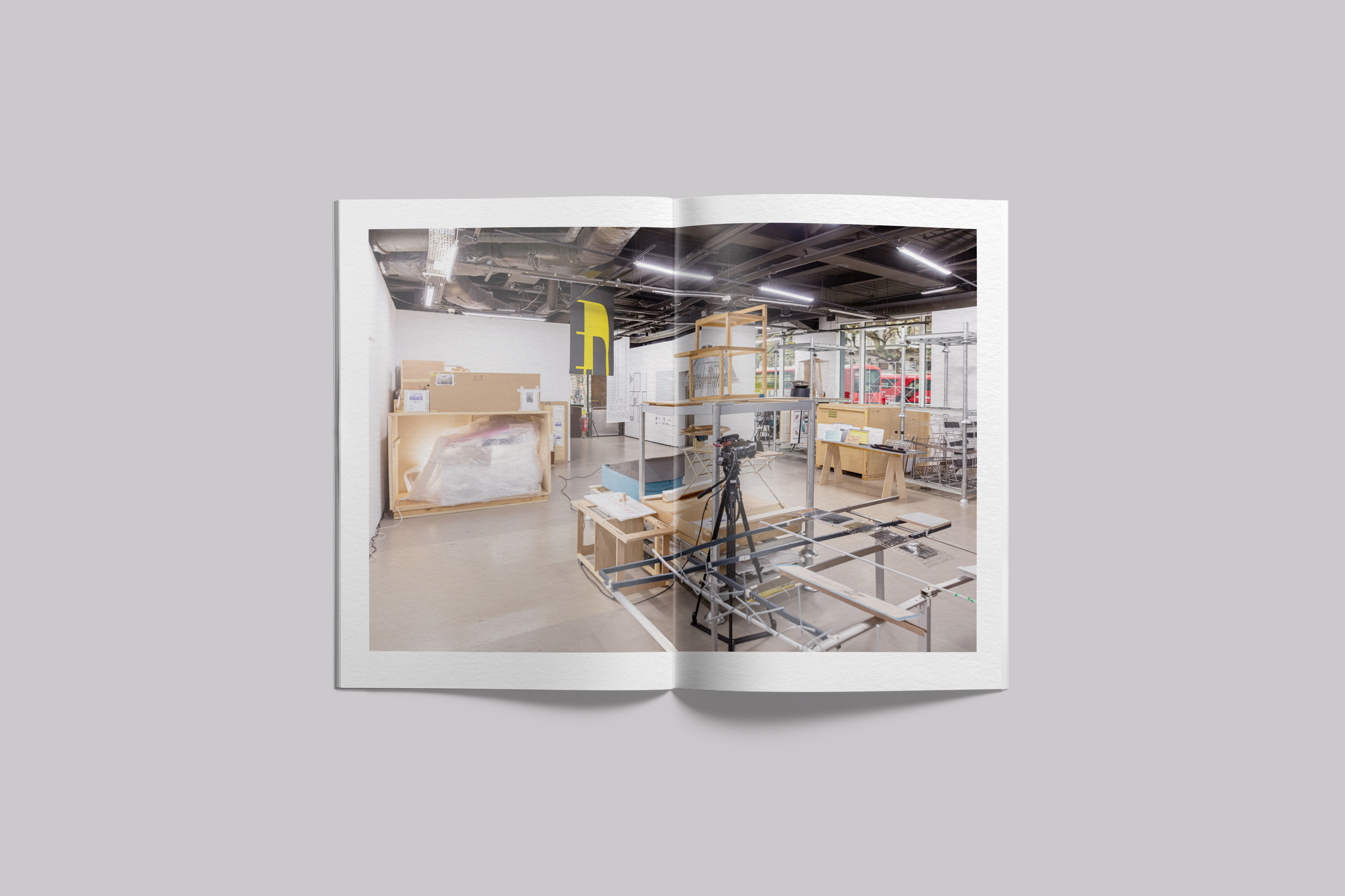
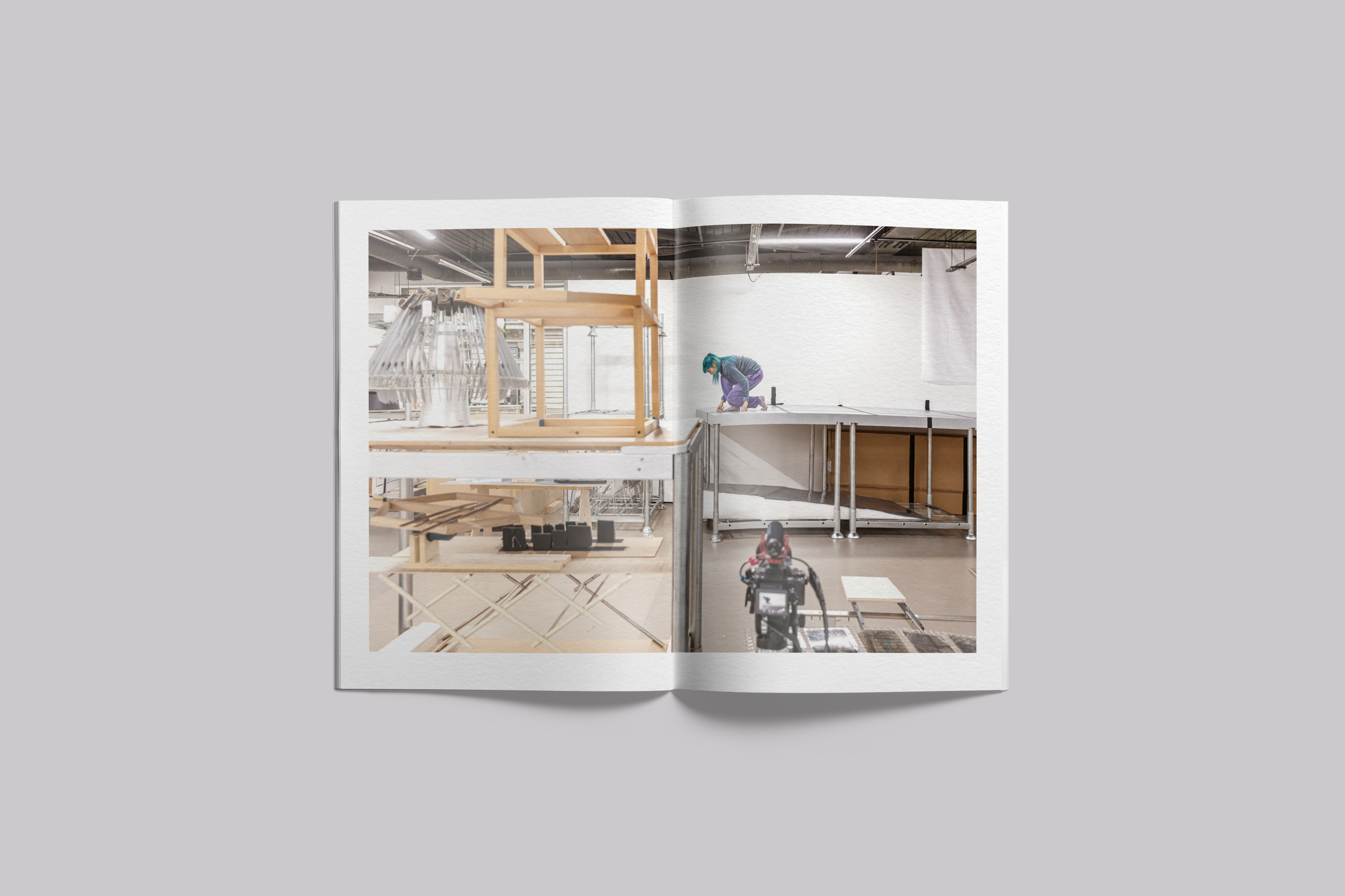
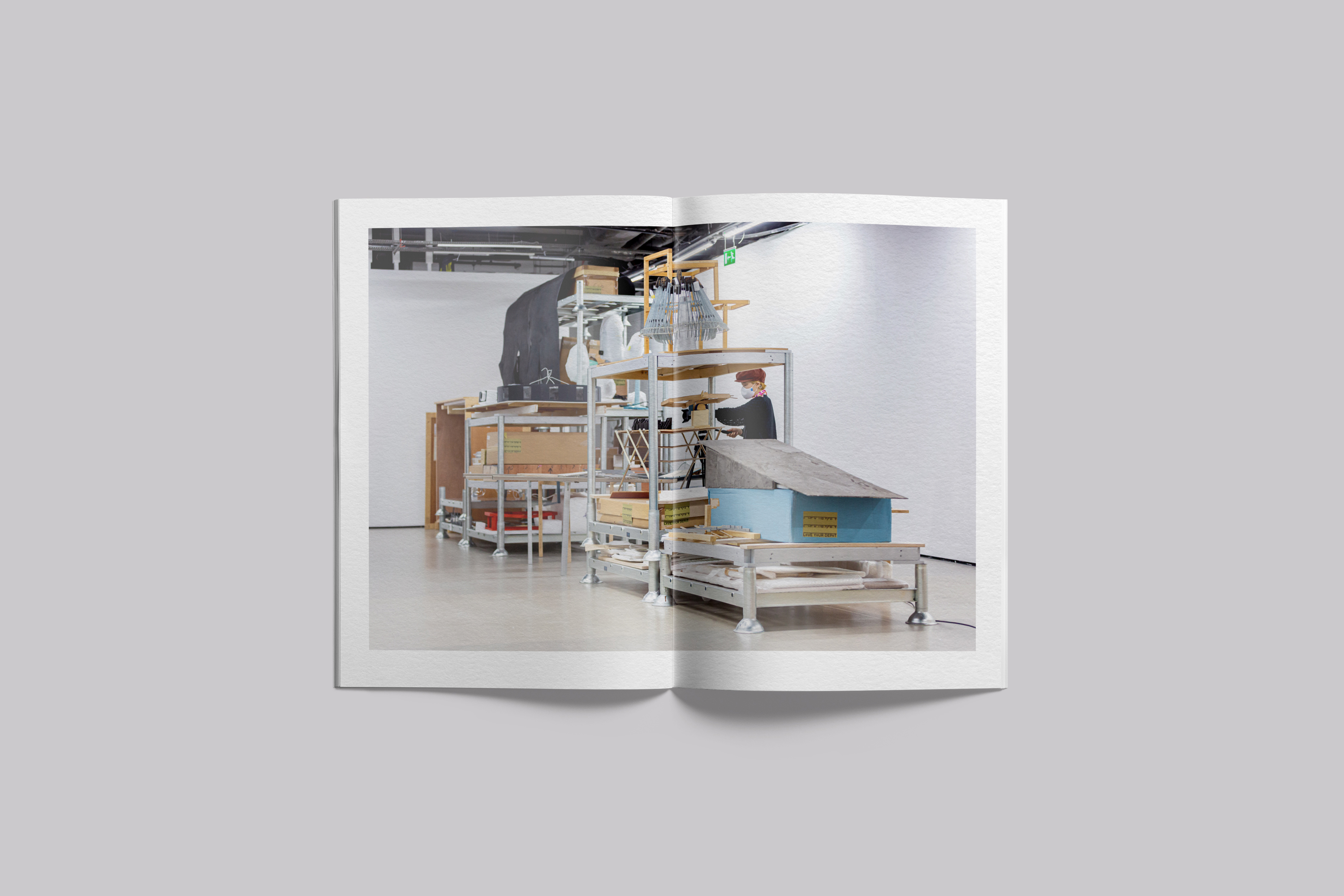
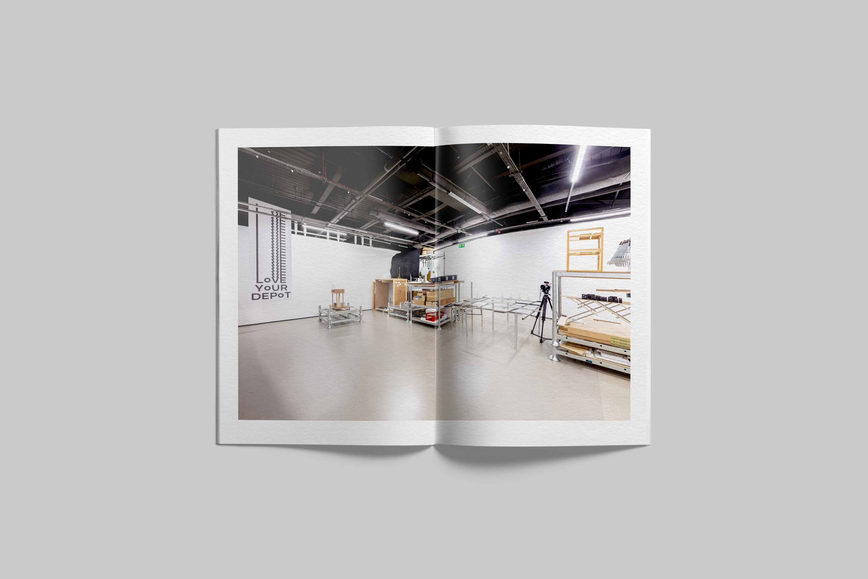
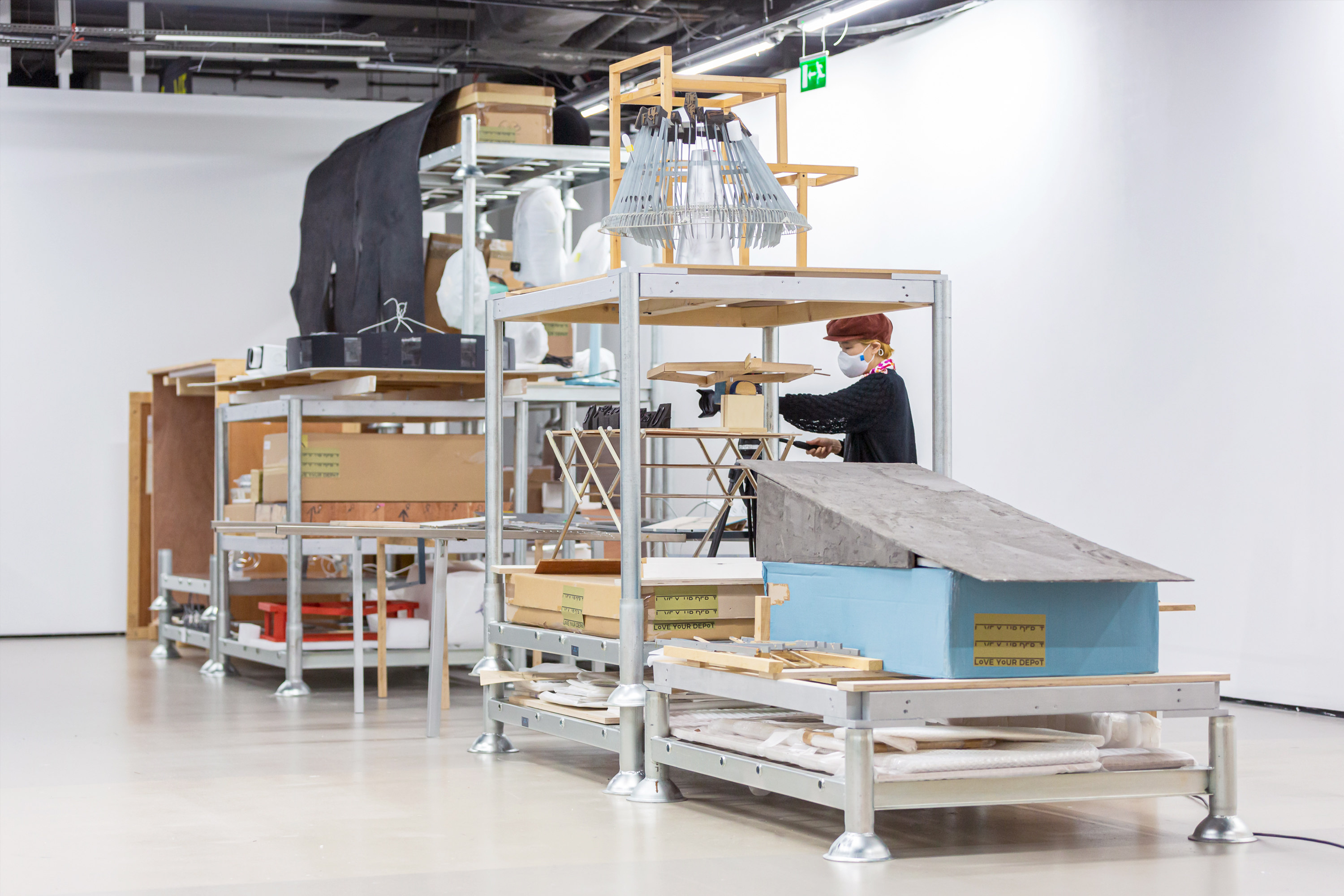
The exhibition at the Korean Cultural Centre UK (KCCUK) has been reconstituted into a multi-purpose, multi-dimensional presentation, showcasing a combination of a physical storage space for artworks and a workspace for creative activities. Modular steel structures are aligned in a way that surrounds the central exhibition space, reminiscing the formation often seen in an industrial warehouse.
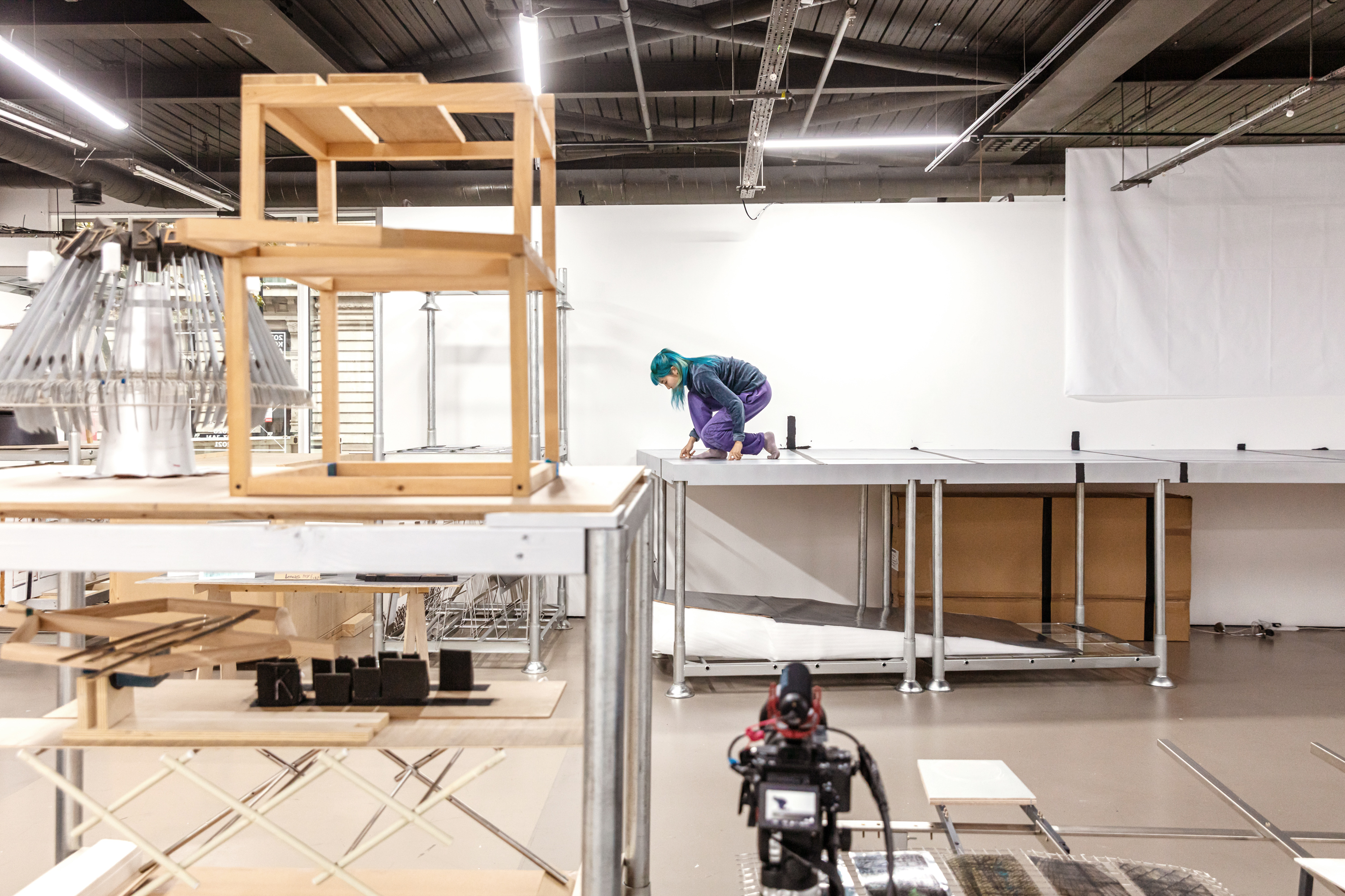
Designed as a prototype storage space for the artist’s work, Love Your Depot_LDN acts as an experimental system which belies the conventional norms of an archive by both housing and exhibiting artworks within a single compounded space.
Here, Rhii disrupts the traditional art world cycle by proposing a new lifespan for works of art beyond museum cabinets and archives. Foregrounding the intersections between public and private spaces and those liminal spaces which lie between the two, Rhii’s work exposes what often remains hidden behind gallery walls.
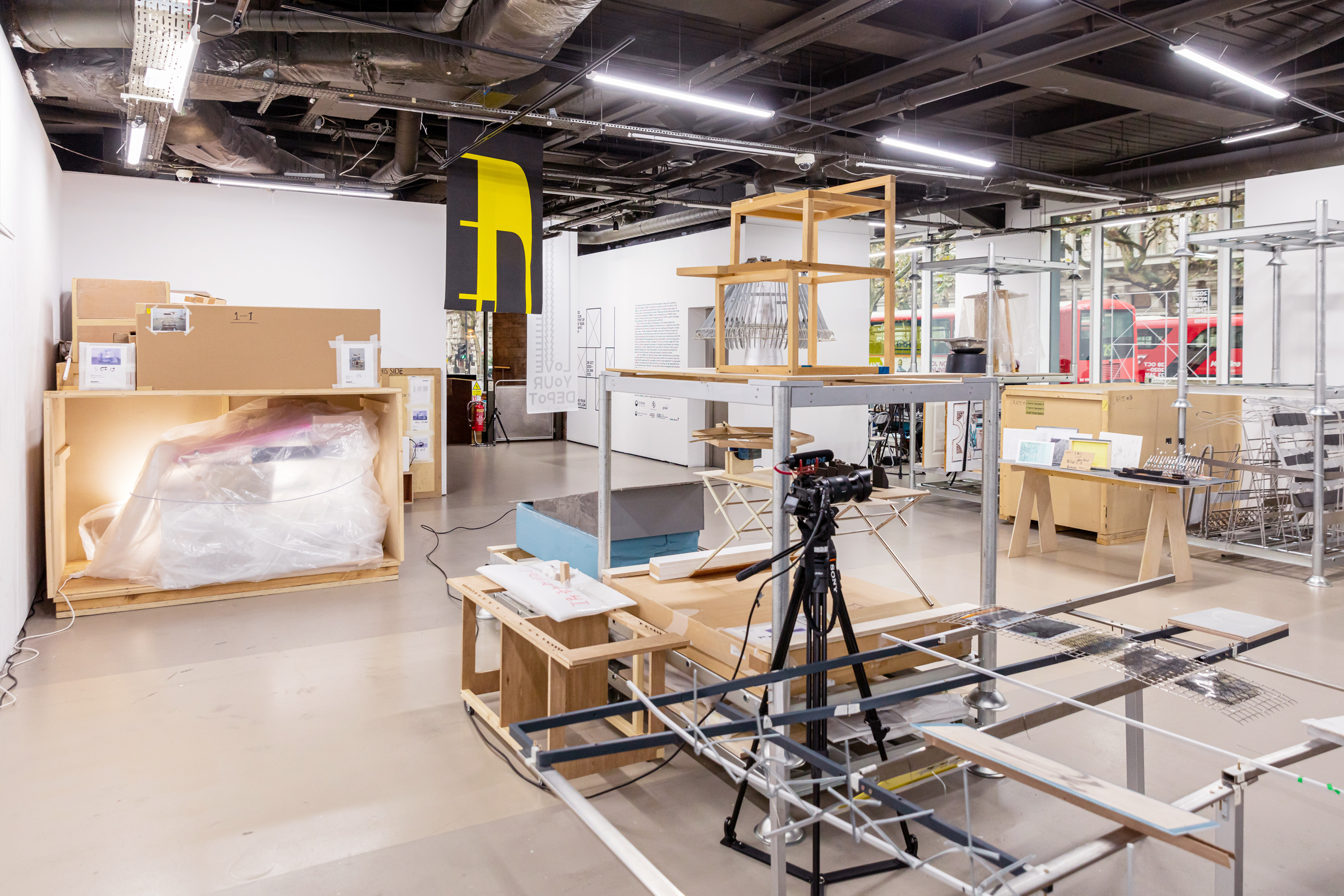
Design Creative
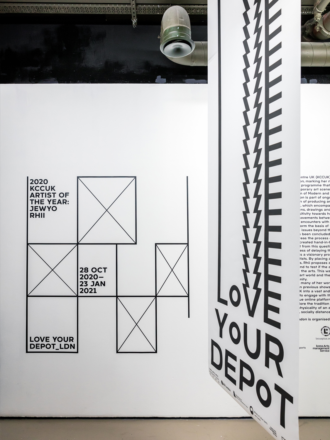
The ambition of the design approach was to subtly reference the conceptual orientations of the exhibition. Particular consideration has been given to the way in which Rhii has created a framework—both physically and conceptually—by which she facilitates a reimagining of what it means to be creating and exhibiting art in the 21st century.
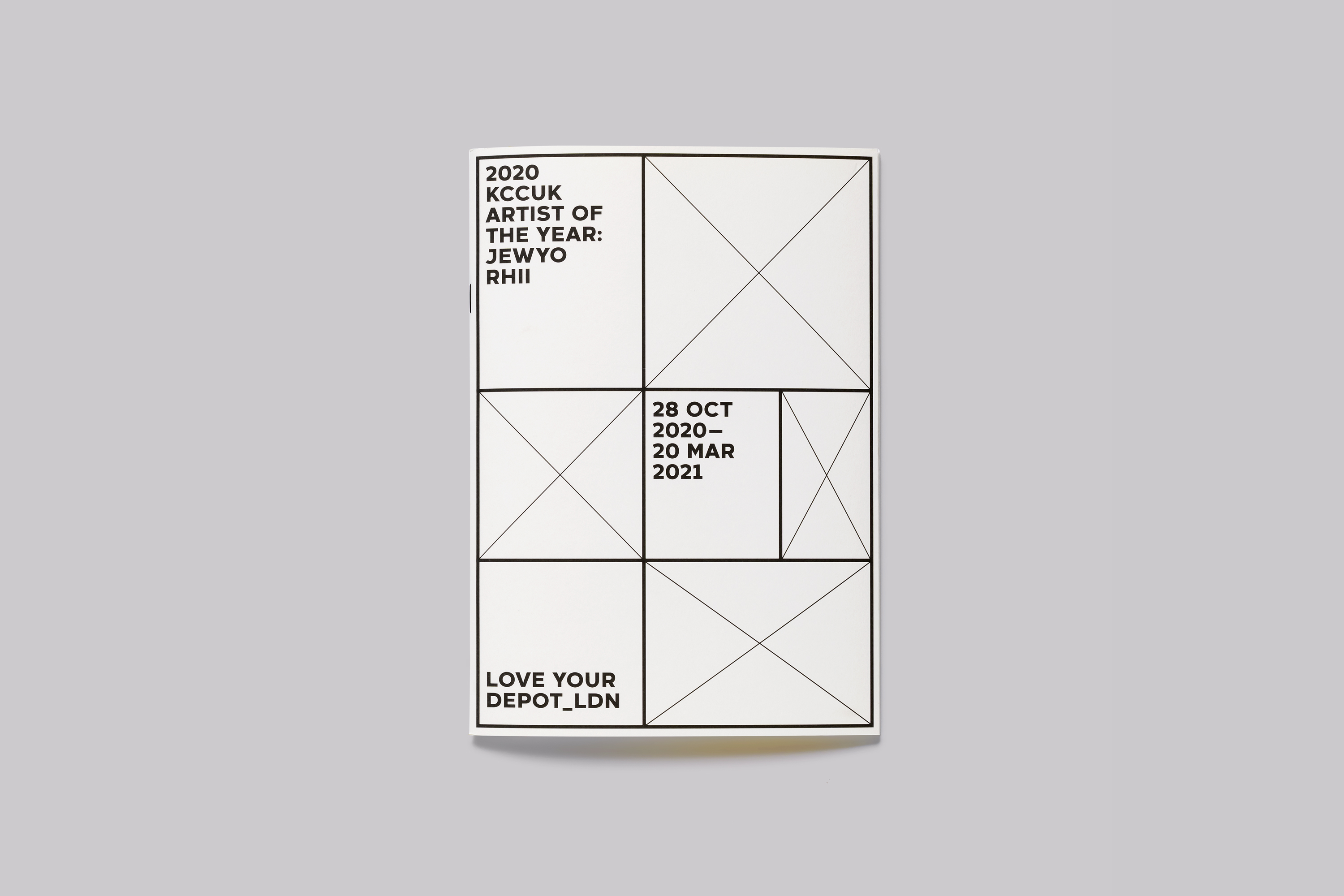
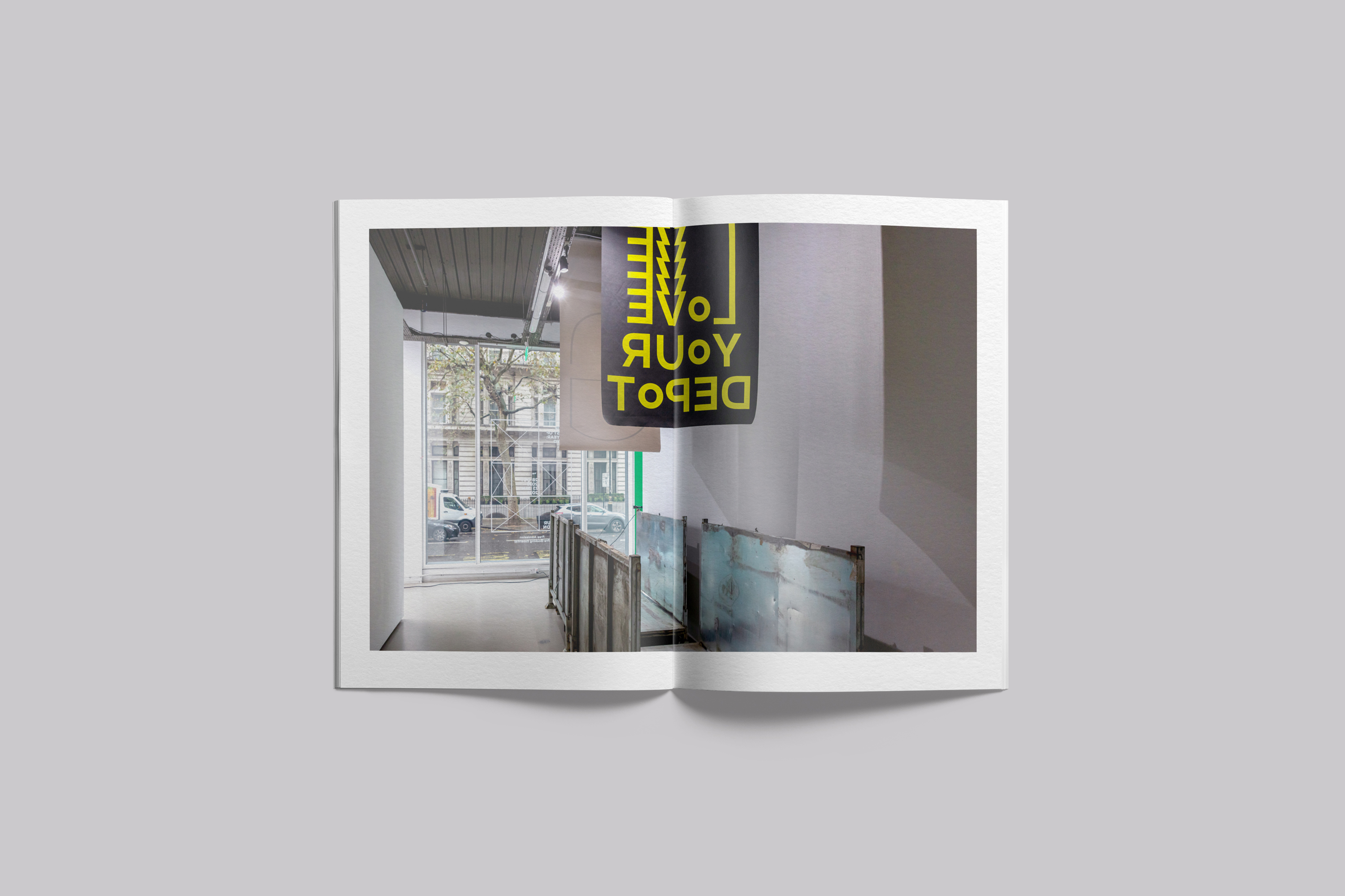
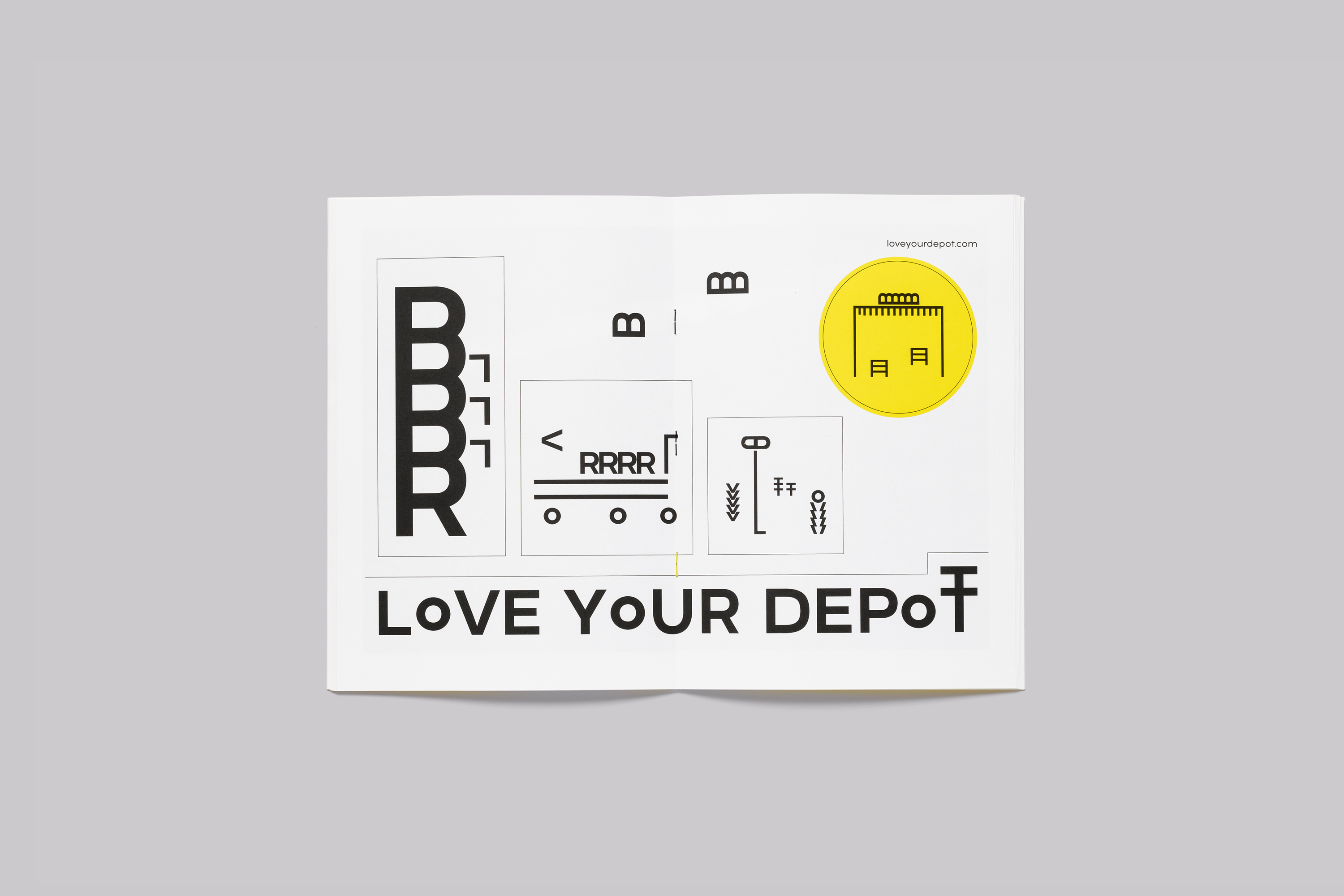
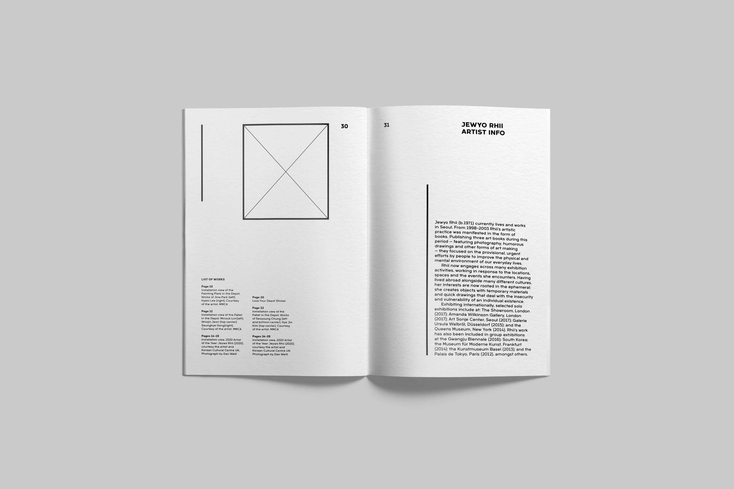
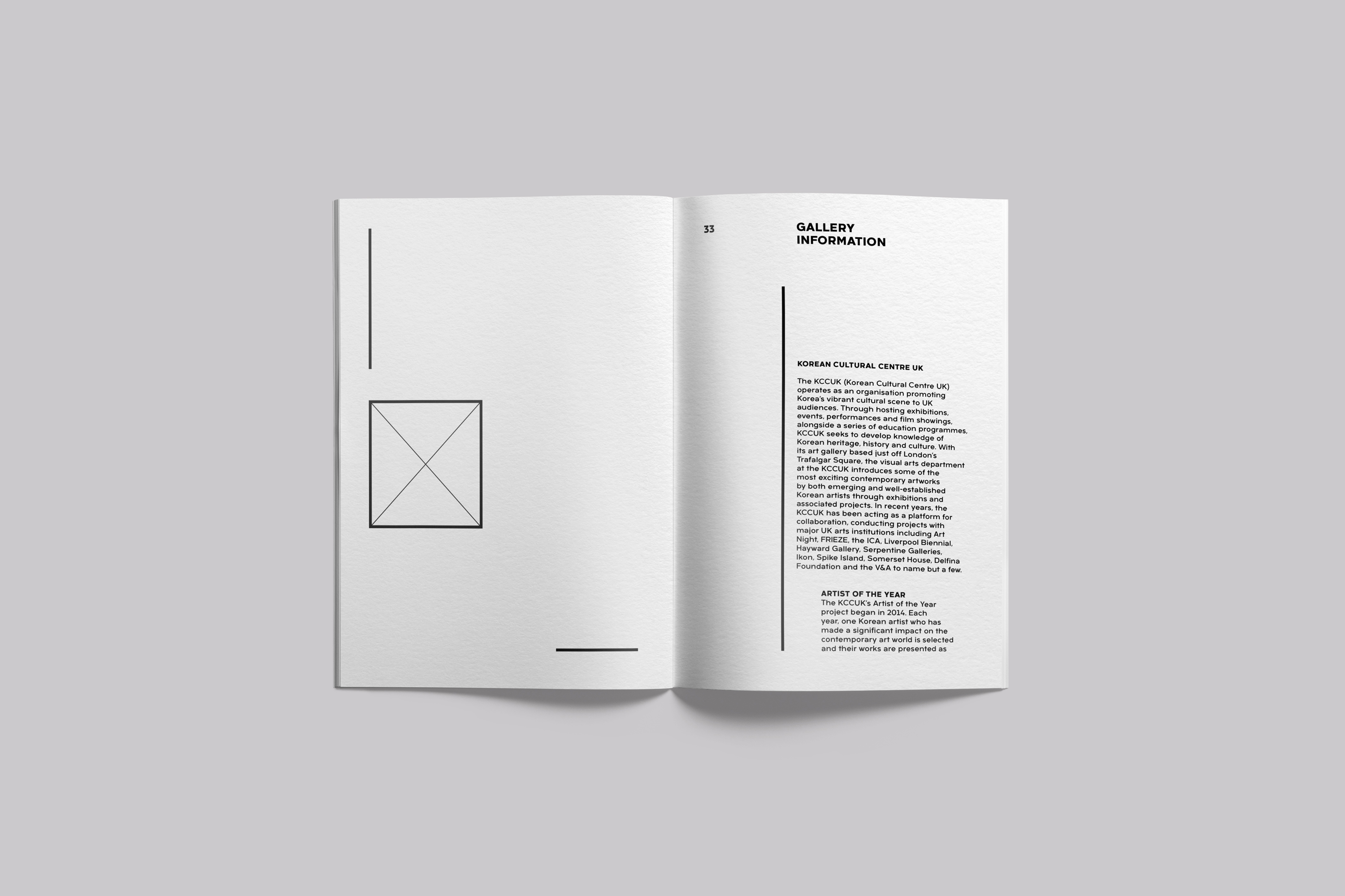
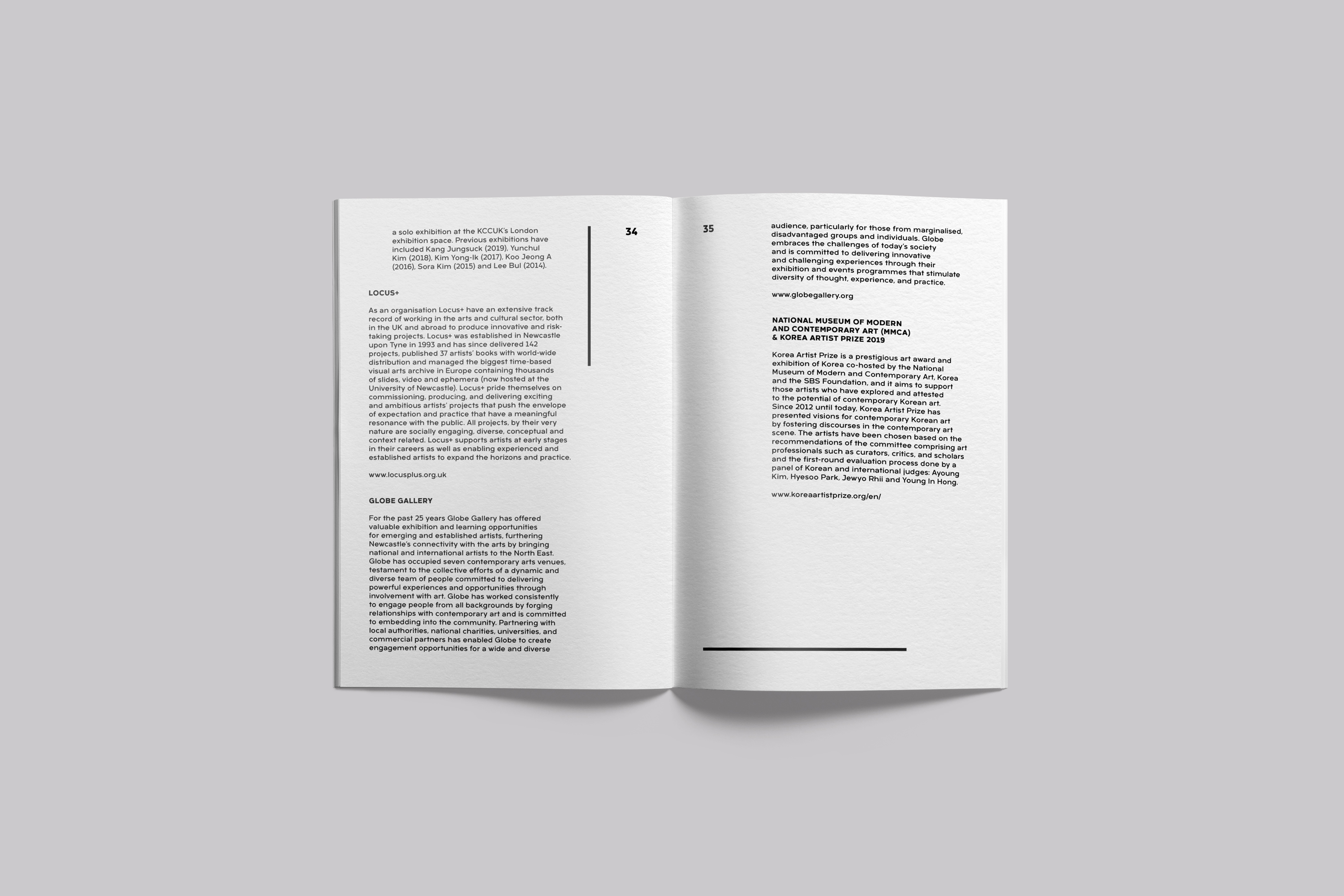
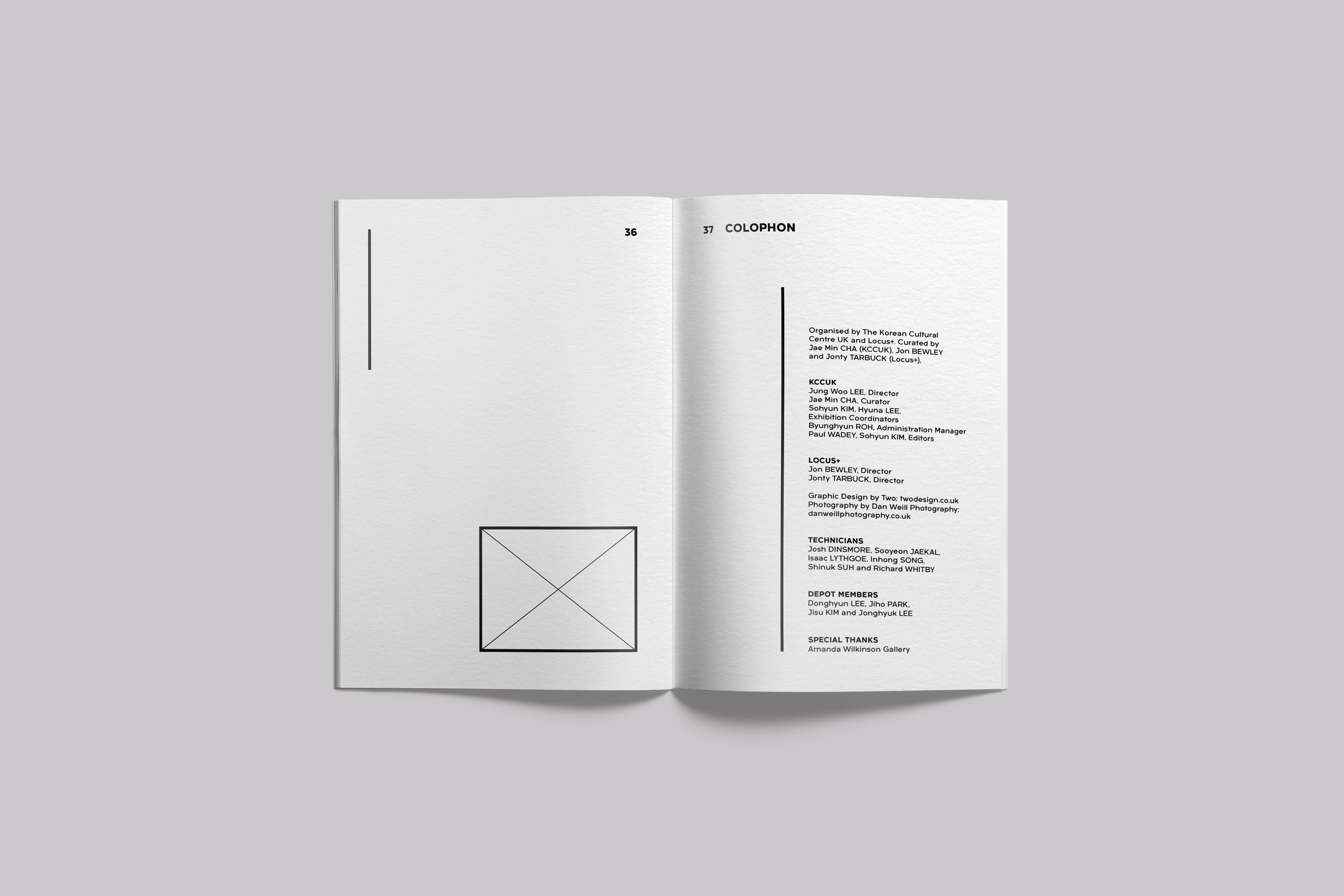
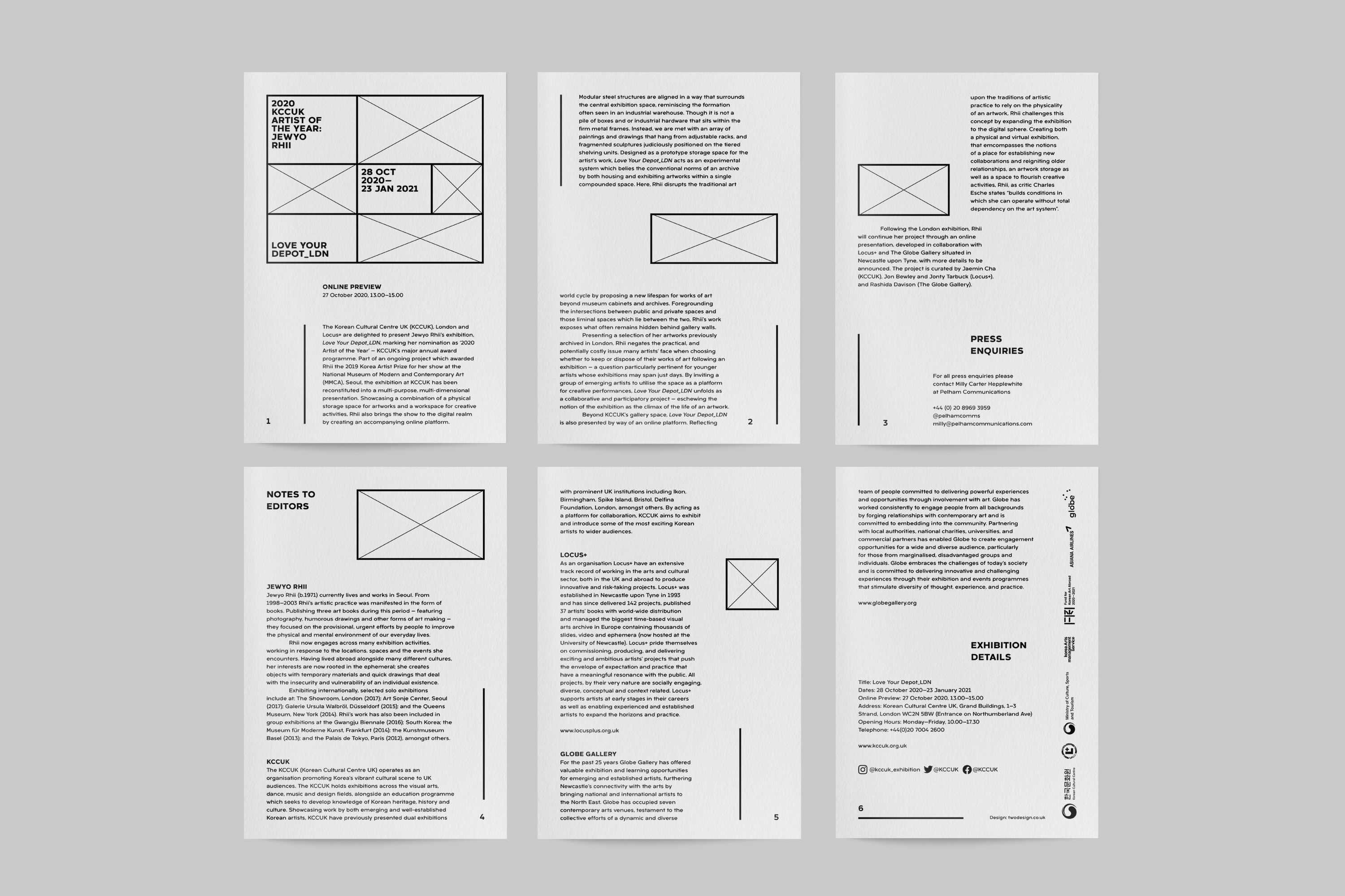
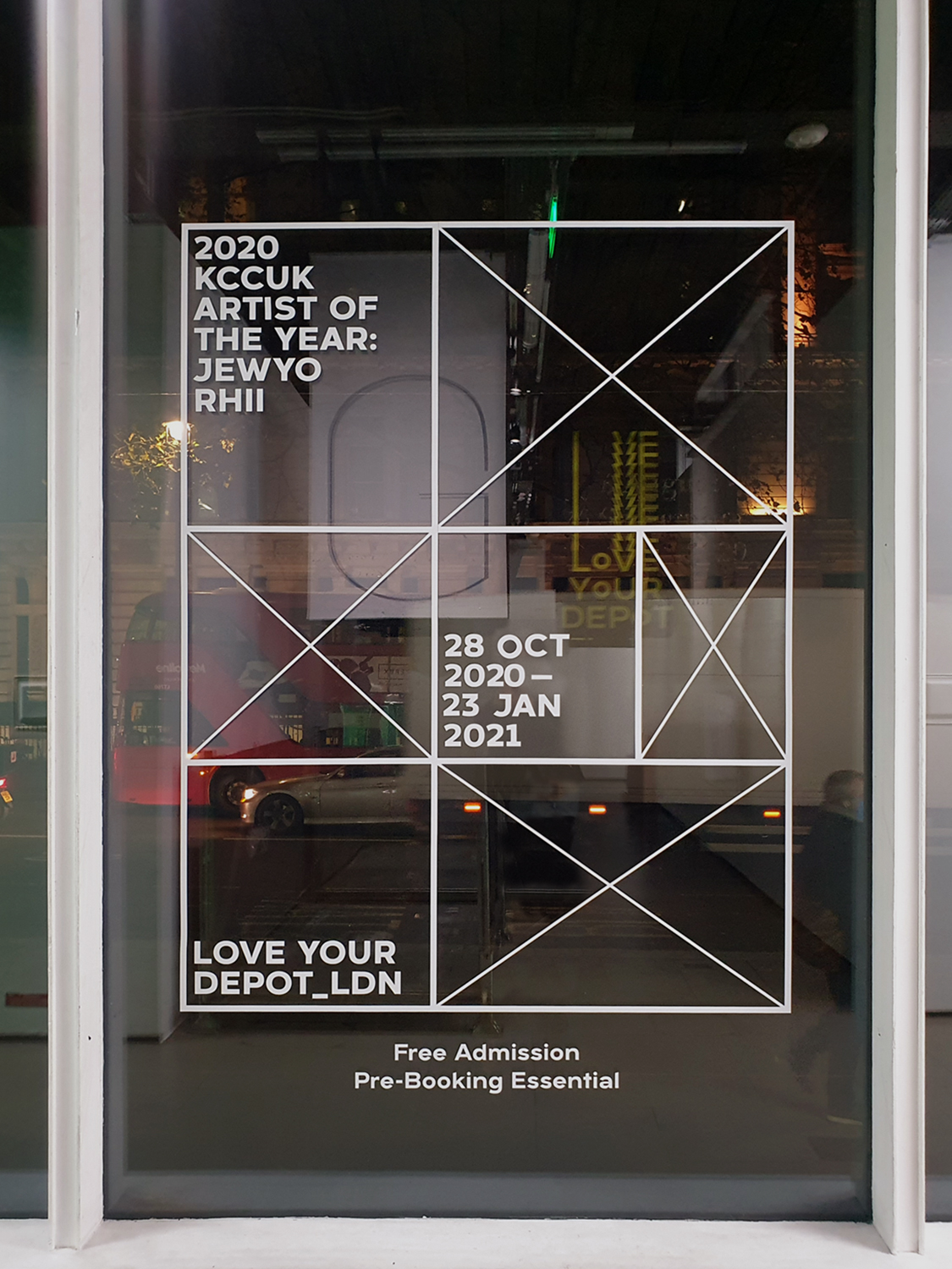
Our response to this framework—to the modular, the collaborative and the democratic nature of the installation—is with a typographic system that, through a graphic framework, defines, rearranges and reconstitutes the graphic space.
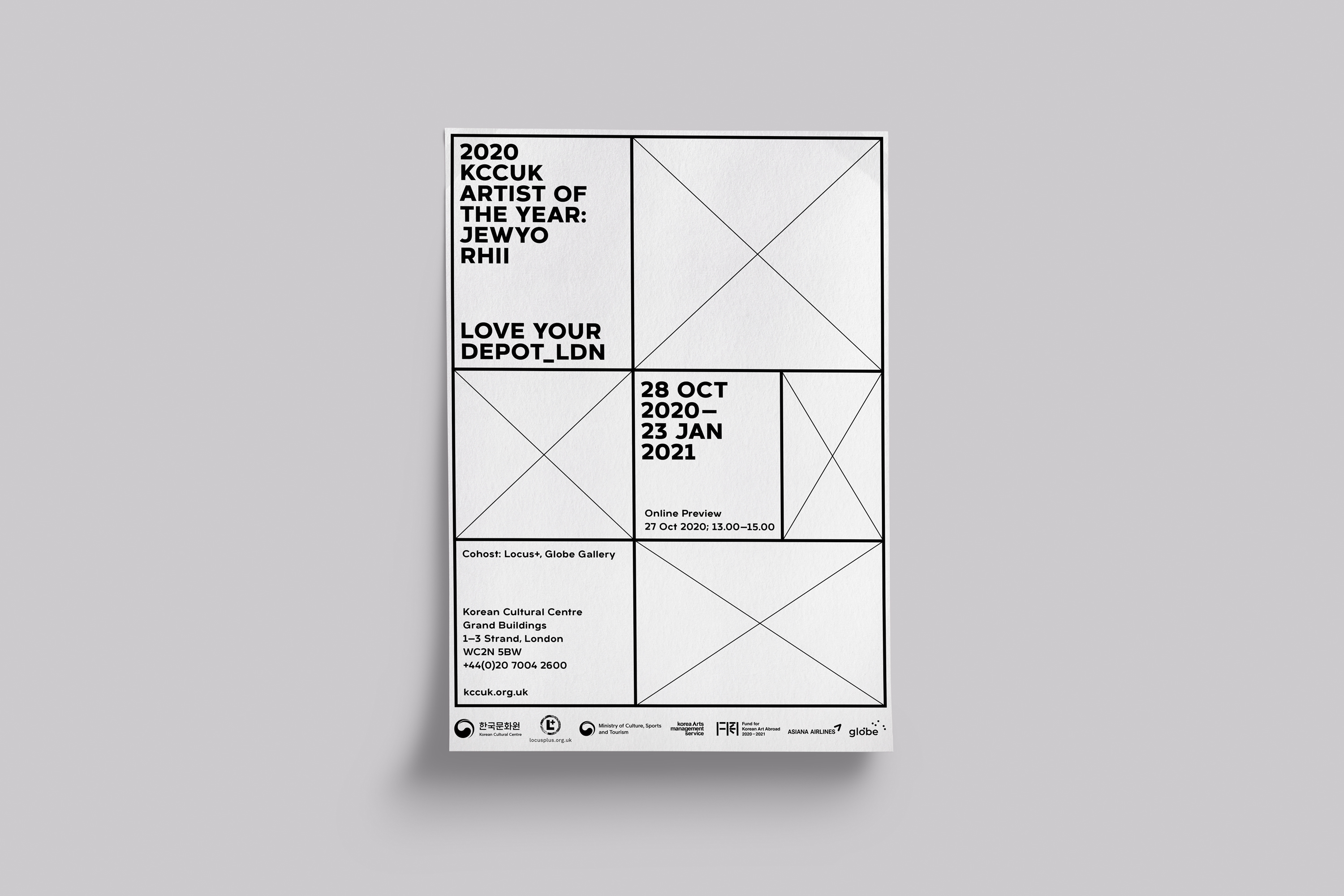
Typeface
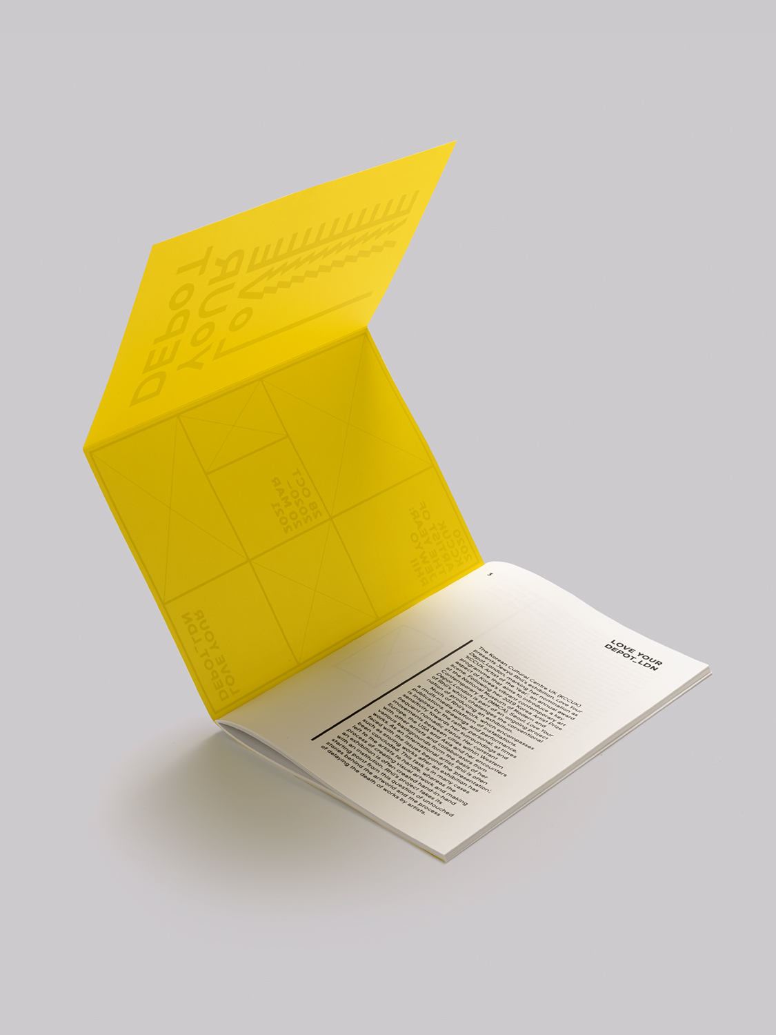
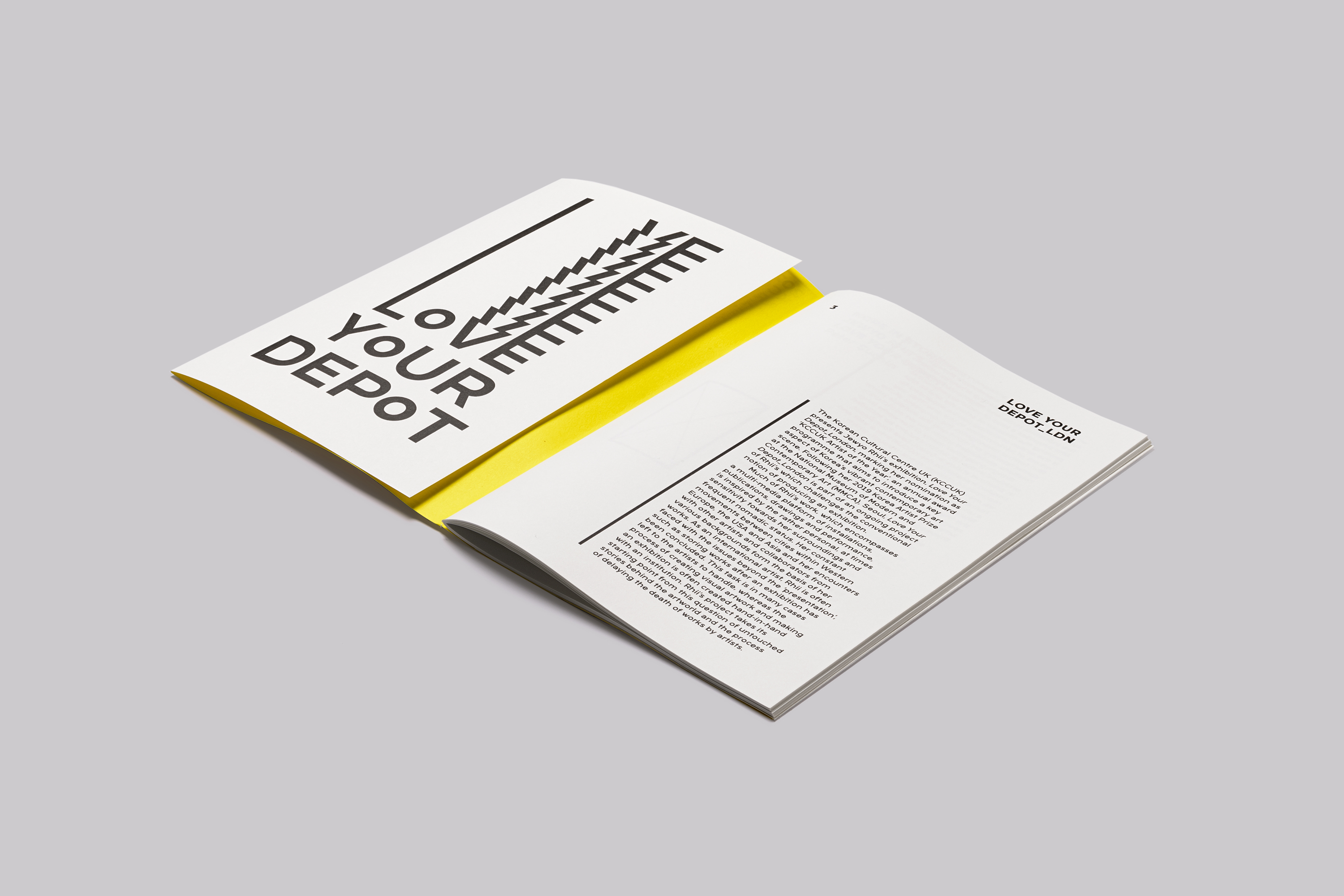
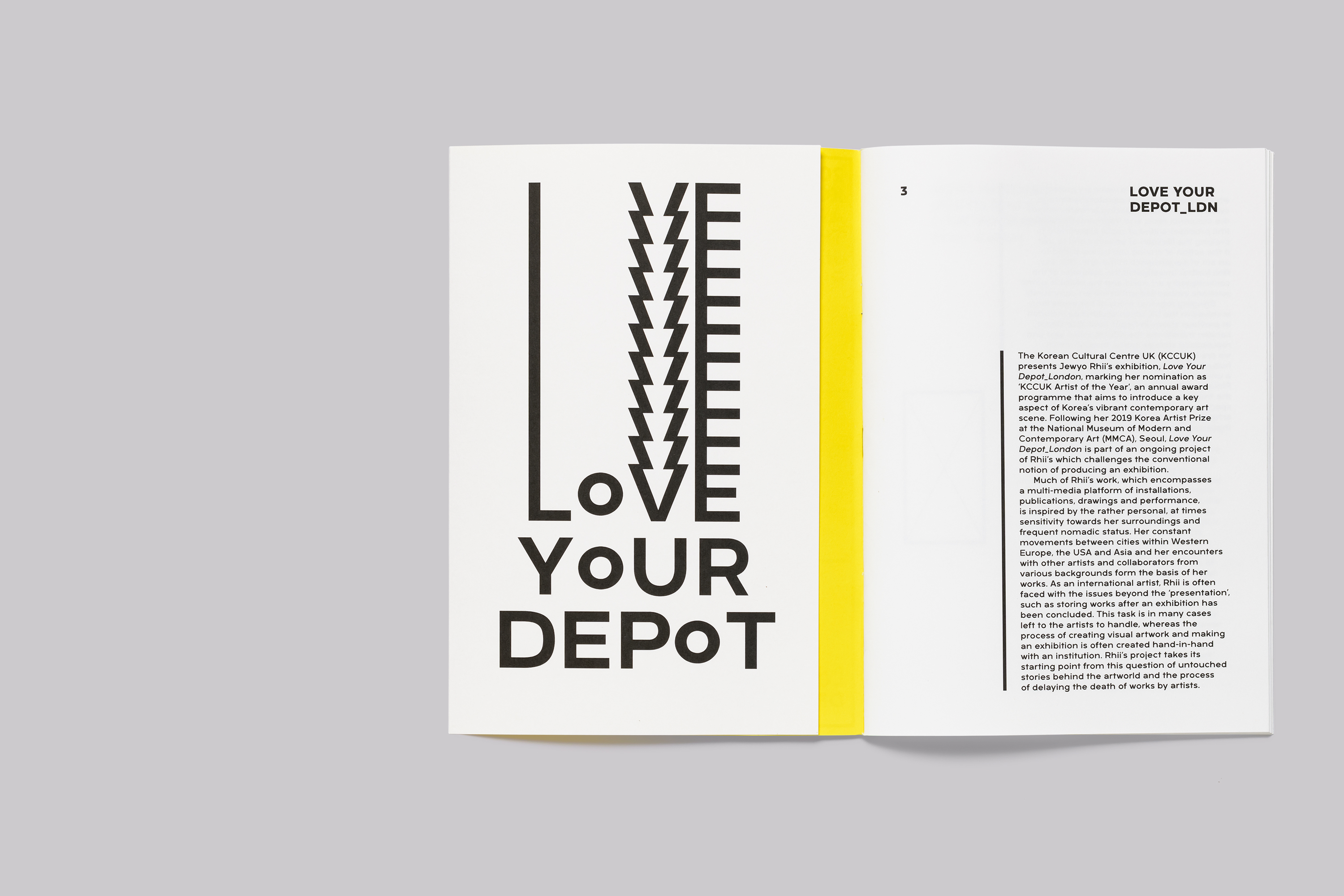
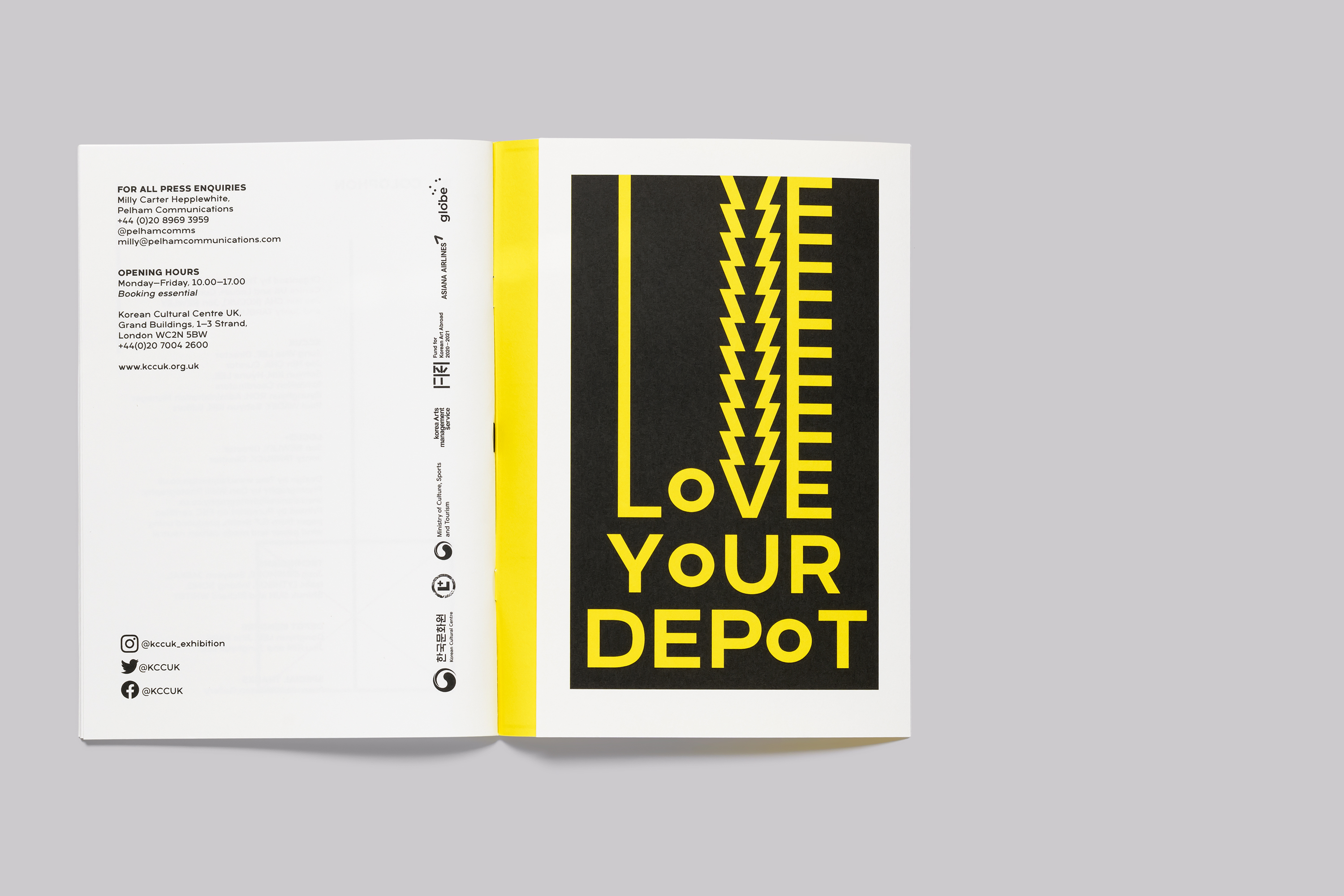
The typeface Arkibal Display was chosen based on its selection by the artist for materials associated with the exhibition. Designed by Jan-Christian Bruun, Arkibal is a sans serif font family inspired by nineteenth century door sign lettering in Copenhagen.
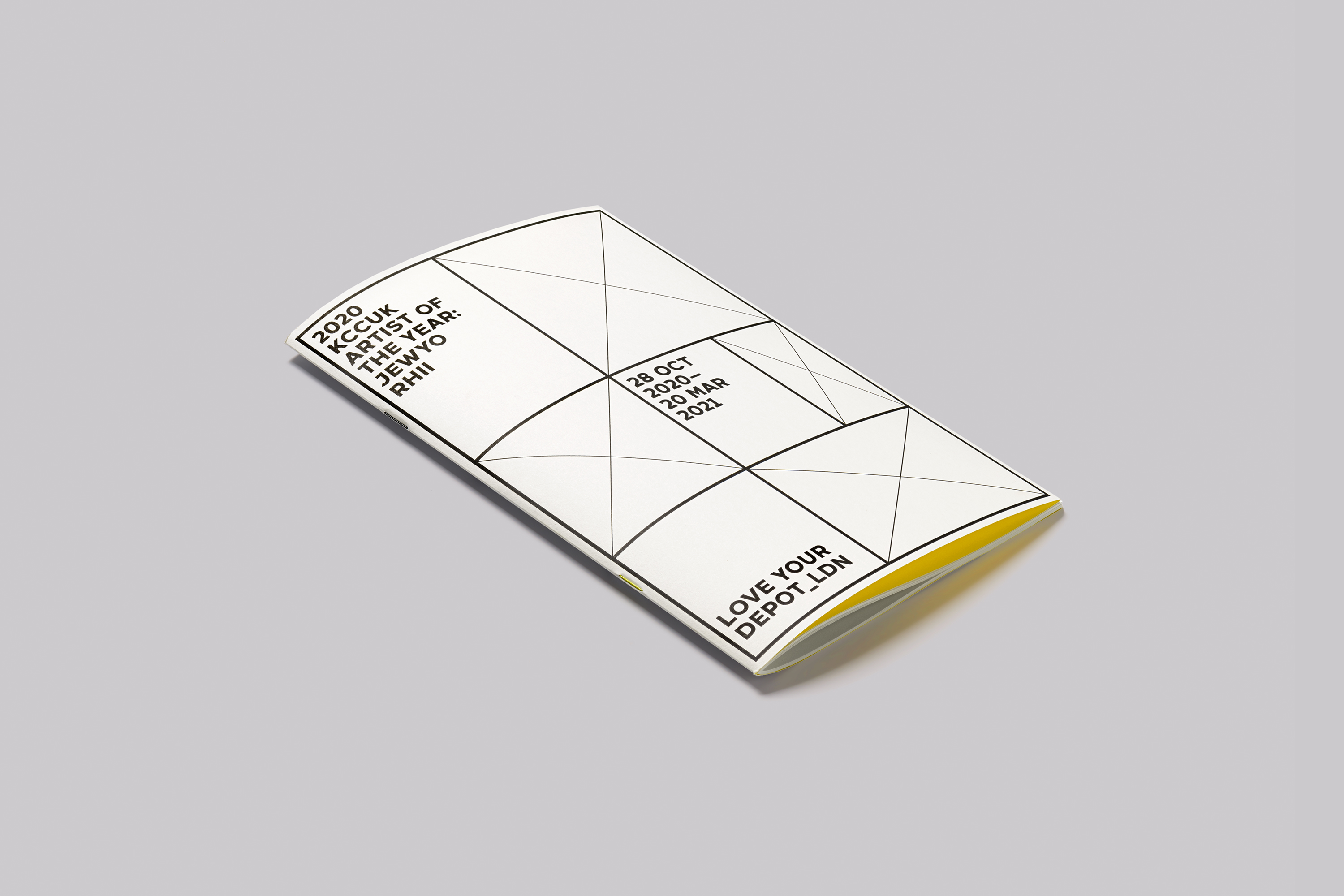
The application of the typography is used to evoke a sense of the ‘depot’. And it does this with subtle referencing of the typographic conventions. The orientation of the typography references the formal structures and hierarchies of information used in a ‘depot’.
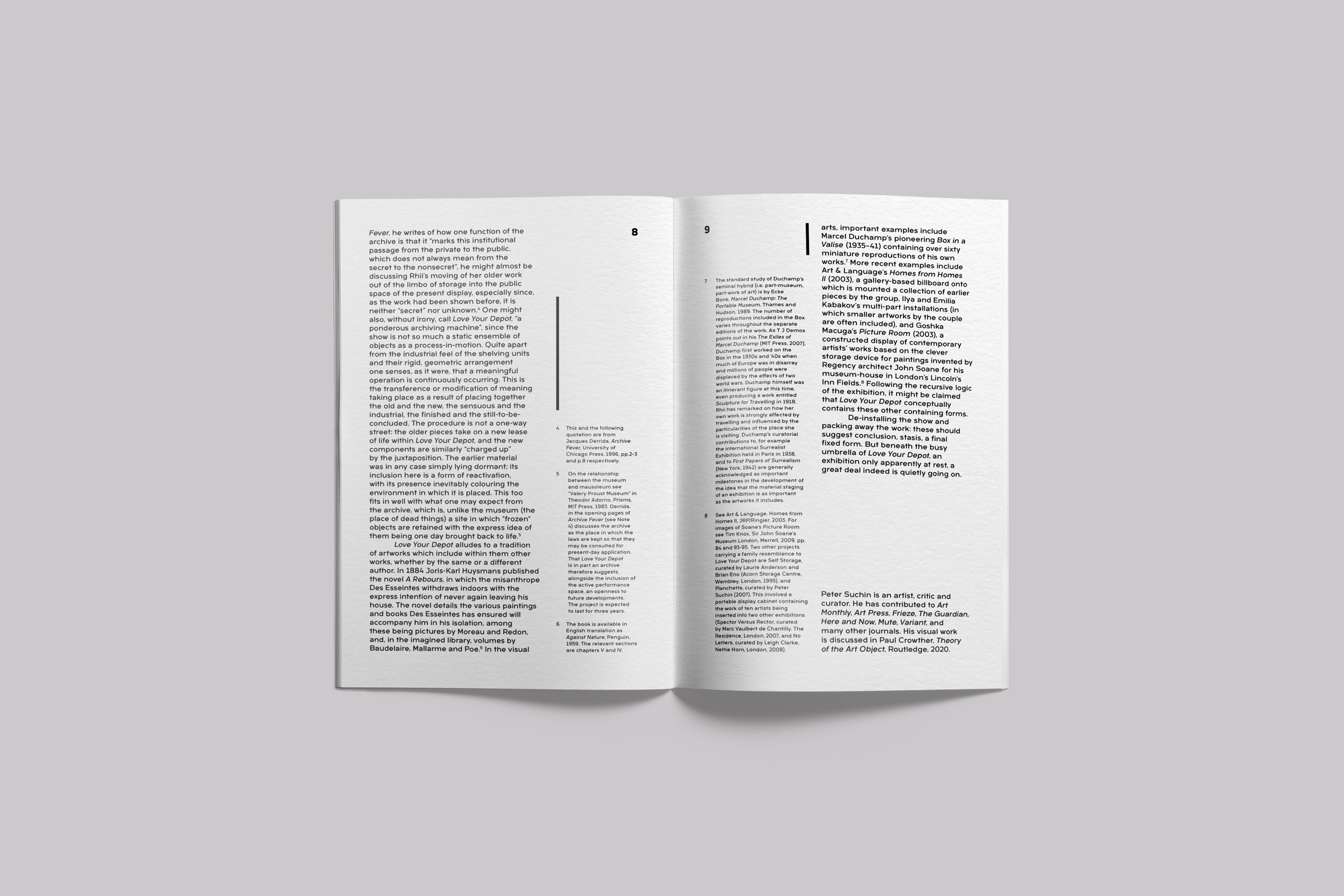
Publication Design
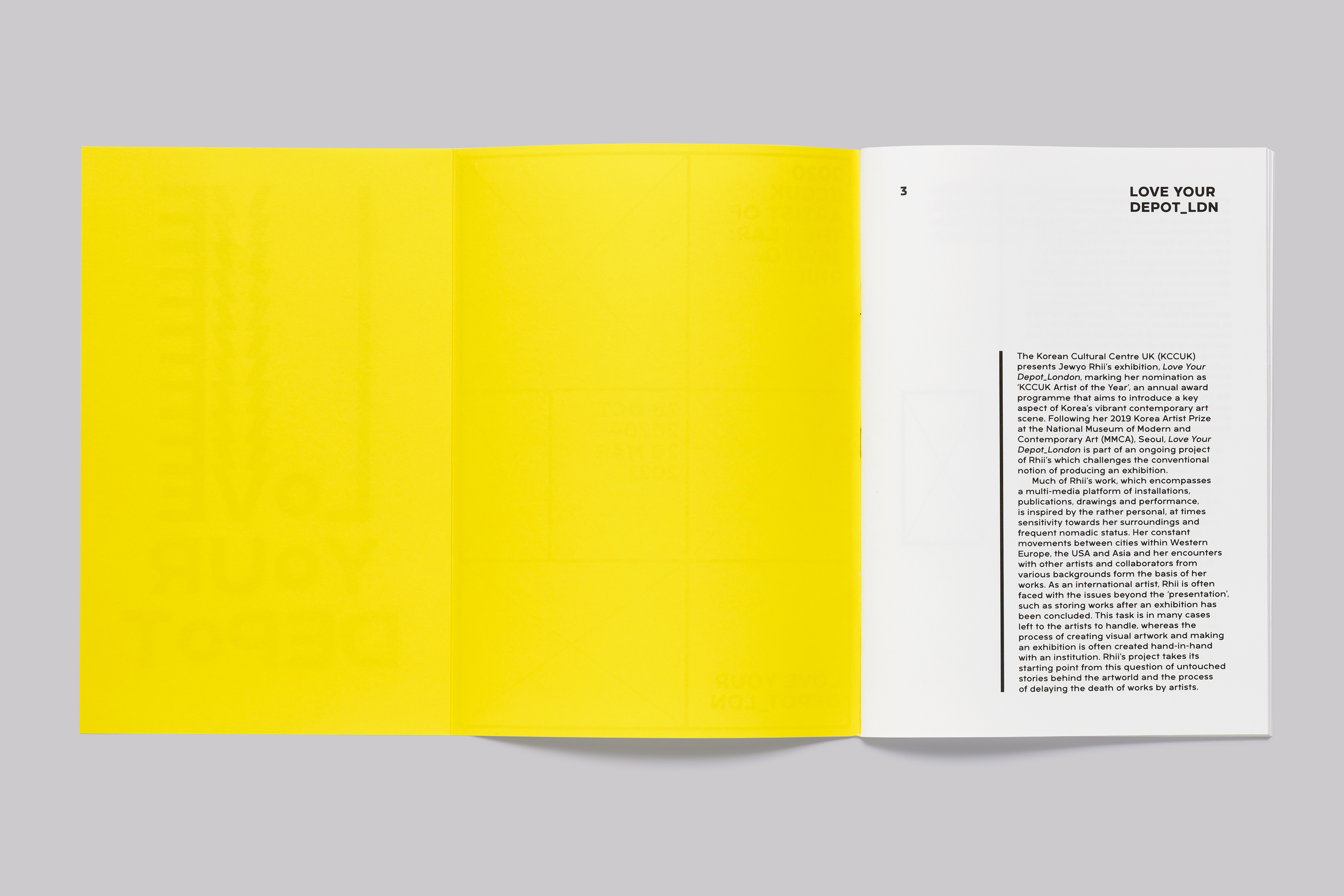
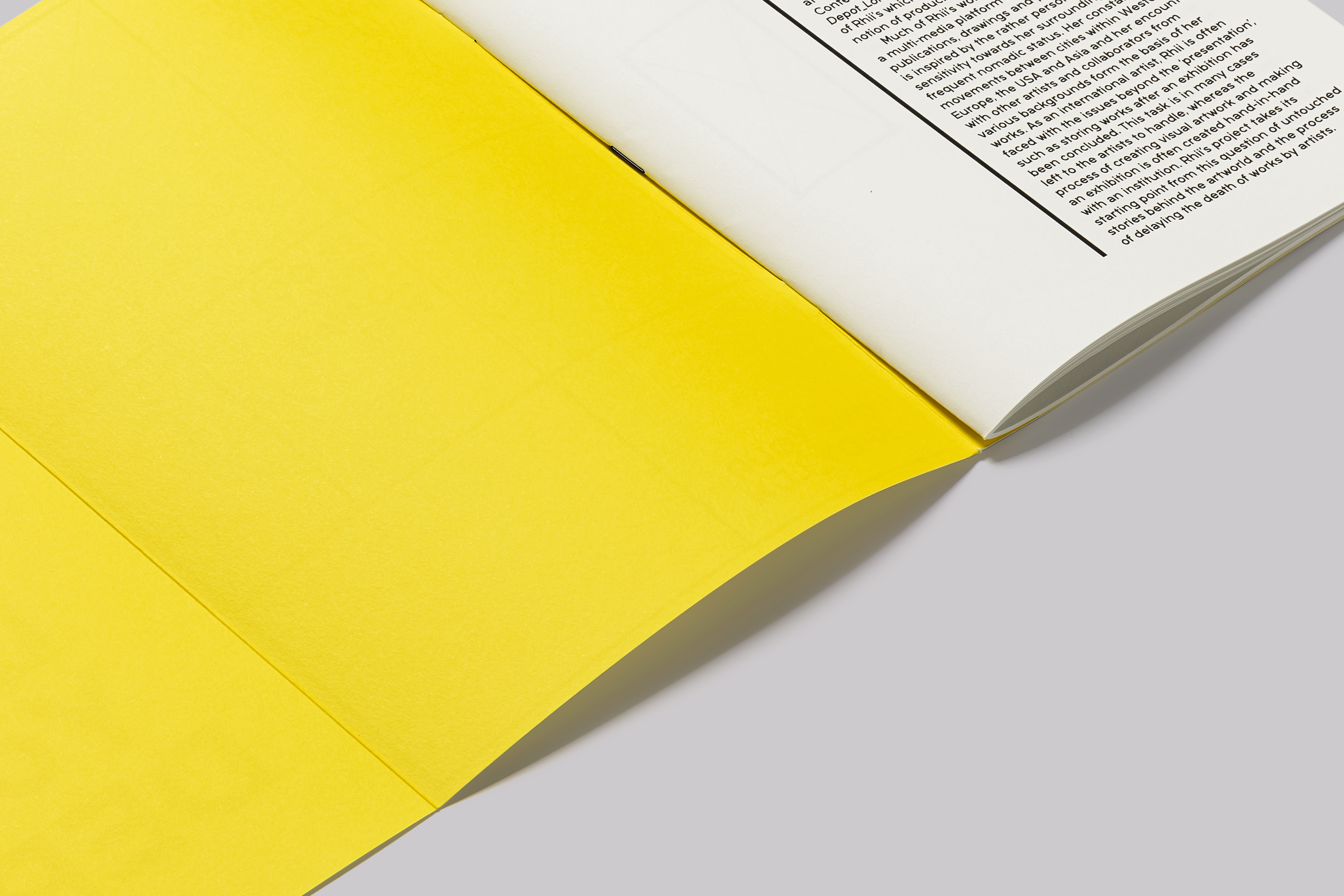
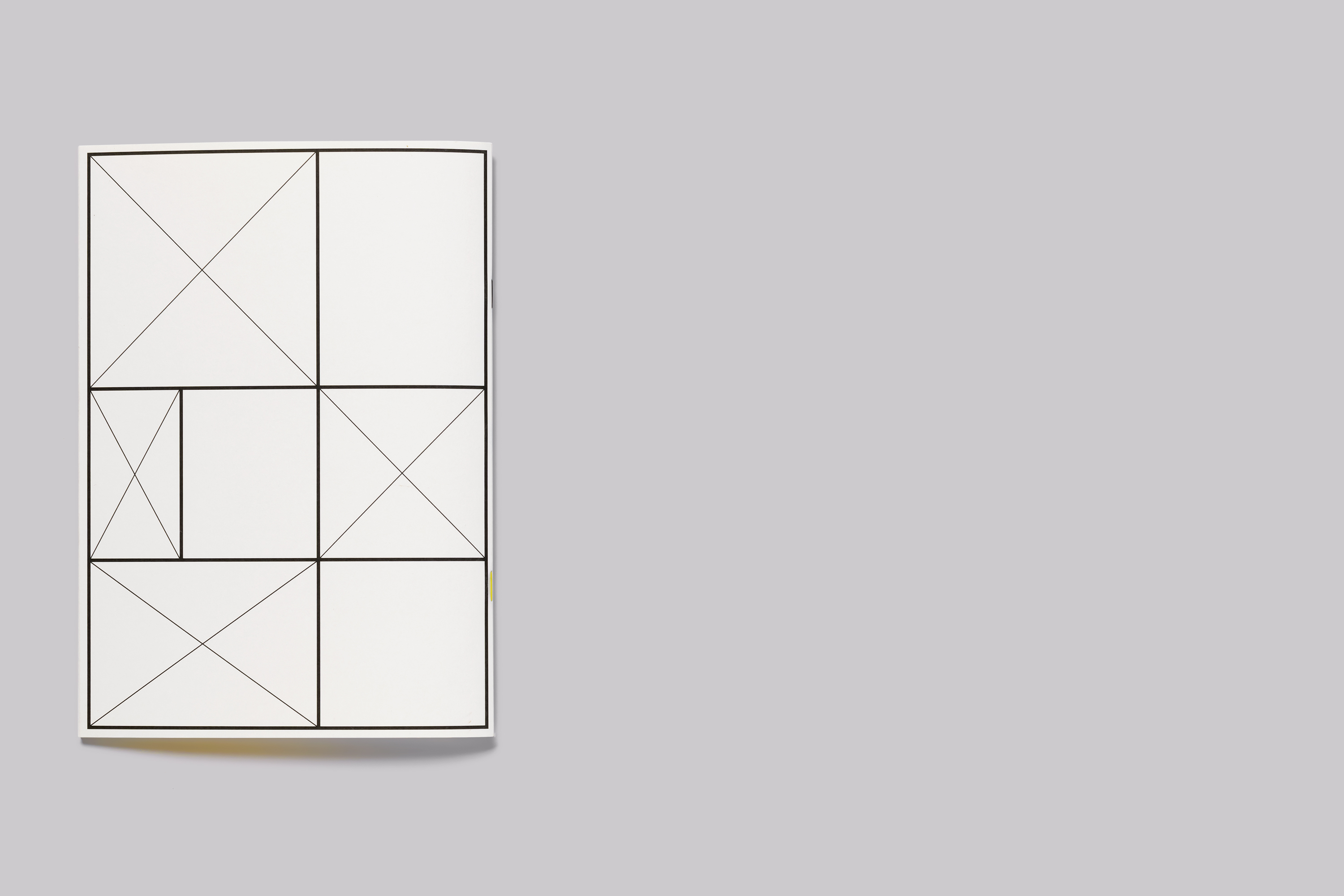
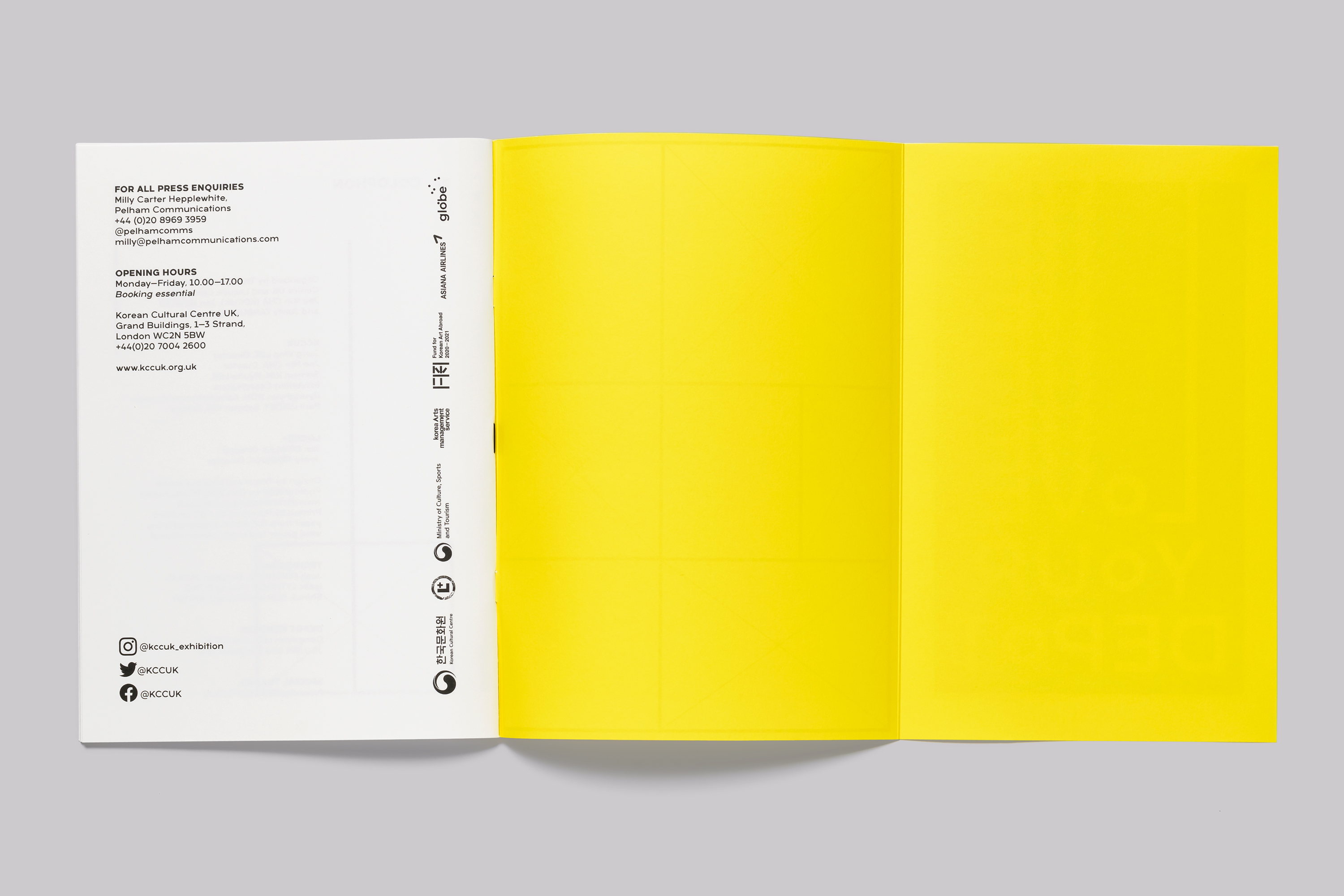
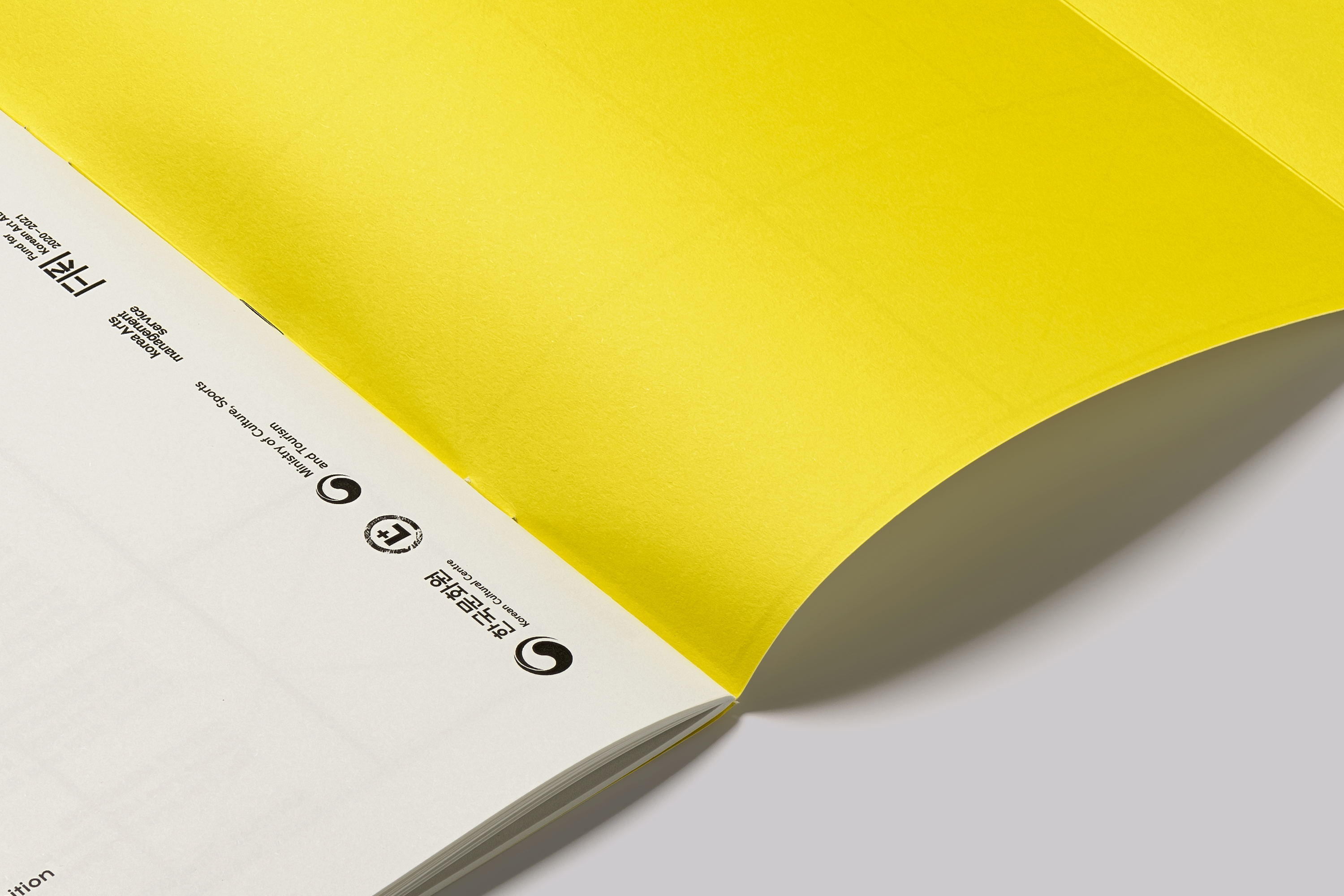
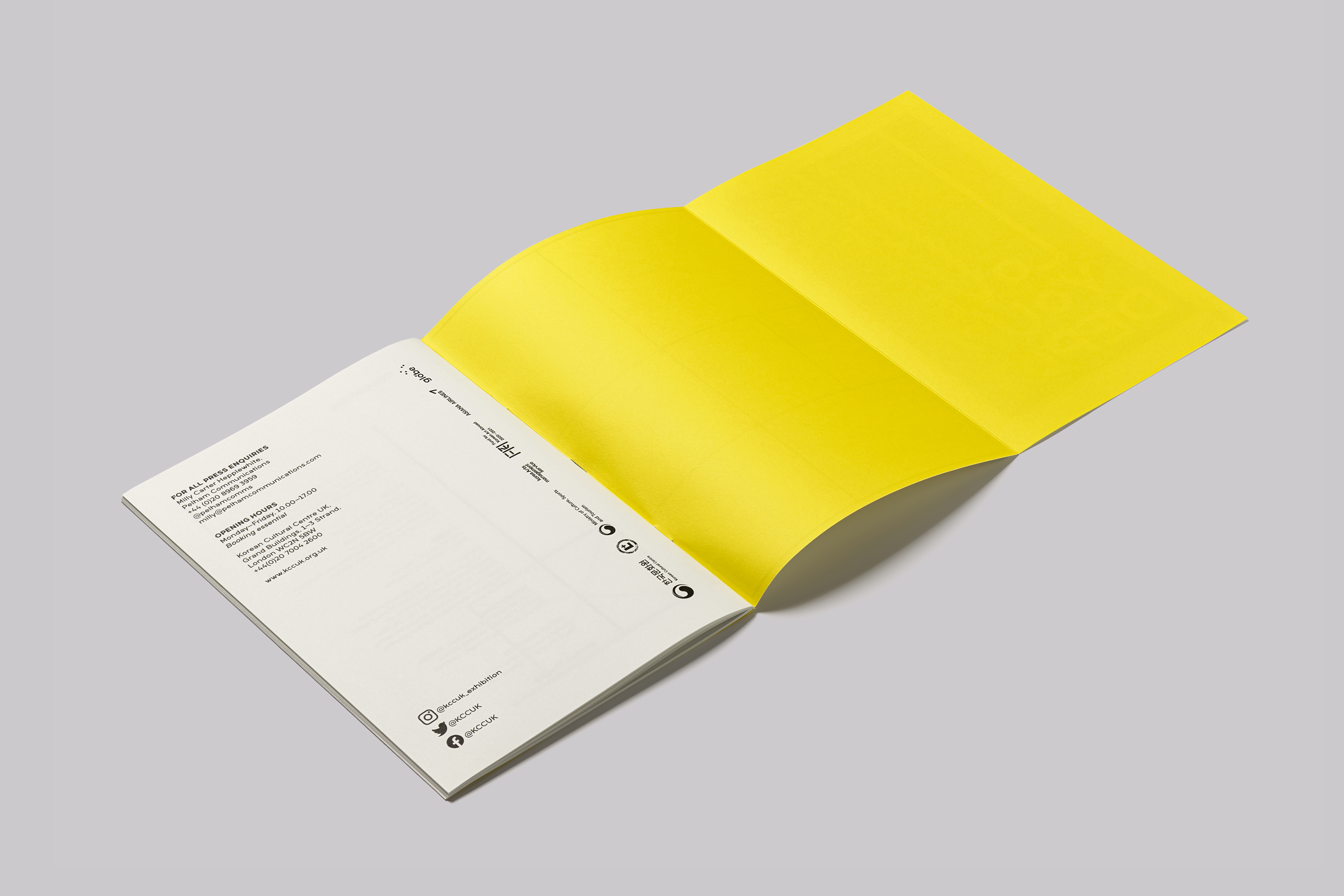
The exhibition booklet was produced with an eight page gatefold cover, printed yellow on the inside and stitched with different coloured wires—yellow and black—representative of the colours used in Rhii’s installation.
Printed in a limited run by Pureprint onto FSC certified paper, produced using electricity from 100% wind power, from G.F Smith papers.
Jonty Tarbuck, Director, Locus+:

Credits
The exhibition is organised by the Korean Cultural Centre UK and Locus+. Curated by Jae Min Cha (KCCUK), Jon Bewley and Jonty Tarbuck (Locus+). Images courtesy of the Korean Cultural Centre UK and the artist; © the artist.
Services
Consultancy
Strategic Positioning
Visual Identity
Printed & Digital Communications
Poster Design
Publication Design
Environmental Graphics
Window Vinyl
Related Projects